This chapter explains how relationships between variables can be used to predict and estimate values of the dependent variable based on known information about the independent variable(s). By the end of this chapter, you will be able to:
Understand the fundamentals of regression analysis.
Explain different types of regression models and the model selection procedures.
Choose the right regression analysis for a research problem/question.
Evaluate the assumptions in regression analysis.
Find regression equations to analyze data and make predictions.
Make inferences from a regression model and regression coefficients.
Interpret the coefficient of determination.
Correctly report regression findings in APA style.
Understand how predictions apply in nursing practice.
Enter method
F-test
Goodness of fit
Hierarchical method
Linear
Linearity
Logistic regression
Method of least squares
Model sum of squares
Multicollinearity
Percentage of variance
Predictor variable(s)
R-square
Regression model
Residual
Residual sum of squares
Stepwise methods
We have learned that correlations inform us whether variables of interest are related to or associated with one another, and, if so, how strong the relationship is. For example, a correlation coefficient of +.50 indicates that the variables are positively and moderately related. Furthermore, statistical significance testing helps us understand if the correlation is just by chance or is more likely due to an actual relationship. In correlation, we usually do not specify the independent and dependent variables, and our primary interest is whether the variables are related. However, understanding how variables are related is usually a precursor to a more important level of understanding: the prediction of variation in the dependent variable by one or more independent variables. In this chapter, we will learn about regression analysis, which is a powerful tool for developing predictions.
Case StudiesVarty, M., Speller-Brown, B., Wakefield, B. J., Ravert, R. D., Kelly, K. P., & Popejoy, L. L. (2022). Decision-making involvement, self-efficacy, and transition readiness in youth with sickle cell disease. Nursing Research, 71(1), 12-20. https://doi.org/10.1097/NNR.0000000000000550
Varty et al. (2022) were interested in adolescents and young adults with sickle cell disease and their preparedness to move into adult health care. These investigators conducted a cross-sectional descriptive study of 50 patient/caregiver pairs to explore the associations between decision-making behaviors, disease management confidence, and transition readiness. Participants completed three scales and demographic information. Measures of the independent variables (decision-making behaviors, disease management confidence), covariates (patient/caregiver demographics), and dependent variables (transition readiness), were analyzed in four multiple linear regressions. The researchers found several factors that contributed 65.9% of the variance to self-reported transition readiness. The strongest predictor of readiness was a high level of disease management confidence. Interestingly, higher-level decision-making behaviors and caregiver involvement were not strong predictors of the patient's perceptions of transition readiness.
Suppose that we had investigated the relationship between fat and protein in the human body and found that fat and protein are negatively correlated (i.e., protein level increases as fat content decreases in the human body). Depending on the strength of the correlation, we could then try to estimate or predict the value of one variable using the value of the other variable. In this case, we would ask a question such as, "Does the level of fat predict the level of protein in body composition?" The accuracy of estimation or prediction depends on the strength of the correlation. In clinical practice and research, understanding the relationship between variables is not enough. We need to know how much influence is exerted by the independent variable on the dependent variablein other words, we want to know what proportion or percentage of variance on the dependent variable is contributed by one or more independent variables. For example, we might ask, "Does body mass index predict the proportion of body fat?" or "How much variance in the proportion of body fat is predicted by body mass index?" Such investigations aim to outline initial thinking about how to regulate phenomena. Similarly, in evidence-based practice (EBP), we are usually interested in predictions to change practices that influence patient outcomes. For example, we might ask, "Does the length of time that urinary catheters are in place predict hospital-acquired urinary tract infections?" or "How much variance in hospital-acquired urinary tract infections is attributable to the length of time that urinary catheters are in place?"
There are other techniques to investigate the predictive value of any given set of independent variables, but regression analysis is the most commonly used and reported approach in the scientific literature. Grasping the fundamentals of regression will assist you in carrying out your own investigations, understanding the results of studies conducted by others, and providing a foundation for understanding and applying more complex techniques explained later in the text.
The value of predictive studies is in their power to identify important relationships, provide information on the direction of those relationships, and begin to specify a more complex and nuanced understanding of the phenomenon under investigation. Because nurses are interested in controlling phenomena, predictive studies are crucial in determining steps toward intervention development, whether a part of original research, quality/process improvement, or EBP.
To explain how regression analysis is performed and to understand the underlying principles, let us recall our college algebra course. Specifically, let us focus on the linear equation modeling used to characterize the relationship between x and y. We can understand that relationship as the best fit using the following equation:
y = a+ b× x
where a is the y-intercept of a line and b is the slope of the line.
In regression analysis, we are doing exactly the same thing: trying to fit a line that best describes the data. However, we must add an error term in the previous equation because we are predicting/estimating the value of a dependent variable using information from an independent variable (because no estimation or prediction will be perfect!). Then, the linear line equation becomes:
y = (a+ b× x)+ε
where ε is the error.
In this equation, a+ b× x is called the model, and we use it to predict the value of the dependent variable based on what is known about the independent variable. Error is the difference between the actual value and our estimate from the model. The model's predictive capacity depends on the strength of the relationships between variables and the error volume.
Regression analysis fits a prediction model using the method of least squares. In this approach, the idea is to find the line that best fits the data with the least amount of vertical distance between the fitted line and the actual data (i.e., the lowest residual) among many lines that could be fitted to the data. To explain the residual further, let us consider Figure 11-1. The vertical lines between each data point and the fitted line through the data points represent residuals. The smaller the sum of residuals, the better the fit of the line through the data and the better the predictive value of the model. In other words, the better the line fits, the more accurately it tells us how much variance the independent variable explains or predicts on the dependent variable.
Method of least squares in graph.
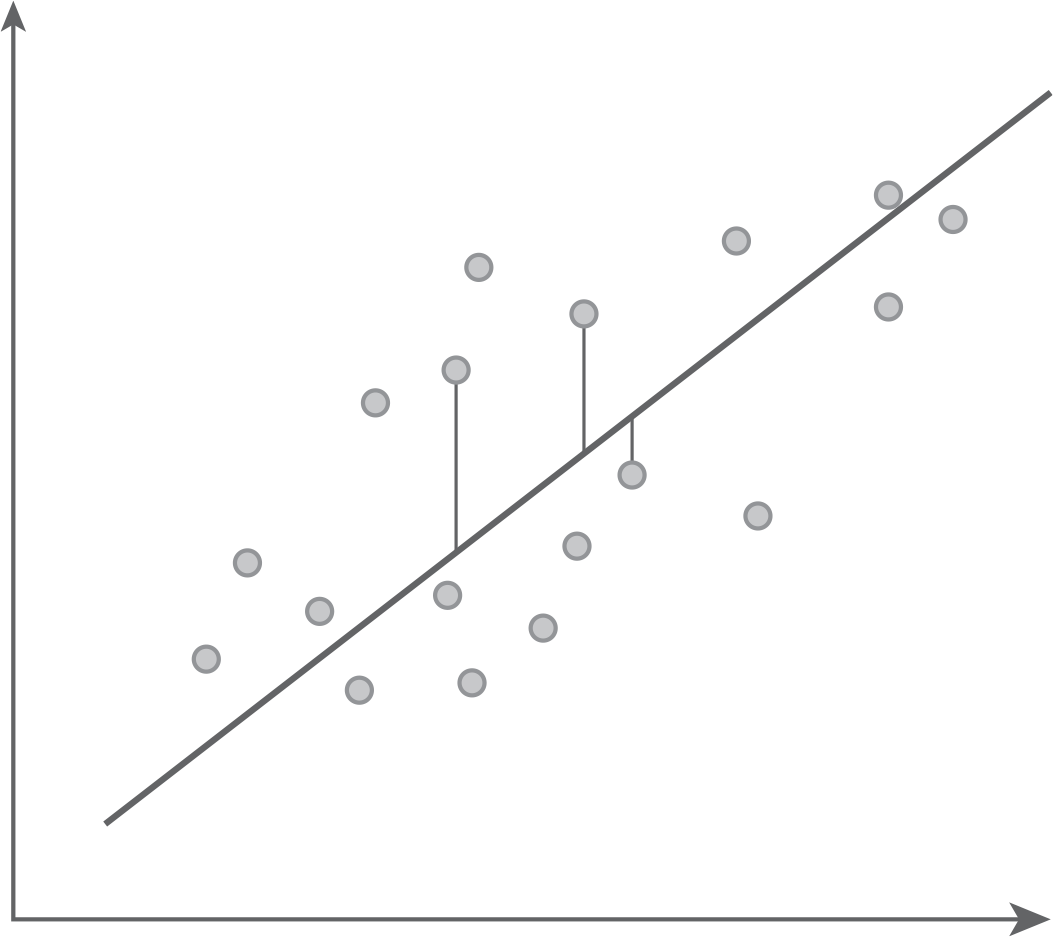
A scatterplot shows a diagonal line drawn through the middle of the graph, with plots above and below it. Two short vertical lines are drawn from the diagonal line, to meet two plots above, and one vertical line is drawn to meet one plot below.
Once the line has been fitted to the data, one way to examine how good the fitted line is for estimation or prediction is to evaluate the goodness of fit. Regression analysis will calculate what is called R2, or R-square, which is a simple square of the correlation coefficient expressed as a percentage in simple linear regression. We can use this statistic to evaluate goodness of fit. Goodness of fit is the ratio of the percentage of variability explained by the fitted model (line) over the total variability in the data. The more variability in the data that the line can explain, and the higher this R2 statistic gets, the more accurate our model is. For example, a model with an R2 of 75% will have a better fit than a model with an R2 of 40% because the former explains more variability and minimizes the variability we cannot explain (i.e., error).
Along with the goodness of fit of the model, we also need to examine the goodness of the predictor (i.e., the independent variable). There is a relationship between the overall goodness of fit and the goodness of individual predictor variable(s) because the model will contain good predictability when an independent variable is useful for prediction (i.e., it is a good variable to use for predicting the value of the dependent variable). Both Excel and IBM SPSS Statistics software (SPSS) will test the goodness of an individual independent variable in prediction using the t-test; the hypotheses for this t-test are:
H0: β= 0 or independent variable is not useful for prediction
Ha: β≠0 or independent variable is useful for prediction
The independent variable is said to be a good predictor when the associated p-value with the independent variable is small, indicating that the observed effect is likely not because of chance and not such a good predictor when the associated p-value with the independent variable is too large to indicate evidence for an effect.
As always, the first step is to check whether the required assumptions are met and the following assumptions should be met for simple linear regressions.
Linearity: The relationship between the dependent variable and independent variables should be linear. As the title says, we are trying to fit a linear relationship, not a nonlinear one. As usual, this assumption can be checked with a scatterplot.
Independence: The values/errors of dependent variables are assumed to be independent, meaning that subjects respond independently. This assumption can be checked with Durbin-Watson statistics and requested as an option in the regression window. If the value of that statistic is around +2, the assumption is said to be met. Otherwise, you will be violating the assumption. Table 11-1 demonstrates the critical values of this statistic and can be used as a guideline to determine the violation of this assumption. If the statistic is outside the interval, you violate this assumption. Note that this statistic can be obtained with a formula, "=SUMXMY2(A2:A10,A1:A9)/SUMSQ (A1:A10)," where the data ranges from A1 to A10 in Excel, and you can obtain the Durbin-Watson statistic with a check box in the Regression option.
Normality: All variables should be normally distributed and can be investigated with a histogram, skewness and kurtosis, a P-P plot, or statistical tests such as the Kolmogorov-Smirnov test or Shapiro-Wilk test. These tests hypothesize that the variable is normally distributed for a null hypothesis and that the variable is not normally distributed for an alternative hypothesis. When the associated p-value with both tests is small to rule out chance, it means that the variable is not normally distributed. Otherwise, the variable is normally distributed.
Equal variance: The variance of error should be equal among all independent variables, and this assumption can be checked with a residual plot, which also can be requested as an option in the regression window. If you were to meet this assumption, you should not find data values scattered without any specific pattern. You violate this assumption if you notice a specific patternsuch as a megaphone effect, where the range of the data values increases depending on the location.
Sample Size | Probability in Lower Tail (Significance Level = α) | k = Number of Regressors (Excluding the Intercept) | |||||||||
|---|---|---|---|---|---|---|---|---|---|---|---|
1 | 2 | 3 | 4 | 5 | |||||||
dL | dU | dL | dU | dL | dU | dL | dU | dL | dU | ||
.01 | 0.81 | 1.07 | 0.70 | 1.25 | 0.59 | 1.46 | 0.49 | 1.70 | 0.39 | 1.96 | |
15 | .025 | 0.95 | 1.23 | 0.83 | 1.40 | 0.71 | 1.61 | 0.59 | 1.84 | 0.48 | 2.09 |
.05 | 1.08 | 1.36 | 0.95 | 1.54 | 0.82 | 1.75 | 0.69 | 1.97 | 0.56 | 2.21 | |
.01 | 0.95 | 1.15 | 0.86 | 1.27 | 0.77 | 1.41 | 0.63 | 1.57 | 0.60 | 1.74 | |
20 | .025 | 1.08 | 1.28 | 0.99 | 1.41 | 0.89 | 1.55 | 0.79 | 1.70 | 0.70 | 1.87 |
.05 | 1.20 | 1.41 | 1.10 | 1.54 | 1.00 | 1.68 | 0.90 | 1.83 | 0.79 | 1.99 | |
.01 | 1.05 | 1.21 | 0.98 | 1.30 | 0.90 | 1.41 | 0.83 | 1.52 | 0.75 | 1.65 | |
25 | .025 | 1.13 | 1.34 | 1.10 | 1.43 | 1.02 | 1.54 | 0.94 | 1.65 | 0.86 | 1.77 |
.05 | 1.29 | 1.45 | 1.21 | 1.55 | 1.12 | 1.66 | 1.04 | 1.77 | 0.95 | 1.89 | |
.01 | 1.13 | 1.26 | 1.07 | 1.34 | 1.01 | 1.42 | 0.94 | 1.51 | 0.88 | 1.61 | |
30 | .025 | 1.25 | 1.38 | 1.18 | 1.46 | 1.12 | 1.54 | 1.05 | 1.63 | 0.98 | 1.73 |
.05 | 1.35 | 1.49 | 1.28 | 1.57 | 1.21 | 1.65 | 1.14 | 1.74 | 1.07 | 1.83 | |
.01 | 1.25 | 1.34 | 1.20 | 1.40 | 1.15 | 1.46 | 1.10 | 1.52 | 1.05 | 1.58 | |
40 | .025 | 1.35 | 1.45 | 1.30 | 1.51 | 1.25 | 1.57 | 1.20 | 1.63 | 1.15 | 1.69 |
.05 | 1.44 | 1.54 | 1.39 | 1.60 | 1.34 | 1.66 | 1.29 | 1.72 | 1.23 | 1.79 | |
.01 | 1.32 | 1.40 | 1.28 | 1.45 | 1.24 | 1.49 | 1.20 | 1.54 | 1.16 | 1.59 | |
50 | .025 | 1.42 | 1.50 | 1.38 | 1.54 | 1.34 | 1.59 | 1.30 | 1.64 | 1.26 | 1.69 |
.05 | 1.50 | 1.59 | 1.46 | 1.63 | 1.42 | 1.67 | 1.38 | 1.72 | 1.34 | 1.77 | |
.01 | 1.38 | 1.45 | 1.35 | 1.48 | 1.32 | 1.52 | 1.28 | 1.56 | 1.25 | 1.60 | |
60 | .025 | 1.47 | 1.54 | 1.44 | 1.57 | 1.40 | 1.61 | 1.37 | 1.65 | 1.33 | 1.69 |
.05 | 1.55 | 1.62 | 1.51 | 1.65 | 1.48 | 1.69 | 1.44 | 1.73 | 1.41 | 1.77 | |
.01 | 1.47 | 1.52 | 1.44 | 1.54 | 1.42 | 1.57 | 1.39 | 1.60 | 1.36 | 1.62 | |
80 | .025 | 1.54 | 1.59 | 1.52 | 1.62 | 1.49 | 1.65 | 1.47 | 1.67 | 1.44 | 1.70 |
.05 | 1.61 | 1.66 | 1.59 | 1.69 | 1.56 | 1.72 | 1.53 | 1.74 | 1.51 | 1.77 | |
.01 | 1.52 | 1.56 | 1.50 | 1.58 | 1.48 | 1.60 | 1.45 | 1.63 | 1.44 | 1.65 | |
100 | .025 | 1.59 | 1.63 | 1.57 | 1.65 | 1.55 | 1.67 | 1.53 | 1.70 | 1.51 | 1.72 |
.05 | 1.65 | 1.69 | 1.63 | 1.72 | 1.61 | 1.74 | 1.59 | 1.76 | 1.57 | 1.78 | |
Reproduced with permission from Oxford University Press, Durbin, J., & Watson, G. S. (1951). Testing for serial correlation in least squares regression III. Biometrika, 38(1-1), 159μ178. doi:10.1093/biomet/58.1.1 | |||||||||||
In general, the steps for conducting a simple linear regression are as follows:
Draw a scatterplot of the data and visually check the strength of the linear relationship between variables.
Compute the correlation coefficients as a numerical verification of what you saw in the scatterplot.
If we find strong evidence of relationship between variables based on the correlation coefficient with a small p-value, try to fit the best line of prediction through regression analysis.
To explain how a simple linear regression is done in Excel, let us consider the following example. A nurse investigator is interested in examining the relationship between gross domestic product (GDP) per capita and life expectancy in several countries and predicting life expectancy with GDP per capita if they seem to be related. The data for this example is called LifeExpectancy.xlsx and are presented in Figure 11-2, and a scatterplot between GDP per capita and life expectancy is displayed in Figure 11-3.
Screenshot of the data in Excel.
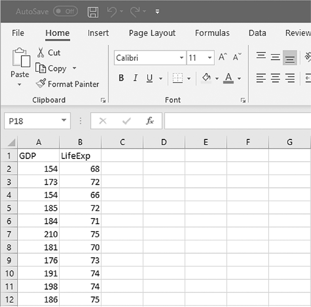
An Excel screenshot shows two column headings, G D P, with three-digit numerical data, between 154 and 210, listed on rows 2 through 12 below it, and LifeExp, with two-digit numerical data, between 66 and 75, listed on rows 2 through 12 below it.
Courtesy of Microsoft Excel © Microsoft 2020.
Scatterplot between GDP per capita and life expectancy in Excel.
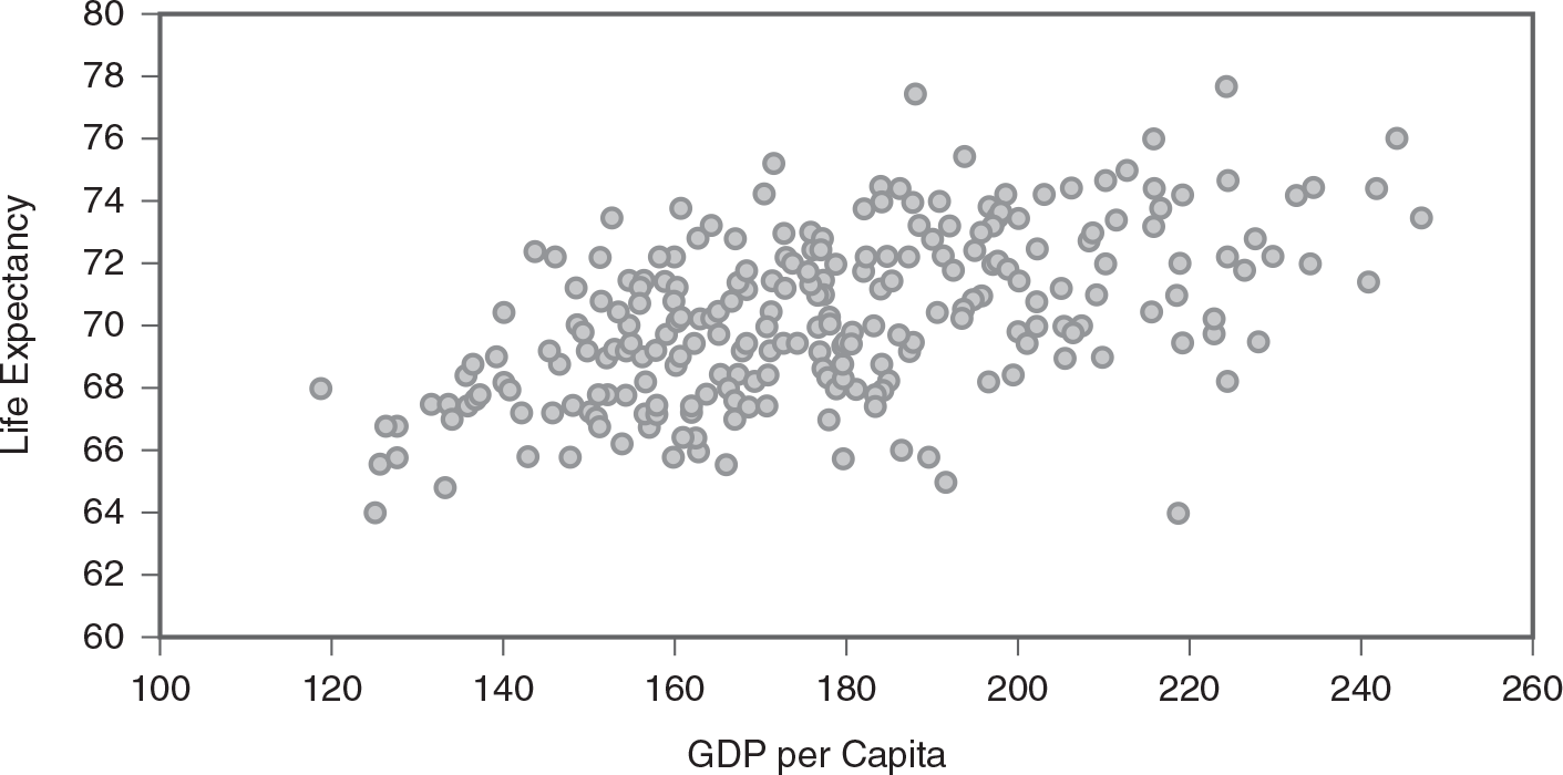
A scatterplot shows the relationship between G D P per capita and life expectancy.
The horizontal axis is labeled, G D P per capita, and ranges from 100 to 260, in increments of 20. The vertical axis is labeled, Expectancy, and ranges from 60 to 80, in increments of 2. The plots are scattered across the entire graph, with the plots dense between points (140, 68) and (190, 70).
The scatterplot presents a somewhat moderate positive relationship. As life expectancy increases, GDP per capita also increases. So, let us proceed to computing the correlation coefficient to check if there is strong enough evidence for the relationship for prediction. The Excel output for the correlation coefficient for these data is presented in Figure 11-4. From the figure, we can infer that the relationship between GDP per capita and life expectancy is moderately strong (r = .54, p = .000). Therefore, we have a good foundation to try fitting a simple regression line and determine how well we may predict life expectancy with per capita GDP.
Example output for correlation coefficient in Excel.
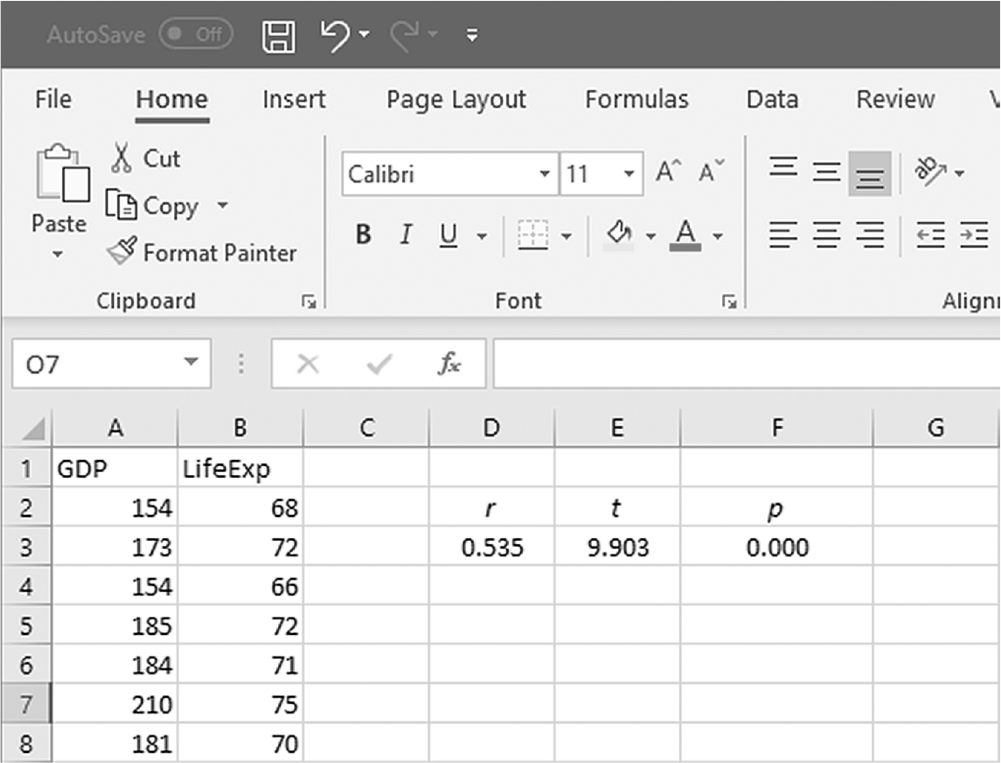
An Excel screenshot shows the derivation of the t statistic and p-value from the correlation coefficient.
Row 1 in Column A displays the heading, G D P, and that in Column B displays the heading, LifeExp, with numerical data displayed from row 2 through row 8s. The cells D 2, E 2, and F 2 display r, t, and p, respectively, and their values in D 3, E 3, and F 3 are, 0.53, 9.903, and 0.000, respectively.
Courtesy of Microsoft Excel © Microsoft 2020.
To conduct simple linear regression analysis in Excel, you will use LifeExpectancy.xlsx and go to Data > Data Analysis, as displayed in Figure 11-5. In the Data Analysis window, choose "Regression" and then click "OK" (Figure 11-6). In the Linear Regression dialogue box, you will provide B1:B237 as Input Y Range and A1:A247 as Input × Range with Labels, Confidence Level, Residuals, Residual Plots, and Normal Probability Plots selected (Figure 11-7). Clicking "OK" will then produce the output of requested regression analysis. The example output is presented in Figure 11-8; note the value in the cell F23 is the Durbin-Watson statistic for this example, calculated with the aforementioned formula of "=SUMXMY2(C30:C274,C29:C273) /SUMSQ (C29:C274)" as computed residuals are displayed in C29:C274.
Finding Data Analysis ToolPak in Excel.
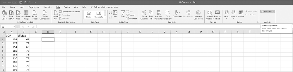
An Excel screenshot shows the Data Analysis ToolPak add-in, in the Analysis group under Data menu. Row 1 in Column A displays the heading, G D P, and that in Column B the heading, LifeExp, with numerical data displayed from row 2 through row 10.
Courtesy of Microsoft Excel © Microsoft 2020.
Selecting Regression within the Data Analysis ToolPak list in Excel.
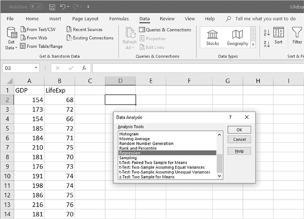
An Excel screenshot shows selection of the analysis tool, Regression, from a list of tools in the data analysis dialog box. Row 1 in Column A displays the heading G D P, and that in Column B, LifeExp, with numerical data from rows 2 through 13.
Courtesy of Microsoft Excel © Microsoft 2020.
Defining data ranges and selecting options for regression in Excel.
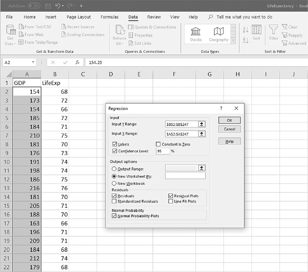
A screenshot shows the selection of values and inputting options in a dialog box for regression in an Excel worksheet.
The Excel sheet displays the heading, G D P, in row 1 of Column A, with three-digit numbers displayed in rows 2 through row 22. The heading, LifeExp, is displayed in row 1 of Column B and two-digit numbers along rows 2 through 22. The values in rows 2 through 22 of Column A are selected. A Regression dialog box is open in the worksheet, where B 2 : B 247 is provided in the Input Y Range entry box; A 2 : A 247 is provided in the Input X Range entry box; the check boxes of Labels, Confidence Level, Residuals, Residual Plots, and Normal Probability Plots selected, and the value in Confidence Level entered as 95 percent. The output options, output range, new worksheet, and new workbook, along with checkboxes, are displayed. The buttons O k, Cancel, and Help are displayed on the top right corner of the dialog box, with O k selected.
Courtesy of Microsoft Excel © Microsoft 2020.
Example output for regression in Excel.
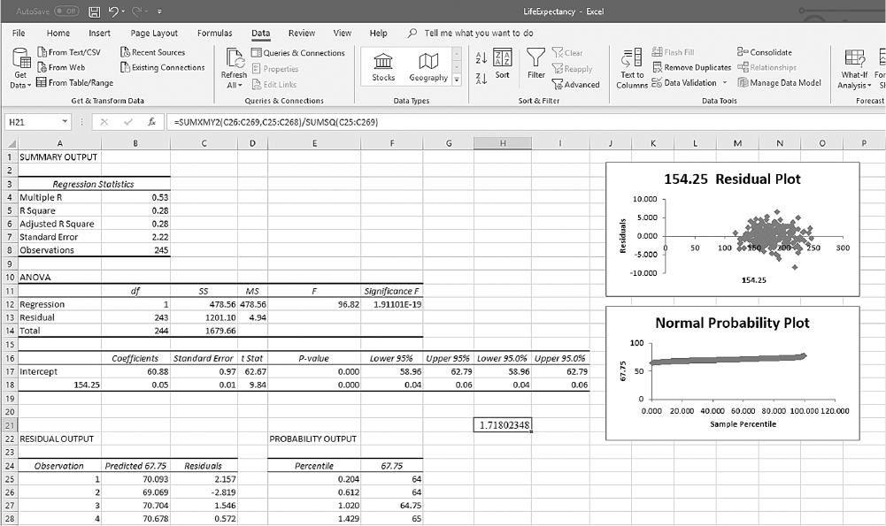
An Excel screenshot shows an output for regression, based on the analysis of variance. The summary output comprises five tables and two graphs.
The heading, Summary output, is displayed on A 1. The first table has two columns, and the column heading, Regression Statistics, spans across A 3 and B 3. The data from row 4 through row 8 are as follows. Row 4: Multiple R, 0.53; Row 5: R Square, 0.28; Row 6: Adjusted R Square, 0.28; Row 7: Standard Error, 2.22; Row 8: Observations, 245. The second table is ANOVA, and is displayed on cell, A 10. There are six columns, no data, d f, S S, M S, F, and Significance F. The data from row 12 through row 14 are as follows. Row 12: Regression, 1, 478.56, 478.56. 96.82, 1.91101E, minus, 19. Row 13: Residual, 243, 1201.10, 4.94, no data, no data. Row 14: Total, 244, 1679.66, no data, no data, no data. The third table has nine columns: no data, Coefficients, Standard Error, t Stat, p-value, Lower 95 percent, Upper 95 percent, Lower 95.0 percent, and Upper 95.0 percent. The data on rows 17 and 18 are as follows. Row 17: Intercept, 60.88, 0.97, 62.67, 0.000, 58.96, 62.79, 58.96, 62.79. Row 18: 154.25, 0.05, 0.01, 9.84, 0.000, 0.04, 0.06, 0.04, 006. The fourth table is Residual output, and spans across A 22 through C 22. The three column headings on row 24 are: Observation, Predicted 67.75, and Residuals. The data from the table on row 25 through row 28 are as follows. Row 25: 1, 70.093, 2.157. Row 26: 2, 69.069, minus 2.819. Row 27: 3, 70.704, 1.546. Row 28: 4, 70.678, 0.572. The fifth table is Probability output, and spans across the cells, E 22 and F 22. The two columns headings on E 24 and E 25 are Percentile and 67.75, respectively. The data from the table on row 25 through row 28 are as follows. Row 25: 0.204, 64. Row 26: 0.612, 64. Row 27: 1.020, 64.75. Row 28: 1.429, 65. The cell H 21 displays the value, 1.71802348, from the formula, equal to, Sum X M Y 2, of, C 26 to C 269, C 25 to C 268, all over, Sum S Q of C 25 to C 269. Graph 1154.25 Residual plot: The horizontal axis is labeled 154.25, and ranges from 0 to 300, in increments of 50. The vertical axis is labeled Residuals, and ranges from minus 10.000 to 10.000, in increments of 5.000. There are clusters of plots between x = 125 and x = 250, and between y = minus 5000 and y = 5000. Graph 2Normal probability plot: The horizontal axis is labeled, Sample percentile, and ranges from 0.000 to 120.000, in increments of 20.000. The vertical axis is labeled 67.75 and ranges from 0 to 100, in increments of 50. The curve is drawn at y = 60, along the values of x from 0.000 to 100.000.
Courtesy of Microsoft Excel © Microsoft 2020.
The first section in Figure 11-8 is for the model's overall fit; you will notice that the correlation coefficient between GDP per capita and life expectancy is .53, as previously calculated. In the same section, we find the value of R2 is .28, which tells us that GDP per capita explains about 28% of the variability in life expectancy, and there is 72% of the variability in life expectancy that cannot be explained by GDP per capita, suggesting that there are additional variables likely influencing life expectancy.
You may ask yourself, "What is a good value for R2?" Is the value of 28% we found good enough for a prediction model? The answer is, "It depends!" In some disciplines or in investigating some phenomena, an R2 of 55% may not be high enough to make a good prediction, but in other disciplines or particular phenomena, an R2 of 25% may be important. Evaluating R2 may also depend on the literature; for example, R2 of 25% can be important if others doing the same type of investigation have reported lower values for R2 in the past. Similarly, an R2 of 55% may not be important if others doing the same type of investigation have consistently reported higher values of R2. It may also depend on the sample or population under study or whether these variables have been investigated before in the population. Interpreting the R-square and the predictive ability of the independent variable depends on the larger context of the research or evidence already available.
The next section in Figure 11-8 is an analysis of variance (ANOVA) table presenting the various sums of squares (i.e., variability), as well as degrees of freedom. The overall F-test is used to determine whether the model as a whole has statistically significant explanatory power, meaning that the independent variables collectively provide valuable information for predicting the dependent variable. It compares a regression model with predictors (the full model) to a simpler model without predictors (the null model), which assumes no relationship between the independent and dependent variables. The F-test calculates the ratio of two variances: the variance explained by the model (known as the model sum of squares) and the variance not explained by the model (the residual sum of squares). A larger F-statistic indicates that the variance explained by the model is significantly greater than the unexplained variance, suggesting that at least one predictor in the model is useful for predicting the outcome. The corresponding p-value tells whether this F-statistic is large enough to be considered statistically significant. A small p-value indicates that the model as a whole provides a better fit than a model without any predictors, meaning that the independent variables together are substantially related to the dependent variable. This F-ratio and associated p-value indicate that this model is a good prediction model with a small p-value to rule out chance under the following hypotheses:
H0: This model is not a good prediction model.
Ha: This model is a good and useful prediction model.
The last section displayed in Figure 11-8 is the testing results of goodness of the independent variable in predicting a dependent variable. The ANOVA section of Figure 11-8 tells us whether or not a prediction model fitted is a good model, but it does not necessarily report whether or not an independent variable is a good predictor variable of the dependent variable. As stated before, Excel will perform a t-test for an independent variable, and an independent variable is said to be a good predictor if the associated p-value of this table is small to rule out chance in finding an effect. For our example, the associated p-value is .000; therefore, GDP per capita is determined to be a good predictor variable of life expectancy.
The values in Figure 11-8 can be used to create a prediction line for the data. By plugging coefficients into a regression equation, y = a+ b× x, we obtain
Life expectancy = 60.88 + 0.05 × GDP per capita
This equation can then be used to predict life expectancy if we know the value of GDP per capita. For example, the value of life expectancy of a country with a GDP per capita of 199 will be
Life expectancy = 60.88 + 0.05 × GDP per capita = 60.88 + 0.05 × 199 ≈ 70.83
To explain how a simple linear regression is done in SPSS, let us consider the same example where a nurse investigator is interested in examining the relationship between GDP per capita and life expectancy in several countries and in predicting life expectancy with GDP per capita if they seem to be related. The data for this example are displayed in Figure 11-2, and a scatterplot between GDP per capita and life expectancy is presented in Figure 11-9.
Scatterplot between GDP per capita and life expectancy in SPSS.
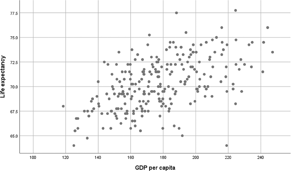
A screenshot in S P S S of a scatterplot shows the relationship between G D P per capita and life expectancy.
The horizontal axis is labeled G D P per capita and ranges from 100 to 260, in increments of 20. The vertical axis is labeled Life expectancy and ranges from 60 to 80, in increments of 2.5. There are multiple plots within the points (119, 72), (125, 62), (153, 73.75), (170, 74), (185, 75.5), (192, 65), (189, 77.5), (195, 75.5), (215, 75), (219, 62), (222, 68), (222, 78), (235, 75), (241, 71.9), (241, 75), and (243, 76.5).
Reprint Courtesy of International Business Machines Corporation, © International Business Machines Corporation. "IBM SPSS Statistics software ("SPSS")". IBM®, the IBM logo, ibm.com, and SPSS are trademarks or registered trademarks of International Business Machines Corporation.
The scatterplot again demonstrates a somewhat moderate positive relationship, so it makes sense to compute the correlation coefficient to check if there is strong evidence for the relationship between GDP per capita and life expectancy. The SPSS output for the correlation coefficient for these data is presented in Table 11-2. From the table, we can observe that the relationship between GDP per capita and life expectancy is moderately strong (r = .54, p = .000). Therefore, we have a good foundation to try fitting a simple regression line and determine how well we may predict life expectancy with per capita GDP.
Correlations | |||
|---|---|---|---|
GDP per Capita | Life Expectancy | ||
GDP per capita | Pearson correlation | 1 | .54 |
Sig. (2-tailed) | .000 | ||
N | 246 | 246 | |
Life expectancy | Pearson correlation | .54 | 1 |
Sig. (2-tailed) | .000 | ||
N | 246 | 246 | |
To conduct simple linear regression analysis in SPSS, you will open LifeExpectancy.sav and go to Analyze > Regression > Linear, as presented in Figure 11-10. In the Linear Regression dialogue box, you will select the variables you are interested in fitting a prediction line between and move an independent variable into "Independent(s)" and a dependent variable into "Dependent" by clicking the corresponding arrow buttons in the middle, as displayed in Figure 11-11. For methods, "Enter" is selected by default and we will leave it as is for now. (The methods will be explained later in this chapter in a section on multiple linear regression.)
Selecting Regression in SPSS.
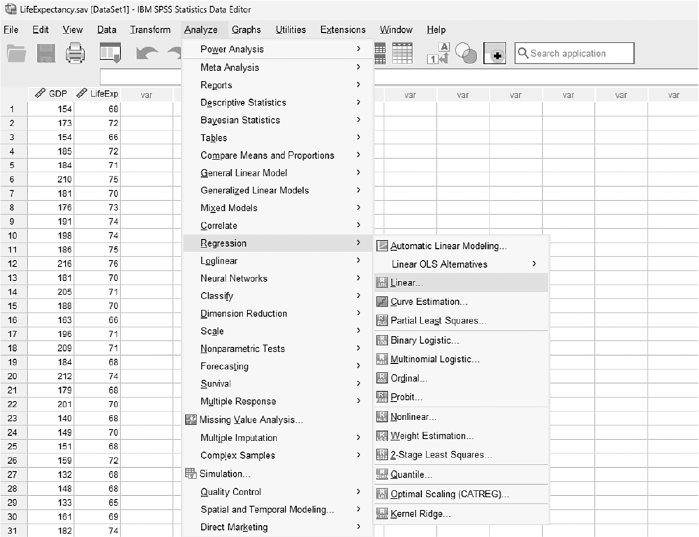
A screenshot displays a dialog box listing analysis procedures, with the regression option highlighted for selection.
Reprint Courtesy of International Business Machines Corporation, © International Business Machines Corporation. "IBM SPSS Statistics software ("SPSS")". IBM®, the IBM logo, ibm.com, and SPSS are trademarks or registered trademarks of International Business Machines Corporation.
Defining variables for regression analysis in SPSS.
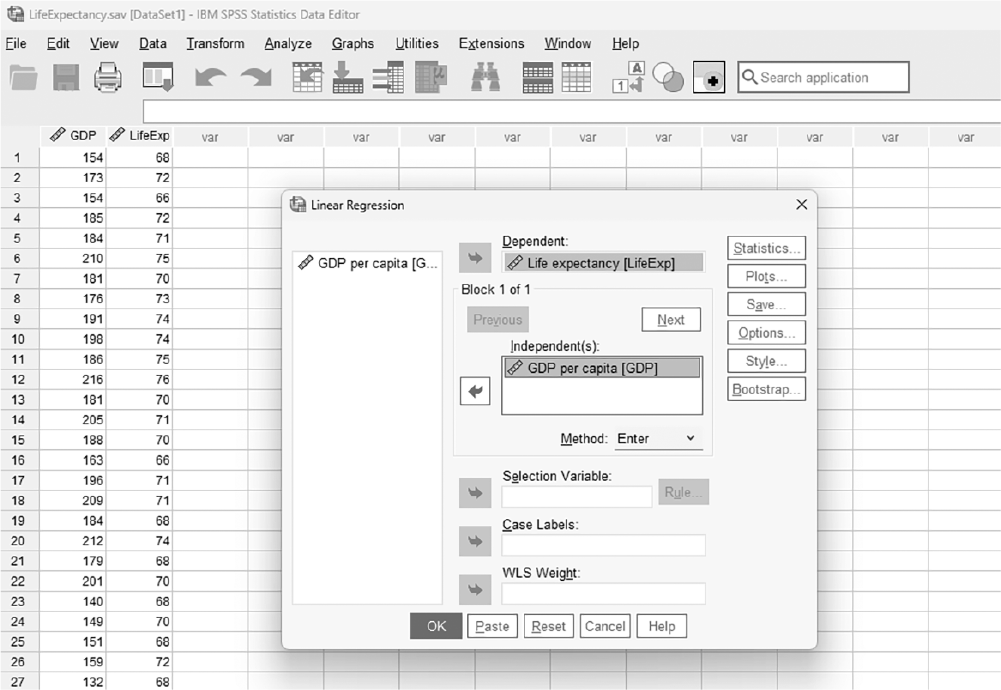
A screenshot displays a dialog box where one variable is assigned to the dependent field and multiple variables are placed in the independent field.
Reprint Courtesy of International Business Machines Corporation, © International Business Machines Corporation. "IBM SPSS Statistics software ("SPSS")". IBM®, the IBM logo, ibm.com, and SPSS are trademarks or registered trademarks of International Business Machines Corporation.
There are some options that are useful in interpreting regression outputs, and they are "Statistics," "Plots," and "Options." Under the "Statistics" button, as displayed in Figure 11-12, regression coefficient estimates and model fit are checked by default because these two options will create important information about overall model fit and significance of each individual independent variable. However, let us check additional checkboxes for the following:
Statistics button in the regression box.
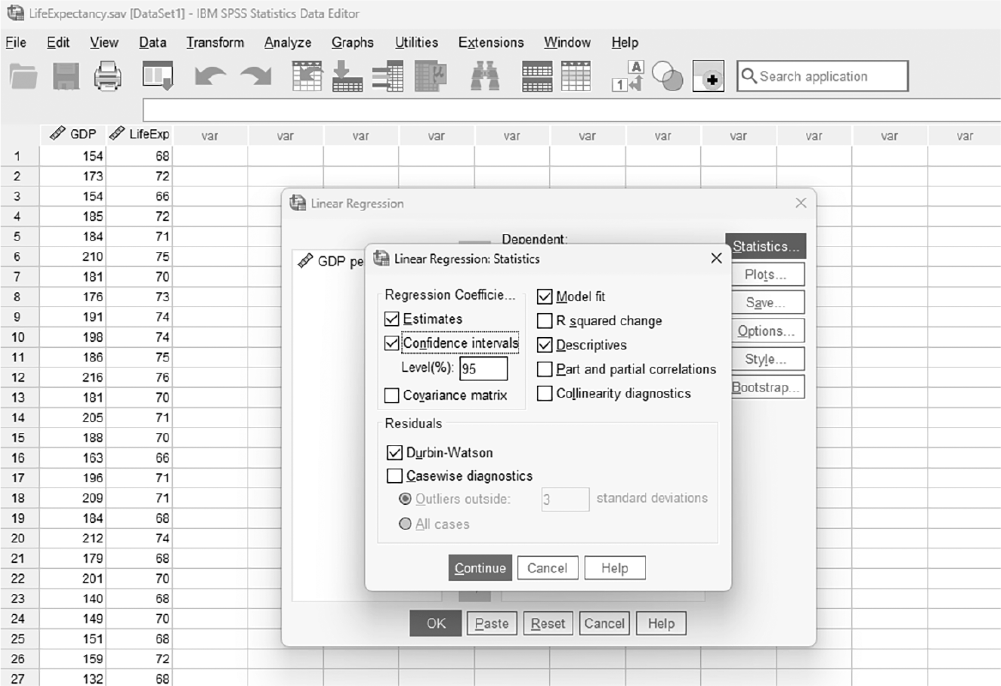
A screenshot displays the regression dialog box with a button labeled Statistics located on the right side below the variable selection panels.
Reprint Courtesy of International Business Machines Corporation, © International Business Machines Corporation. "IBM SPSS Statistics software ("SPSS")". IBM®, the IBM logo, ibm.com, and SPSS are trademarks or registered trademarks of International Business Machines Corporation.
Descriptives: Checking descriptive statistics will help us interpret the results, so let us also check this option.
Durbin-Watson: This option will compute Durbin-Watson statistics to check the assumption of independence. You would want this statistic to be around +2 to avoid the violation.
Confidence intervals: This option will compute the confidence interval estimate for the effect.
In the Linear Regression Plots dialogue box, as displayed in Figure 11-13, let us create a residual plot by moving "ZRESID" into Y and "ZPRED" into X to check the assumption of homogeneity of variance and linearity. You should not spot any pattern in this plot if you were to meet those assumptions. In addition, you should check the "Histogram" and "Normal Probability Plot" to check the normality assumption.
Linear Regression Plots dialogue box.
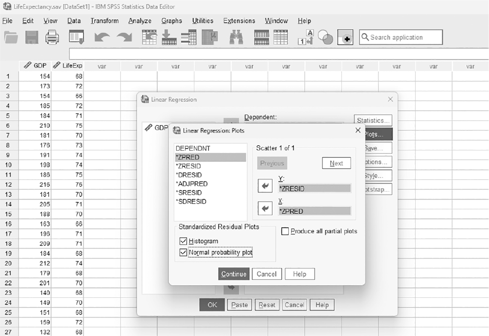
A screenshot displays a dialog box with options to select variables for the X and Y axes and checkboxes to include residual and predicted value plots.
Reprint Courtesy of International Business Machines Corporation, © International Business Machines Corporation. "IBM SPSS Statistics software ("SPSS")". IBM®, the IBM logo, ibm.com, and SPSS are trademarks or registered trademarks of International Business Machines Corporation.
Clicking "OK" will produce the requested regression analysis output. The example output is presented in Table 11-3.
Model Summary | |||||||
|---|---|---|---|---|---|---|---|
Model | R | R-Square | Adjusted R-Square | Std. Error of the Estimate | DurbinμWatson | ||
1 | .54a | .29 | .28 | 2.22 | 1.725 | ||
aPredictors: (Constant), GDP per capita | |||||||
ANOVAb | |||||||
Model | Sum of Squares | df | Mean Square | F | Sig. | ||
1 | Regression | 483.45 | 1 | 483.45 | 98.07 | .000a | |
Residual | 1,202.86 | 244 | 4.93 | ||||
Total | 1,686.31 | 245 | |||||
aPredictors: (Constant), GDP per capita bDependent variable: Life expectancy | |||||||
Coefficientsa | ||||||||
|---|---|---|---|---|---|---|---|---|
Unstandardized Coefficients | Standardized Coefficients | 95.0% Confidence Interval for B | ||||||
Model | B | SE | β | t | Sig. | Lower Bound | Upper Bound | |
1 | (Constant) | 60.84 | .97 | 62.85 | .000 | 58.933 | 62.747 | |
GDP per capita | .05 | .01 | .54 | 9.90 | .000 | .043 | .064 | |
aDependent variable: Life expectancy | ||||||||
You will note that we have generated the same results here as we did with Excel. The correlation coefficient between GDP per capita and life expectancy is .54, as previously calculated, and we find the value of R2 is .29.
Results in the ANOVA table indicate that this model is a good prediction model with results in the coefficients table indicating that GDP per capita is a good predictor variable of life expectancy.
Similar to the results from Excel, the values in Table 10-3 can be used to create a prediction line for the data. By plugging unstandardized coefficients (B) into a regression equation, y = a+ b× x, we obtain
Life expectancy = 60.84 + 0.05 × GDP per capita
This equation can then be used to predict life expectancy if we know the value of GDP per capita. For example, the value of life expectancy of a country with a GDP per capita of 199 will be
Life expectancy = 60.84 + 0.05 × GDP per capita = 60.84 + 0.05 × 199 ≈ 70.79
Reporting regression analysis results can be done in a table format that includes, at minimum, the unstandardized coefficients (B); standard error of unstandardized coefficients, SE (B); standardized coefficients (β); confidence interval for the unstandardized coefficients (B); and some overall statistics about the fitted model, such as R2. Reporting for our example is displayed in Table 11-4. Results indicate that GDP per capita is a significant predictor of life expectancy, with GDP per capita sharing 29% of the variability in life expectancy.
Multiple linear regression is an extension of simple linear regression, where two or more independent variables, continuous or categorical, are used jointly to predict a single dependent variable. For example, an investigator might use multiple regression to explore how factors like age, baseline health conditions, treatment type, and lifestyle (e.g., smoking status) together influence recovery time after a surgical procedure or to explore how variables like education level, socioeconomic status, health literacy, and support systems impact patient compliance, enabling nurses to develop targeted interventions that address barriers to adherence. Recall the equation for simple linear regression:
y = a+ bx+ε
Now that we have more than one variable to use for prediction, this equation is extended to
y = b0+ b1x1+ b2x2+ . . . + bnxn+ε
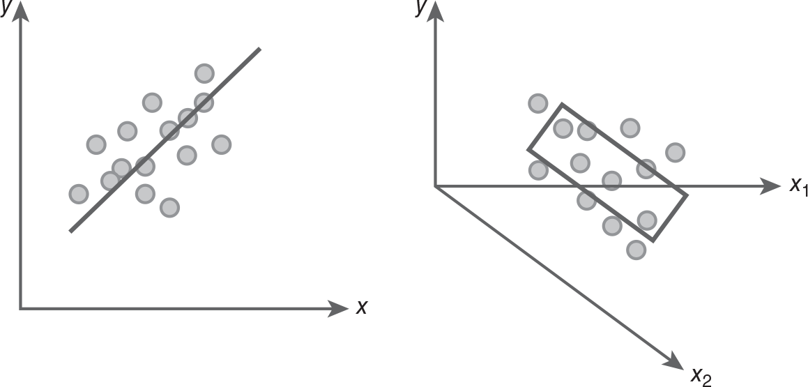
where y is the dependent variable, b0 is the y-intercept, b1 is the partial regression coefficient of the first independent variable (x1), b2 is the partial regression coefficient of the second independent variable (x2), bn is the partial regression coefficient of the nth independent variable (xn), and ε is the error. Note here that we call b1 through bn partial regression coefficients because each is not a solely unique contribution of corresponding independent variables. Rather, it is the additional amount contributed by an independent variable after the other independent variables went into the model and explained variability within the dependent variable. With this model, our goal is to find the best linear combination of independent variables that jointly predict a dependent variable. However, we are fitting a hyperplane on a three- or more-dimensional space rather than a linear line on a two-dimensional space because we have more than one independent variable for prediction. A visual explanation of the difference between simple linear regression and multiple linear regression is presented in Figure 11-14.
Difference between simple linear regression and multiple linear regression.
Two graphs show the difference between simple linear regression and multiple linear regression.
Graph on the left: The horizontal axis is the x variable, and the vertical axis is the y variable. There are plots above and below a diagonal line. Graph on the right: The horizontal axes has two variables, x 1 at 180 degrees and x 2 at minus 45 degrees, and the vertical axis is the y variable. There are plots above and below the x 1, and are enclosed by a rectangle.
In simple linear regression analysis, we were interested in the ability of a single independent variable to predict a single dependent variable. In investigations of humans and EBP, however, phenomena are rarely composed of only one independent variable affecting the dependent variable of interest. In most cases, we know that multiple independent variables are involved. Multiple linear regression becomes useful in examining the ability of two or more independent variables to predict one dependent variable.
To explain multiple linear regression, let us consider the following example data set, taken from Cengage Learning (2010). Click on "Systolic Blood Pressure Data" in the list in the center of the page to show the data file download options on the right. You can find this data, MLR.sav, in the Navigate course accessed via the code included with this text. There are three variables: systolic blood pressure (SBP), age in years, and weight in pounds. Our goal is to find the best linear combination of age in years and weight in pounds to predict SBP.
As always, the first step is to check whether the required assumptions are met, and we have an additional assumption of no multicollinearity beyond what we discussed earlier for simple linear regression. Multicollinearity exists when independent variables are highly correlated (over .85) with each other. Suppose a study is conducted to predict patient recovery time based on variables such as age, blood pressure, and cholesterol levels. If blood pressure and cholesterol levels are highly correlated, this could introduce multicollinearity into the model. As a result, it may be difficult to determine the distinct effect of each of these predictors on recovery time, leading to misleading conclusions. The final goal of multiple linear regressions is to find the best model of prediction with the lowest possible number of variables and maximum explanation about the data. We should test for multicollinearity and remove one of the variables if it is present.
All inferential statistics should begin with descriptive statistics because these help us understand the data, especially in terms of accuracy. Descriptive statistics can be requested as an option in the regression window, and this should help you understand the results of regression analysis.
Once we find a hyperplane that fits the data well, we can examine how good the fitted hyperplane is for estimation or prediction by evaluating the goodness of fit. We can use R2 to evaluate goodness of fit as in simple linear regression. There is no difference in the definition of R-square in multiple linear regression; it is still the ratio of the percentage of variability explained by the fitted model (line) over the total variability in the data. However, in multiple regression, R2 is computed differently from the procedure in simple linear regression. Then, it was a square of the correlation coefficient between the two variables, but R2 in multiple linear regressions is more than a simple square of the correlation coefficient. We have more independent variables to consider, so they should be considered jointly. Because of the complexity of computation, calculating R2 in multiple linear regressions will not be discussed here. However, the interpretation is done in the same manner as before; the higher the R2, the better the model and the greater the prediction accuracy. The ANOVA table will also be used to check the overall fit of the model, and the model is said to be good when the results indicate strong evidence against the null with a small p-value to rule out chance.
This part of the output will inform you whether the independent variables are useful predictors of a dependent variable, and again, there is a relationship between the overall goodness of fit and the goodness of each individual predictor variable. The model will contain good predictability when an independent variable is useful for prediction (i.e., it is a good variable to use for predicting the value of a dependent variable). Both Excel and SPSS will test the goodness of each individual independent variable using a t-test, and hypotheses for these t-tests are:
H0: βi = 0 or independent variable is not useful for prediction
Ha: βi ≠ 0 or independent variable is useful for prediction
The independent variables are said to be good predictors when the results indicate strong evidence against the null with a small p-value to rule out chance and not a good predictor when the results do not find evidence against the null with a large p-value.
Our goal in multiple linear regression is to find the best prediction model with the lowest possible number of independent variables (i.e., a simpler model is generally preferred over a more complex one if both models provide similar predictive power). Having more independent variables as predictors in a model does not necessarily mean that it is the best model; it may contain nonsignificant independent variables, which do not add much predictive strength and, therefore, are better left out of the model because they will only complicate the model without adding predictive strength. There are three commonly discussed model selection proceduresenter, hierarchical, and stepwiseand we will cover each one.
The enter method is the default method in regression analysis, and it forces all the independent variables into the regression model at the same time. Then, all parameter estimates are computed and tested for their goodness in predicting the dependent variable of interest. Because they are forced to enter the model all at once, no modification of the model at the initial step is allowed.
In the hierarchical method, the researcher can determine different blocks of independent variables based on the importance or interest in particular variables. A common approach is to begin by adding only demographic variables in the first block, and then add independent variables of interest to check if these new independent variables add more predictability to what has been explained by demographic variables. As this is a little beyond the scope of this text, we will limit our discussion here.
Stepwise methods are used in regression analysis where variables are entered into or removed from the model based on predetermined statistical criteria. Note that these procedures still use an arbitrary threshold such as .05 or .10, given the way they were designed (e.g., the default criteria for entry is p< .05, and the one for removal is p > .10). There are three types of stepwise methods: forward selection, backward selection, and stepwise selection. In forward selection, we begin with an empty model with only a constant (i.e., y-intercept). Then, independent variables are added to the model based on their statistical importance, with the most strongly related independent variable (i.e., one with the smallest p-value less than .05) entered first, followed by the next most strongly related, and so on. This process continues until the remaining variables do not have strong evidence against the null (i.e., associated p-values are larger than .05, say). One thing to note is that added variables will never leave the model once added. The second type of stepwise regression is backward selection; this method begins with a full model, just like enter methods of regression. Next, it will find the least related independent variable upon preset statistical criteria (i.e., one with the largest p-value greater than .10) and take it out of the model first. It will then find the next least related independent variable and delete it from the model, with this process continuing until there are no more independent variables to delete from the model. One thing to note is that deleted variables from the model will never get back into the model.
The last method, stepwise selection, combines the previous two. It begins with an empty model and finds the most strongly related independent variable to add it to the model, like the forward selection method. It will then find the next most strongly related independent variable and add it to the model. This is where this method begins to differ from the forward selection method. In the next step, you will reexamine the two previously entered independent variables to identify if those two variables remain useful for prediction. Because adding or deleting a variable can change the model's goodness of fit, it is important to check for changes in the existing variables. You will continue to find the next strongly related independent variable based on predetermined statistical criteria if the two variables remain strongly related, but the variable will be eliminated from the model if the addition of the second independent variable somehow makes the first added independent variable not strongly related. Unlike the forward and backward regression, a variable may be added or deleted from the model if adding other variables changes its goodness for the prediction. The process continues until no useful variable for prediction is left outside of the model.
All stepwise methods rely on the investigator's statistical criteria, and the software makes the decisions regarding the best prediction model. Therefore, it is possible that the fitted model created by this method may not be the best model for the data. In other words, a variable will not be included in the model because it does not meet the statistical criteria in a given data, even if it is theoretically important.
So, the legitimate question is, which method do I use? You should consider the enter method as a rough examination procedure of the data, as the model built by forcing everything to be entered into the model simultaneously will probably not be the best model. Because the goal is to find the best prediction model with the fewest predictor variables, stepwise methods should be considered when exploring data without preconceived ideas. If you are testing a theory or using literature to build the best prediction model, hierarchical regression may be the choice. However, this method is only recommended when you have substantial knowledge about the variables and a firm foundation about what to control in the first block and what to test for significance in later blocks.
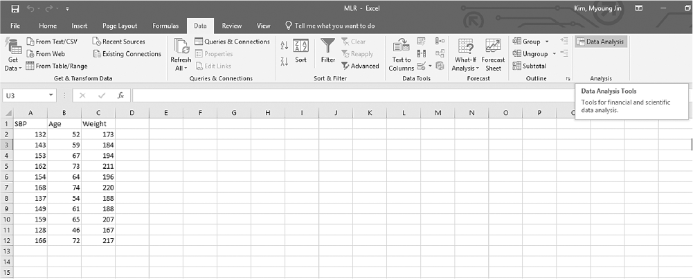
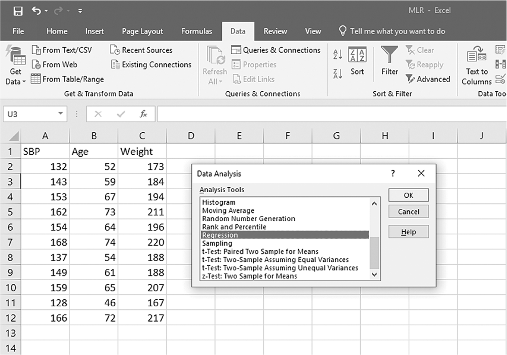
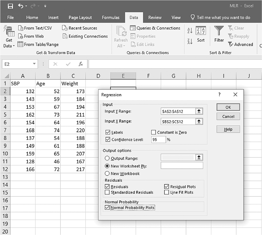
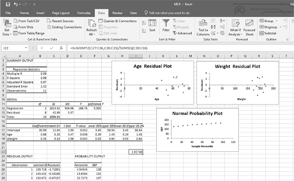
Now, let us go back to our example of SBP with age and weight as predictors. To conduct multiple linear regression analysis in Excel, you will open MLR.xlsx and go to Data > Data Analysis, as presented in Figure 11-15. In the Data Analysis window, choose "Regression" and then click "OK" (Figure 11-16). In the Linear Regression dialogue box, you will provide A1:A12 as Input Y Range and B2:C12 as Input X Range with Labels, Confidence Level, Residuals, Residual Plots, and Normal Probability Plots selected (Figure 11-17). Clicking "OK" will then produce the output of requested regression analysis. The example output is presented in Figure 11-18; note that the value in cell I22 is the Durbin-Watson statistic for this example, calculated with the aforementioned formula of "=SUMXMY2(C27:C36,C26:C35) /SUMSQ(C26:C36)" as computed residuals are presented in C26:C36.
Finding Data Analysis ToolPak in Excel.
An Excel screenshot shows the Data Analysis ToolPak in the Analysis group under Data menu in the menu bar. The worksheet contains column headings, S B P, Age, and Weight, with numerical data displayed under each column.
Courtesy of Microsoft Excel © Microsoft 2020.
Selecting Regression within the Data Analysis ToolPak list in Excel.
An Excel screenshot shows a dialog box, Data Analysis, with the option Regression selected, from a list. The worksheet contains columns, S B P, Age, and Weight, with numerical data. The buttons O k, Cancel, and Help are on right of the dialog box.
Courtesy of Microsoft Excel © Microsoft 2020.
Defining data ranges and selecting options for multiple linear regression in Excel.
A screenshot shows the selection of values and inputting options in a dialog box for regression in an Excel worksheet. The worksheet contains columns, S B P, Age, and Weight, with numerical data.
The Excel sheet displays the heading, S B P, in row 1 of Column A, with three-digit numbers displayed in rows 2 through row 12. The heading, Age, is displayed in row 1 of Column B and two-digit numbers along rows 2 through 12. The heading, Weight, is displayed in row 1 of Column C and three-digit numbers along rows 2 through 12. A Regression dialog box is open in the worksheet, where A 2 : A 12 is provided in the Input Y Range entry box; B 2 : C 12 is provided in the Input X Range entry box; the check box of Labels and Confidence Level are selected with the value in Confidence Level entered as 95 percent; the checkbox of the field Constant is zero is unchecked. The output options, output range, new worksheet, and new workbook, along with checkboxes, are displayed. In the textbox, Residuals, the fields, Residuals, Residual Plots are checked, and the fields, Standardized residuals and line fit plots are unchecked. In the textbox, Normal probability, the field Normal probability plots is checked. The buttons O k, Cancel, and Help are displayed on the top right corner of the dialog box, with O k selected.
Courtesy of Microsoft Excel © Microsoft 2020.
Example output for multiple linear regression in Excel.
An Excel screenshot shows an output for multiple linear regression, based on the analysis of variance. The summary output comprises five tables and three graphs.
The heading, Summary output, is displayed on A 1. The first table has two columns, and the column heading, Regression Statistics, spans across A 3 and B 3. The data from row 4 through row 8 are as follows. Row 4: Multiple R, 0.99; Row 5: R Square, 0.98; Row 6: Adjusted R Square, 0.97; Row 7: Standard Error, 2.32; Row 8: Observations, 11. The second table is ANOVA, and is displayed on cell, A 10. There are six columns, no data, d f, S S, M S, F, and Significance F. The data from row 12 through row 14 are as follows. Row 12: Regression, 2, 1813.92, 906.96. 168.76, 0.000. Row 13: Residual, 8, 42.99, 5.37, no data, no data. Row 14: Total, 10, 1856.91, no data, no data, no data. The third table has nine columns: no data, Coefficients, Standard Error, t Stat, p-value, Lower 95 percent, Upper 95 percent, Lower 95.0 percent, and Upper 95.0 percent. The data on rows 17 through 19 are as follows. Row 17: Intercept, 30.99, 11.94, 2.59, 0.032, 3.45, 58.54, 3.45, 58.54. Row 18: Age, 0.86, 0.25, 3.47, 0.008, 0.29, 1.43, 0.29, 1.43. Row 19: Weight, 0.33, 0.13, 2.56, 0.034, 0.03, 0.64, 0.03, 0.64. The fourth table is Residual output, and spans across A 23 through C 23. The three column headings on row 24 are: Observation, Predicted, and Residuals. The data from the table on row 25 through row 27 are as follows. Row 25: 1, 133.718, minus 1.71831. Row 26: 2, 143.432, minus 0.43166. Row 27: 3, 153.672, minus 0.67157. The fifth table is Probability output, and spans across the cells, E 23 and F 23. The two columns headings on E 24 and E 25 are Percentile and S B P, respectively. The data from the table on row 25 through row 27 are as follows. Row 25: 4.54545, 128. Row 26: 15.6364, 132. Row 27: 22.7273, 137. The cell H 21 displays the value, 1.92736, from the formula, equal to, Sum X M Y 2, of, C 26 to C 36, C 25 to C 35, all over, Sum S Q of C 25 to C 36. Graph 1154.25 Age residual plot: The horizontal axis is labeled Age, and ranges from 0 to 80, in increments of 20. The vertical axis is labeled Residuals, and ranges from minus 4 to 4, in increments of 2. There are clusters of plots between x = 45 and x = 75, and between y = minus 3 and y = 3. Graph 2Weight residual plot: The horizontal axis is labeled, Weight, and ranges from 0 to 250, in increments of 50. The vertical axis is labeled Residuals, and ranges from minus 4 to 4, in increments of 2. There are plots between x = 160 and x = 225, and between y = minus 3 and y = 3. Graph 3Normal probability plot: The horizontal axis is labeled, Sample percentile, and ranges from 0 to 120, in increments of 20. The vertical axis is labeled S B P and ranges from 0 to 200, in increments of 50. The approximate data is as follows. There are plots at the points, (5, 125), (10, 125), (22, 130), (30, 142), (40, 147), (50, 148), (60, 150), (70, 150), (79, 152), (85, 160), (98, 160).
Courtesy of Microsoft Excel © Microsoft 2020.
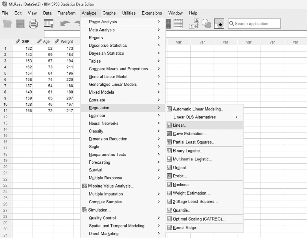
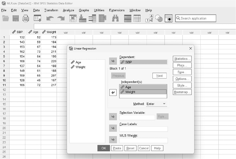
To conduct multiple linear regression analysis in SPSS, you will open MLR.sav and go to Analyze > Regression > Linear, as displayed in Figure 11-19. In the Linear Regression dialogue box, you will move SBP into "Dependent" and move age and weight into "Independent(s)" by clicking the corresponding arrow buttons in the middle, as displayed in Figure 11-20. For this method, let us select "Forward" because we looked at "Enter" in the simple linear regression example.
Selecting multiple linear regression in SPSS.
A screenshot displays a dialog box listing different regression types, with the multiple linear regression option highlighted.
Reprint Courtesy of International Business Machines Corporation, © International Business Machines Corporation. "IBM SPSS Statistics software ("SPSS")". IBM®, the IBM logo, ibm.com, and SPSS are trademarks or registered trademarks of International Business Machines Corporation.
Defining variables in the Linear Regression box.
A screenshot displays a dialog box where one variable is placed in the dependent field and several variables are listed in the independent field.
Reprint Courtesy of International Business Machines Corporation, © International Business Machines Corporation. "IBM SPSS Statistics software ("SPSS")". IBM®, the IBM logo, ibm.com, and SPSS are trademarks or registered trademarks of International Business Machines Corporation.
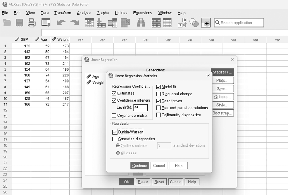
We will select options that were useful in interpreting simple linear regression outputs within "Statistics," "Plots," and "Options." Under the "Statistics" button, as displayed in Figure 11-21, let us check additional checkboxes for the following:
Statistics button in the Linear Regression box.
A screenshot displays the Linear Regression dialog box with a button labeled Statistics located beside the variable selection panels.
Reprint Courtesy of International Business Machines Corporation, © International Business Machines Corporation. "IBM SPSS Statistics software ("SPSS")". IBM®, the IBM logo, ibm.com, and SPSS are trademarks or registered trademarks of International Business Machines Corporation.
R-squared change: This option will examine the changes in R2 with different stages of modeling for adding and deleting a variable, so it will be helpful to address how much predictability each added variable adds to the model.
Descriptives: Checking descriptive statistics will help us interpret the results, so let us also check this option.
Durbin-Watson: This option will compute Durbin-Watson statistics to check the assumption of independence. You would want this statistic to be around +2 to avoid the violation.
Confidence intervals: This option will compute a confidence interval estimate for the effect.
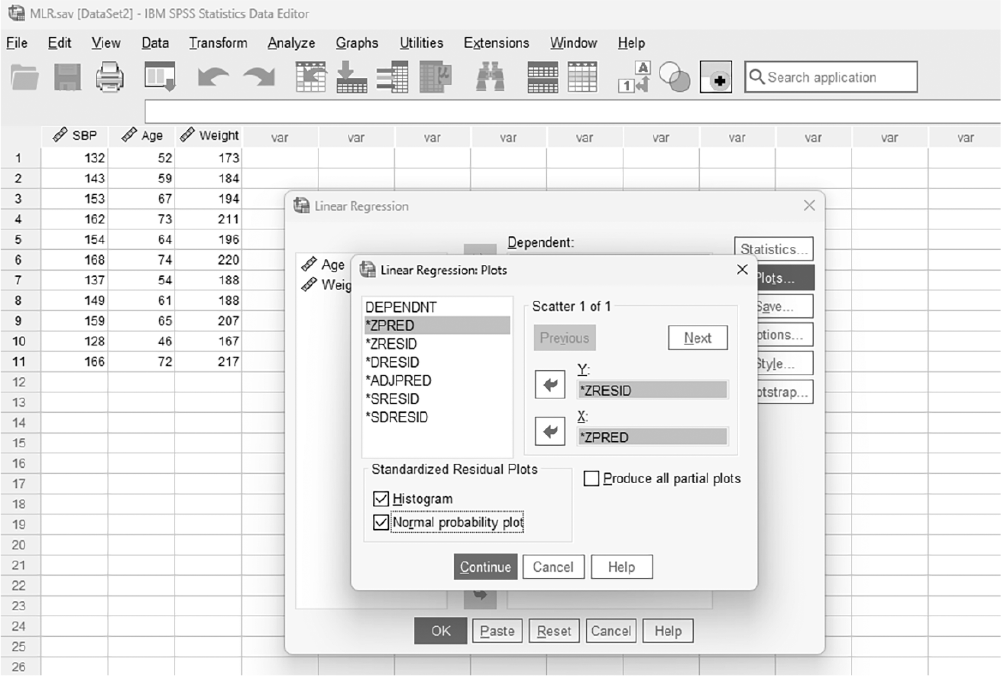
In the Linear Regression Plots dialogue box, as presented in Figure 11-22, let us create a residual plot by moving "ZRESID" into Y and "ZPRED" into X to check the assumption of homogeneity of variance and linearity. You will also check "Histogram" and "Normal Probability Plot" to check the assumption of normality.
Linear Regression Plots dialogue box.
A screenshot displays a dialog box containing fields to assign variables for the X and Y axes, along with options for residual and predicted value plots.
Reprint Courtesy of International Business Machines Corporation, © International Business Machines Corporation. "IBM SPSS Statistics software ("SPSS")". IBM®, the IBM logo, ibm.com, and SPSS are trademarks or registered trademarks of International Business Machines Corporation.
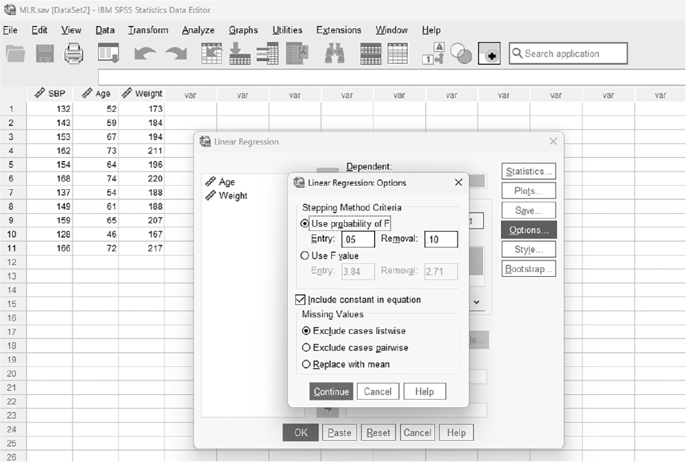
In the Linear Regression Options dialogue box, as displayed in Figure 11-23, you can play with probability criteria of entry and removal for stepwise selection methods. The default is .05 for entry and .10 for removal, but you can make it more stringent or liberal.
Linear Regression Options dialogue box.
A screenshot displays a dialog box showing checkboxes for additional settings such as handling missing values and selecting confidence intervals.
Reprint Courtesy of International Business Machines Corporation, © International Business Machines Corporation. "IBM SPSS Statistics software ("SPSS")". IBM®, the IBM logo, ibm.com, and SPSS are trademarks or registered trademarks of International Business Machines Corporation.
Clicking "OK" will then produce the output of requested regression analysis. An example output is given in Table 11-5.
Descriptive Statistics | |||
Mean | Std. Deviation | N | |
SBP | 150.09 | 13.63 | 11 |
Age | 62.45 | 9.11 | 11 |
Weight | 195.00 | 17.32 | 11 |
Correlations | ||||
|---|---|---|---|---|
SBP | Age | Weight | ||
Pearson correlation | SBP | 1.00 | .98 | .97 |
Age | .98 | 1.00 | .95 | |
Weight | .97 | .95 | 1.00 | |
Sig. (1-tailed) | SBP | .00 | .00 | |
Age | .00 | .00 | ||
Weight | .00 | .00 | ||
N | SBP | 11 | 11 | 11 |
Age | 11 | 11 | 11 | |
Weight | 11 | 11 | 11 | |
Variables Entered/Removeda | |||
Model | Variables Entered | Variables Removed | Method |
1 | Age | Forward (Criterion: Probability-of-F-to-enter ≤ .050) | |
2 | Weight | Forward (Criterion: Probability-of-F-to-enter ≤ .050) | |
aDependent Variable: SBP | |||
Model Summaryc | ||||||
|---|---|---|---|---|---|---|
Model | R | R-Square | Adjusted R-Square | Std. Error of the Estimate | Change Statistics | |
R-Square Change | F Change | |||||
1 | .98a | .96 | .95 | 2.95 | .96 | 204.48 |
2 | .99b | .98 | .97 | 2.31 | .02 | 6.57 |
Model Summaryc | ||||
|---|---|---|---|---|
Model | Change Statistics | |||
df1 | df2 | Sig. F Change | DurbinμWatson | |
1 | 1 | 9 | .000 | |
2 | 1 | 8 | .034 | 1.93 |
aPredictors: (Constant), Age bPredictors: (Constant), Age, Weight cDependent Variable: SBP | ||||
ANOVAa | ||||||
|---|---|---|---|---|---|---|
Model | Sum of Squares | df | Mean Square | F | Sig. | |
1 | Regression | 1778.62 | 1 | 1778.62 | 204.48 | .000b |
Residual | 78.29 | 9 | 8.70 | |||
Total | 1856.91 | 10 | ||||
2 | Regression | 1813.92 | 2 | 906.96 | 168.77 | .000c |
Residual | 42.99 | 8 | 5.37 | |||
Total | 1856.91 | 10 | ||||
aDependent Variable: SBP bPredictors: (Constant), Age cPredictors: (Constant), Age, Weight | ||||||
Coefficientsa | ||||||||
|---|---|---|---|---|---|---|---|---|
Unstandardized Coefficients | Standardized Coefficients | 95.0% Confidence Interval for B | ||||||
Model | B | Std. Error | β | t | Sig. | Lower Bound | Upper Bound | |
1 | (Constant) | 58.71 | 6.45 | 9.10 | .000 | 44.109 | 73.302 | |
Age | 1.46 | .10 | .98 | 14.30 | .000 | 1.232 | 1.695 | |
2 | (Constant) | 30.99 | 11.94 | 2.60 | .032 | 3.452 | 58.537 | |
Age | .86 | .25 | .58 | 3.47 | .008 | .289 | 1.434 | |
Weight | .34 | .13 | .43 | 2.56 | .034 | .034 | .636 | |
aDependent variable: SBP | ||||||||
Reporting the results of multiple linear regressions is an extension of those in simple linear regression. It can be done in a table format and should include, at minimum, the unstandardized coefficients (B), the standard error of unstandardized coefficientsSE (B), standardized coefficients (β), the confidence interval for the unstandardized coefficients (B), and some overall statistics about the fitted model such as R2. You will have additional rows representing additional variables compared to simple linear regression. An example of reporting for our scenario, presented in Table 11-6, is for the forward method. Results indicate that both age and weight are meaningful predictor variables of SBP, sharing 98% of the variability in SBP. However, age is the more important variable for prediction. By itself, age explains 95% of the total variability.
95% Confidence Interval | ||||||
|---|---|---|---|---|---|---|
B | SE (B) | β | p | Lower | Upper | |
Step 1 | ||||||
Constant | 58.71 | 6.45 | ||||
Age in years | 1.46 | .10 | .98 | .000 | 1.23 | 1.70 |
Step 2 | ||||||
Constant | 30.99 | 11.94 | ||||
Age in years | .86 | .25 | .58 | .008 | .29 | 1.43 |
Weight in pounds | .34 | .13 | .43 | .034 | .03 | .64 |
Note: R2 = .95 for step 1, ΔR2 = .03 for step 2 (p< .05) | ||||||
Logistic regression is a multiple linear regression where independent variables of either a continuous or categorical nature are used to predict a categorical dependent variable. It can be binary logistic regression if a dependent variable is dichotomous with only two outcomes, such as "disease vs. no disease" or "postoperative infection vs. no postoperative infection," and multinomial logistic regression if a dependent variable is categorical with more than two outcomes such as "mild vs. moderate vs. severe pain" or "low vs. moderate vs. high medication adherence." Multinomial logistic regression is beyond the scope of this text, so we will limit our discussion to binary logistic regression.
Logistic regression can predict group membership based on information collected from different independent variables. For example, logistic regression could be used to predict whether a patient will fail or not fail a surgery from knowledge about a patient's age, blood pressure, weight, and the number of days in the hospital. Or, using our previous example with per capita gross domestic product, we could predict life expectancywhether long or short.
To better understand logistic regression, let us consider the data, called LR.sav. There are three variables: age in years, weight in pounds, and surgery outcome. Our goal is to create a good prediction model for a surgery outcome using age and weight.
As always, the first step is to check whether the required assumptions are met. In fact, logistic regression has a different set of assumptions from multiple linear regression because the dependent variable is not continuous. Some of the assumptions to be met are:
Discrete dependent variable: The dependent variable should be discrete or measured at the nominal level so that we predict group membership from independent variables.
Linearity between the logit of the dependent variable and continuous independent variables: As previously discussed, linearity assumptions for linear regression will be violated with logistic regression because the dependent variable is not continuous. Therefore, we take the logit of the dependent variable and examine its relationship with continuous independent variables to check if it is linear.
Independence: The values of dependent variables are assumed to be independent, meaning that none of the values are from the same person.
No multicollinearity: As in multiple linear regression, having variables measuring the same thing can make the model complicated with not much gain in predictability. Therefore, we should examine for multicollinearity and remove one of the variables if it exists.
As with multiple linear regressions, you can choose between the enter method and the stepwise methods.
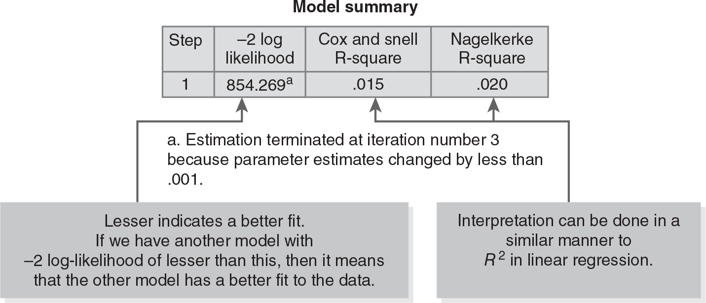
Once the logistic model has been fitted to the data, we should examine how good the fitted model is for predicting group memberships. Logistic regression analysis will output −2 log-likelihood, Cox & Snell R2, and Nagelkerke R2 for the model summary. The statistic, −2 log-likelihood, represents a more desirable model when it is lower; the model with independent variables should have a lower −2 log-likelihood as compared with a constant-only model. Cox & Snell R2 and Nagelkerke R2 are indications of how well the model predicts group membership, and a higher figure represents a better model (Figure 11-24).
Example model summary output.
A flow diagram illustrates model summary.
There is a table with four variables and their corresponding data. The data is as follows. Step: 1, minus 2 log likelihood: 854.269, with estimation terminated at iteration number 3 because parameter estimates changed by less than 0.001; Cox and Snell R-square: 0.015; Nagelkerke R-Square: 0.020. A textbox with text, Lesser indicates a better fit; if we have another model with minus 2 log-likelihood of lesser than this, then it means that the other model has a better fit to the data, points to the value 854.269. A textbox with text, Interpretation can be done in a similar manner to R square in linear regression, points to the values, 0.015 and 0.020.
This part of the output demonstrates the goodness of independent variables as predictors, but the Wald test is used instead of a t-test to test the goodness of those independent variables. Interpretation should be the same as for the t-test. Under the following hypotheses
H0: βi = 0 or independent variable is not useful for prediction
Ha: βi ≠ 0 or independent variable is useful for prediction
the independent variable is said to be a good predictor when the associated p-value with a Wald statistic of the independent variable is small, indicating that the observed effect is substantial enough to rule out chance, and not a good predictor when the associated p-value with a Wald statistic of the independent variable is large, indicating no evidence for an effect.
The Odds ratio is another important part of logistic regression outputs that tells us how much of a change in odds we expect in a dependent variable following a unit change in an independent variable. The odds ratio can be defined as the ratio of odds of an event occurring for two groups. When the odds ratio is equal to 1, it means that the odds of an event occurring are the same for both groups. For our example, the odds of a patient dying are exactly the same for males and females. When the odds ratio is greater than 1, it means that the odds of an event occurring are greater for the male group (coded as 1) than for the female group (coded as 0). For instance, if OR = 2, the odds of a patient dying are twice as high for the male group than for the female group. When the odds ratio is less than 1, it means that the odds of an event occurring are greater for the female group than for the male group. For instance, if OR = 0.5, the odds of a patient dying are halved for the male group than for the female group. One thing to note about the odds ratio here is that corresponding confidence intervals should also be reported along with the odds ratio.
In SPSS, you can request predicted values of probability for classification, and it can help you understand how the classification is done. A classification table can also be obtained in SPSS, and this table will depict how much correct classification we obtain with the currently fitted model. The higher the classification percentage is, the better the model is.
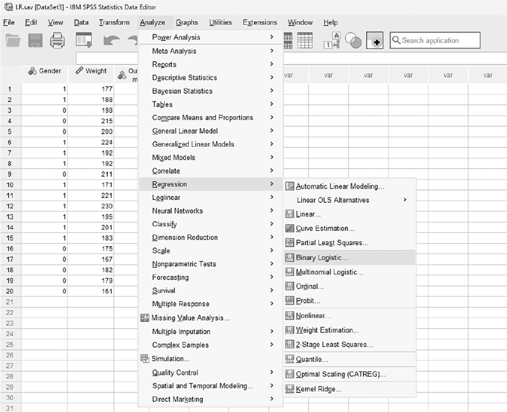
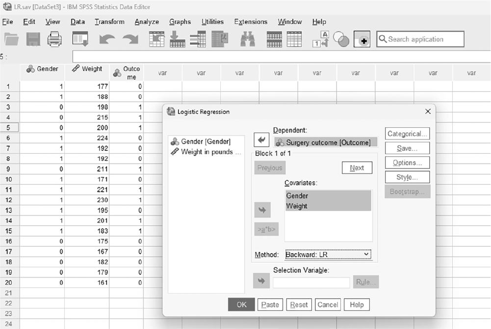
To conduct logistic regression in SPSS, you will open LR.sav and go to Analyze > Regression > Binary Logistic, as presented in Figure 11-25. In the Logistic Regression dialog box, you will select the variables you are interested in fitting a prediction line between and move the independent variables into "Independent(s)" and a dependent variable into "Dependent" by clicking the corresponding arrow buttons in the middle, as displayed in Figure 11-26.
Selecting logistic regression in SPSS.
A screenshot displays a dialog box listing available regression procedures, with the logistic regression option highlighted.
Reprint Courtesy of International Business Machines Corporation, © International Business Machines Corporation. "IBM SPSS Statistics software ("SPSS")". IBM®, the IBM logo, ibm.com, and SPSS are trademarks or registered trademarks of International Business Machines Corporation.
Defining variables in SPSS.
A screenshot displays a dialog box where one variable is placed in the dependent field and several variables are moved into the covariates field for analysis.
Reprint Courtesy of International Business Machines Corporation, © International Business Machines Corporation. "IBM SPSS Statistics software ("SPSS")". IBM®, the IBM logo, ibm.com, and SPSS are trademarks or registered trademarks of International Business Machines Corporation.
We will select "Backward: LR" this time because we have discussed both the "Enter" and "Forward" procedures earlier in this chapter.
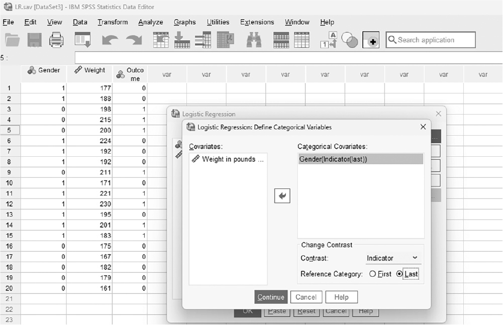
There are some options that are useful in interpreting logistic regression outputs, and they are "Categorical," "Save," and "Options." In the "Categorical" button, as appearing in Figure 11-27, we define any categorical independent variables, if there are any. Gender is a categorical variable in our data, so we will select Gender and move it over to the "Categorical Covariates" window by clicking the arrow in the middle.
Categorical button in the Logistic Regression dialogue box.
A screenshot displays the Logistic Regression dialog box with a button labeled Categorical positioned beside the variable selection panels.
Reprint Courtesy of International Business Machines Corporation, © International Business Machines Corporation. "IBM SPSS Statistics software ("SPSS")". IBM®, the IBM logo, ibm.com, and SPSS are trademarks or registered trademarks of International Business Machines Corporation.
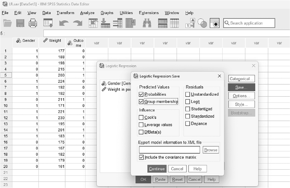
Under the "Save" button, as displayed in Figure 11-28, you can request predicted values probability and group membership. Let us check these two boxes: that SPSS saves predicted probability values for each case as well as predicted group membership based on predicted probability, and that it produces a classification table that we can check for correct percentage of classification.
Save button in the Logistic Regression dialogue box.
A screenshot displays the Logistic Regression dialog box with a button labeled Save located along the right side beneath other function buttons.
Reprint Courtesy of International Business Machines Corporation, © International Business Machines Corporation. "IBM SPSS Statistics software ("SPSS")". IBM®, the IBM logo, ibm.com, and SPSS are trademarks or registered trademarks of International Business Machines Corporation.
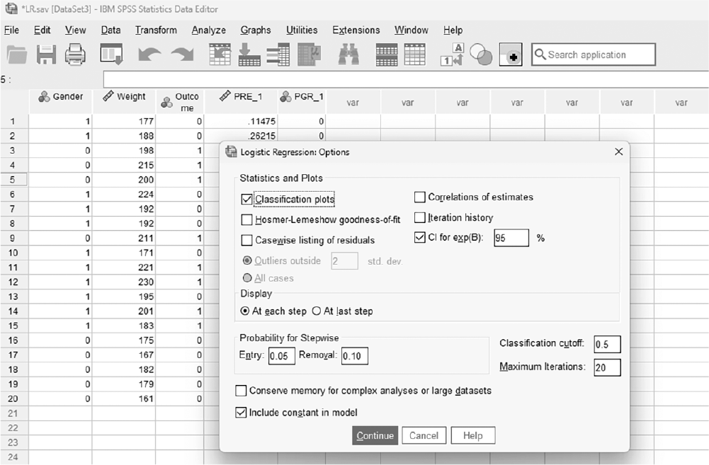
In the "Options" button, as displayed in Figure 11-29, you can request additional useful options such as classification plots and CI for exp (β). Classification plots will display the predicted probability of the observed group, and you will want two different symbols far from each other, ideally one on the far-left end and the other on the far right end. CI for exp (b) will produce odds ratios and corresponding CI for each independent variable. Clicking "OK" will produce the requested regression analysis output. An example output is exhibited in Table 11-7.
Options button in the Logistic Regression dialogue box.
A screenshot displays the Logistic Regression dialog box with a button labeled Options placed below the Save button on the right side of the window.
Reprint Courtesy of International Business Machines Corporation, © International Business Machines Corporation. "IBM SPSS Statistics software ("SPSS")". IBM®, the IBM logo, ibm.com, and SPSS are trademarks or registered trademarks of International Business Machines Corporation.
Variables in the Equation | ||||||||||||||||||||||||
95% CI for Exp (B) | ||||||||||||||||||||||||
B | SE | Wald | df | Sig. | Exp (B) | Lower | Upper | |||||||||||||||||
Step 1a | Gender(1) | 1.45 | 1.30 | 1.24 | 1 | .266 | 4.26 | .33 | 54.93 | |||||||||||||||
Weight | .10 | .04 | 5.91 | 1 | .015 | 1.11 | 1.02 | 1.20 | ||||||||||||||||
Constant | μ20.50 | 8.25 | 6.18 | 1 | .013 | .00 | ||||||||||||||||||
Step 2a | Weight | .092 | .04 | 5.04 | 1 | .025 | 1.10 | 1.01 | 1.19 | |||||||||||||||
Constant | μ18.27 | 8.00 | 5.21 | 1 | .022 | .00 | ||||||||||||||||||
Model If Term Removed | ||||||||||||||||||||||||
Variable | Model Log-Likelihood | Change in μ2-Log Likelihood | df | Sig. of the Change | ||||||||||||||||||||
Step 1 | Gender | μ9.14 | 1.37 | 1 | .242 | |||||||||||||||||||
Weight | μ13.39 | 9.88 | 1 | .002 | ||||||||||||||||||||
Step 2 | Weight | μ13.46 | 8.64 | 1 | .003 | |||||||||||||||||||
Variables Not in the Equation | ||||||||||||||||||||||||
Score | df | Sig. | ||||||||||||||||||||||
Step 2a | Variables | Gender(1) | 1.33 | 1 | .250 | |||||||||||||||||||
Overall statistics | 1.33 | 1 | .250 | |||||||||||||||||||||
aVariable(s) removed on step 2: Gender | ||||||||||||||||||||||||
Classification Tablea | ||||||||||||||||||||||||
Predicted | ||||||||||||||||||||||||
Surgery Outcome | Percentage Correct | |||||||||||||||||||||||
Observed | Survived | Dead | ||||||||||||||||||||||
Step 1 | Surgery | Survived | 11 | 1 | 91.7 | |||||||||||||||||||
Outcome | Dead | 2 | 6 | 75.0 | ||||||||||||||||||||
Overall Percentage | 85.0 | |||||||||||||||||||||||
Step 2 | Surgery | Survived | 11 | 1 | 91.7 | |||||||||||||||||||
Outcome | Dead | 2 | 6 | 75.0 | ||||||||||||||||||||
Overall Percentage | 85.0 | |||||||||||||||||||||||
aThe cut value is .500. Reprint Courtesy of International Business Machines Corporation, © International Business Machines Corporation. "IBM SPSS Statistics software ("SPSS")". IBM®, the IBM logo, ibm.com, and SPSS are trademarks or registered trademarks of International Business Machines Corporation. | ||||||||||||||||||||||||
Similar to other types of regression, logistic regression results are usually presented in a table and should include, at a minimum, coefficient B, standard error of B, odds ratios, associated confidence interval, and some overall statistics about the fitted model, such as R2. Example reporting for logistic regression results is presented in Table 11-8. Our example results indicate that only weight is a useful predictor variable of surgery outcome, and the model with only weight included produces a correct classification of 85%. Odds ratio for weight tells us that the probability of a patient failing surgery increases as their weight increases because the corresponding odds ratio is greater than 1.
95% CI for Odds Ratio | |||||
B (SE) | p | Lower | Odds Ratio | Upper | |
Step 1 | |||||
Gender | 1.45 (1.30) | .266 | .33 | 4.26 | 54.93 |
Weight | .10 (.04) | .015 | 1.02 | 1.11 | 1.20 |
Constant | μ20.50 (8.25) | .013 | .00 | ||
Step 2 | |||||
Weight | .92 (.04) | .025 | 1.10 | 2.00 | 1.19 |
Constant | μ18.27 (8.00) | .022 | .00 | ||
Note: R2 = .35 (Cox & Snell), .47 (Nagelkerke), Model χ²(1) = 8.64, p = .000 | |||||
Regression analysis builds on results from correlation analysis to make predictions about the variance on the dependent variable accounted for by independent variables. Simple linear regression is used when we need to predict a single continuous dependent variable using a single continuous independent variable. In order to do simple linear regression, you will first draw a scatterplot of the data and visually check the strength of the linear relationship between variables. Second, you will compute the correlation coefficients as a numerical verification of what you saw in a scatterplot if the relationship in the plot appears relatively strong. Finally, you will try to fit the best line of prediction through regression analysis if the correlation coefficient still comes out to be useful.
Multiple linear regression is a natural extension of simple linear regression where more than one independent variable is used to predict a continuous dependent variable. Prediction models can be fitted using one of three methods: enter, hierarchical, and stepwise. The decision of which to use should be made based on whether you want to explore the data or to test a theory from the literature. The best prediction model is often the one that has the fewest predictor variables, but still explains a substantial variability in a dependent variable.
Logistic regression is essentially multiple linear regression with a discrete or nominal level dependent variable; therefore, the goal is to predict group membership, not the value of the dependent variable. Similar model selection methods as with multiple linear regressions can be used in logistic regression, and the goal is to find the best prediction model with the fewest predictor variables.
Discuss the importance of prediction in research and clinical practice.
Let us say that you want to know if the number of days hospitalized is a significant predictor of accidental falls among patients. How would you set up a simple linear regression or logistic regression to test this hypothesis?
How would you interpret a negative regression coefficient in a healthcare study examining the effect of exercise on blood pressure?
Which stepwise approach to multiple linear regression would be best when testing a harm reduction theory for predicting smoking cessation?
In regression analyses, R2 seems to provide important information regarding model predictability. Let us assume that a researcher obtained R2 of 35% in a study, which seems to be higher than the results from similar types of research in the literature. How should the researcher report these results in terms of contribution to the literature?
In what situations might a low R-squared value still be acceptable or meaningful in healthcare research? Provide examples.
Use the data file HeadWeight.sav (found on the Student Companion website using the access code card from the front of this text) and run a simple linear regression analysis. Report the findings in APA format. Discuss how well head size predicts weight.
In studying the relationship between staff-to-patient ratio, average patient age, and patient satisfaction scores, you find that staff-to-patient ratio and patient age are strongly correlated. How would this multicollinearity impact your multiple regression model, and what strategies could you use to mitigate the problem?
If your regression model includes categorical predictors (e.g., gender or treatment type), how do you interpret the coefficients associated with these dummy variables in the context of clinical research?
How would you explain to a non-statistician the difference between statistical significance and practical significance in the context of a regression model predicting patient health outcomes?
True or False: Predicting the variance on a dependent variable based on the variation of the independent variable is an important step toward controlling health-related phenomena.
True or False: It is still important to run a regression analysis even when the relationship is not significant with a scatterplot and correlation coefficient.
A regression analysis found a prediction line for systolic blood pressure with age to be y = 100 + .25 × x. What would be the predicted systolic blood pressure when a selected patient is 42 years old?
True or False: If a researcher finds an R-square of .55, this means that 55% of the variance on the dependent variable can be explained by the independent variable.
What does the R2 value in a regression model indicate?
The proportion of variance in the dependent variable explained by the independent variables.
The correlation between two independent variables.
The average of the residuals.
The sum of squared errors in the model.
If a regression coefficient is negative, it means:
The independent variable is unrelated to the dependent variable.
The dependent variable increases as the independent variable increases.
The dependent variable decreases as the independent variable increases.
The independent variable has no effect on the dependent variable.
True or False: The presence of multicollinearity among predictors can make it difficult to determine the individual effect of each predictor on the dependent variable.
True or False: In multiple regression, the coefficient of each independent variable represents the effect of that variable on the dependent variable, holding all other variables constant.
In logistic regression, the outcome variable is:
continuous.
categorical with two or more categories
normally distributed.
ratio level of measurement.
True or False: In regression analysis, a model with more predictors always performs better than a model with fewer predictors.
Cengage Learning
. (2010). Systolic blood pressure data: Data for multiple linear regression [Data file]. Retrieved from http://college.cengage.com/mathematics/brase/understandable_statistics/7e/students/datasets/mlr/frames/frame.html , & (1951). Testing for serial correlation in least squares regression II. Biometrika, 38(1-2), 159-178. , , , , , & (2022). Decision-making involvement, self-efficacy, and transition readiness in youth with sickle cell disease. Nursing Research, 71(1), 12-20. https://doi.org/10.1097/NNR.0000000000000550