The principal goal of this chapter is to present the most common approaches to organizing and displaying data and statistical results, preparing you to efficiently and effectively communicate findings to an audience. By the end of this chapter, you will be able to:
Understand the importance of data organization in health care and nursing practice.
Employ techniques for displaying data and statistical results in tables and graphs.
Choose the best format to display data and statistical results.
Accurately interpret data and statistical results presented in a graph or table.
Bar chart
Boxplot
Frequency distribution
Histogram
Line chart
Percentile
Pie chart
Scatterplots
Stem and leaf plots
Nurses in practice, leadership, and research must present data or statistical results to accomplish a variety of purposesyou may need to make a case for changes in practice, for the use of resources, or perhaps you need to convince a patient to consider a particular treatment. Visual representations of data and results are essential for communicating numerical information, whether you are preparing a written report for your institution, giving an oral presentation with visual aids, or writing a manuscript for publication. Following data collection and analysis, you have a bunch of numbers and characters; it is important to communicate the most salient aspects of the data to others. Similarly, as you are reading reports, you need to determine if the investigator made a defensible choice in the data analysis and presentation of data, and be able to understand a table or graph in the report.
If the number of data values is small, it may be easy to interpret the data set using language only; that is, we simply explain in writing or in an oral report what our findings are. However, if the data set is large or complex, it can take a lot of work to figure out what the data have to say. Imagine that you have two data sets: one with measurements on infant mortality from 20 countries, and one with data from 200 countries. Which one will be easier to understand? Of course, it is the one with infant mortality measurements from 20 countries!
The old adage "a picture is worth a thousand words" is also true for data and statistics. A graph or table depicting the data often tells the story in a more compelling fashion than words alone. However, data presentations can be clean and clear or muddy and misleading, depending upon the quality of the investigator's decisions. In deciding what techniques to use for data display, we must ask ourselves two important questions. First, "When should we use a graph or table?" Graphs and tables are likely useful when there is a large amount of, or complex, information to report. Second, "What is the best type of graph or table to display our data?" Sometimes a simple bar chart may be adequate to present data. In other cases, more complex displays are needed to communicate precisely with the audience. Data displays should fit with the variable type and its level of measurement, and account for the audience characteristics.
Do you recall the different levels of measurement and types of variables we discussed in Chapter 4? Whether a variable is measured at the nominal, ordinal, interval, or ratio level will, in part, determine what data display methods you will choose. Suppose that we collect data on the gender of subjects. Gender is measured at the nominal level of measurement. A simple bar chart or pie chart may be a good way to convey this information because there will likely be a limited number of response categories. Now consider data on the income of nurses. Income is measured at the ratio level of measurement, and the data values are not limited to preset categories. A bar or pie chart may be used to convey data about income, but continuous data may be better displayed in a histogram.
As a nurse in an advanced role, you are expected to accurately interpret and decide on the best approach for data displays. The goal of this chapter is to help you choose how to best present your data and statistical results.
Case StudiesJones, F. M., Gilchrist, H. K., Holden, G., & Nelson, M. (2023). Integration of transitional care management into a chronic care management program: A quality improvement initiative. Nursing Economic$, 41(5), 244-250.
When implementing a change in clinical practice, presenting the results with simple and clear graphs can effectively communicate the value of your work to the audience. Jones et al. (2023) reported on their initiatives to improve transitional care management (TCM) of patients in a chronic care management (CCM) service post-discharge from a rural hospital. The aims of this project are to increase CCM patient enrollments, decrease hospital readmission rates, and increase the revenue of the TCM and CCM programs to fund the RN care coordinator position. The authors display their results using a line graph of CCM patient enrollments over 6 months, a bar chart displaying TCM and CCM practice revenues over 6 months, and a bar chart of the hospital readmission rate compared to the average national rate. These graphs clearly communicate the multilevel value of this practice change through an increase in CCM enrollments, an increase in TCM and CCM revenues, and a lower 30-day hospital readmission rate.
Consider your current efforts in improving patient health outcomes and how you might use a chart to present your results; for example, monitoring depression screening and referrals, investigating patterns of medication adherence, and tracking achievement of cholesterol reduction goals.
One of the most common ways of presenting data is a frequency distribution, which displays the possible values of a variable and the corresponding frequency of those values. The simplest frequency distribution has two columnsone for data values and the other for corresponding frequencies. Table 6-1 is an example of a frequency distribution displaying the number of calls per night received at an emergency department (ED) in a month.
Number of Calls | Frequency |
|---|---|
0 | 2 |
1 | 5 |
2 | 7 |
3 | 16 |
4 | 1 |
The first column presents the number of calls received per night at an ED, ranging from zero to four calls. The second column presents how frequently an ED received the corresponding number of calls in 1 month. There were 2 nights when the ED received no calls and 16 nights when the ED received three calls.
A frequency distribution table can be extended by adding additional columns, such as cumulative frequency and cumulative percentage. Cumulative frequency is the sum of the frequency of the current category with that of previous categories, and the cumulative percentage is the ratio of the cumulative frequency of the category of interest to the total number of subjects. Table 6-2 presents the extended frequency distribution table of Table 6-1.
Number of Calls | Frequency | Cumulative Frequency | Cumulative Percentage |
|---|---|---|---|
0 | 2 | 2 | 0.06 |
1 | 5 | 7 | 0.23 |
2 | 7 | 14 | 0.45 |
3 | 16 | 30 | 0.97 |
4 | 1 | 31 | 1.00 |
A frequency distribution can be either ungrouped or grouped. Our previous example was an ungrouped frequency distribution. If the data are measured at the categorical level, either nominal or ordinal, an ungrouped frequency distribution is the usual choice, as there will be a limited number of category responses. Table 6-3 presents a frequency distribution table for gender.
Gender | Frequency |
|---|---|
Designated Male | 20 |
Designated Female | 70 |
Transgender | 5 |
Total | 95 |
If the variables are measured at the interval or ratio level of measurement, the choice of ungrouped or grouped frequency distribution depends on the range of the data values. If the range of data values is small, such as found in Tables 6-1 and 6-2, an ungrouped frequency distribution table still may be appropriate. If not, a grouped frequency distribution may be more efficient for displaying the data.
Suppose you want to create a frequency distribution of mortality rates of 200 countries. The data will range over many different values, and an ungrouped frequency distribution table would be quite large to display the data. In this case, a grouped frequency distribution table will display the data more concisely as the distinct intervals of data values will be grouped to simplify the information about a variable. Table 6-4 presents a grouped frequency distribution table of mortality rates of 200 countries.
Mortality Rates (Death per 1,000 Live Births) | Frequency |
|---|---|
0-10 | 9 |
11-20 | 27 |
21-30 | 42 |
31-40 | 111 |
41 and above | 11 |
Although a grouped frequency distribution provides a useful summary of a large or complex data set, we lose information on individual data values. For example, how would you answer the question, "Which of these countries have an infant mortality rate of 5 or 6 deaths per 1,000 live births?" It is impossible to answer that question by examining the grouped frequency distribution table.
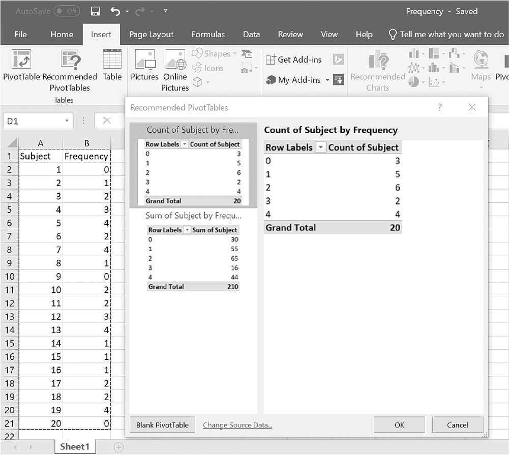
To create a frequency distribution in Microsoft Excel, you will open Frequency.xlsx and click on "Recommended PivotTables" under the Insert tab, as presented in Figure 6-1. In the Choose Data source box, you will enter A1:B21 as the range, as displayed in Figure 6-2. Clicking "OK" will move you to the Recommended PivotTables box, as displayed in Figure 6-3. Leaving "Count of Subject by Frequency" selected as default and clicking "OK" will produce the output (Figure 6-4).
Locating the Recommended PivotTables in Excel.
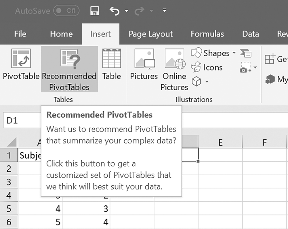
An Excel screenshot shows the selection of the Recommended PivotTables command of the Tables group under the Insert menu.
The text in the description box on placing the cursor on the command read, Want us to recommend PivotTables that summarize your complex data? Click this button to get a customized set of PivotTables that we think will best suit your data.
Courtesy of Microsoft Excel © Microsoft 2020.
Defining a data range in Excel.
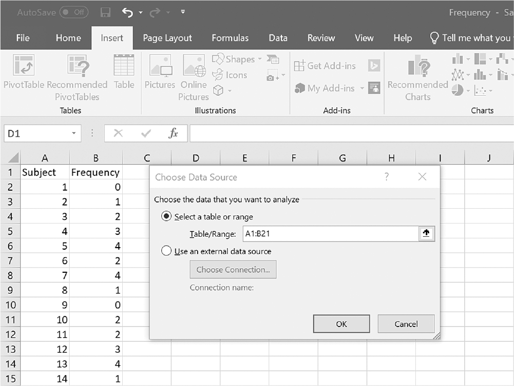
An Excel screenshot shows the Choose Data source box dialog box which appears on selection of the Recommended PivotTables command.
There are two columns of numerical data, under the headings, subject which has the values 1 to 20, and frequency with values 0 to 4 at random. The options of the selection range in the dialog box appear as follows: Choose the data that you want to analyze, and the options are select a table or range and A1 : B21 is entered, and use an external data source with the connection name to be chosen; the first option is checked. The O k and Cancel buttons are at the bottom.
Courtesy of Microsoft Excel © Microsoft 2020.
Selecting the Recommended PivotTables in Excel.
An Excel screenshot displays the PivotTables formats to be selected.
With the range of two columns of numerical data, under the headings, subject which has the values 1 to 20, and frequency with values 0 to 4 at random, selected, the dialog box, Recommended PivotTables, displays two recommended data tables, count of subject by frequency, and sum of subject by frequency, with the count of subject by frequency table selected.
Courtesy of Microsoft Excel © Microsoft 2020.
Example output for frequency distribution in Excel.
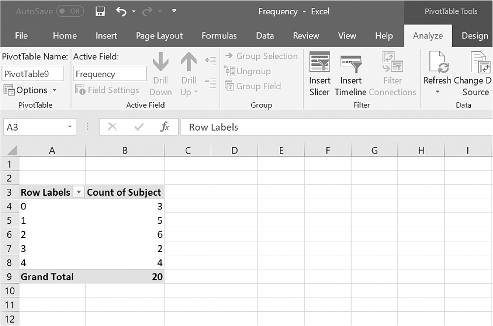
A screenshot from an excel worksheet displays the output of the count of subject by frequency table.
The output is as follows: The values 0 through 4 are displayed under Row labels, and the values, 3, 5, 6, 2, and 4 are displayed under count of subject. The last row displays Grand Total as 20.
Courtesy of Microsoft Excel © Microsoft 2020.
To create a frequency distribution in IBM SPSS Statistics software ("SPSS"), you will open Frequency.sav and go to Analyze > Descriptive Statistics > Frequencies, as displayed in Figure 6-5. In the Frequencies box, you will then move a variable of interestin this case, Frequencyinto "Variable(s)," as displayed in Figure 6-6. Clicking "OK" will then produce the output, as presented in Figure 6-7.
Selecting Frequencies in SPSS.
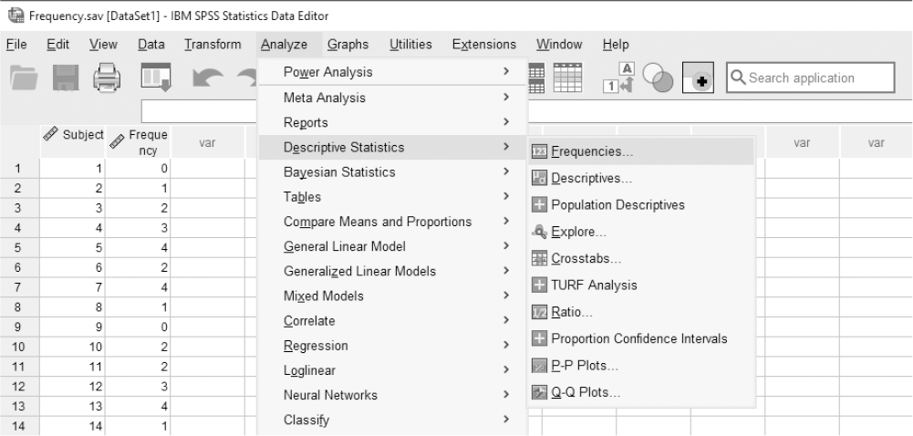
A screenshot displays an SPSS dialog box with a list of variables and a highlighted option for generating frequencies, along with buttons to move variables into the analysis list.
Reprint Courtesy of International Business Machines Corporation, © International Business Machines Corporation. "IBM SPSS Statistics software ("SPSS")". IBM®, the IBM logo, ibm.com, and SPSS are trademarks or registered trademarks of International Business Machines Corporation.
Defining a variable frequency in SPSS.
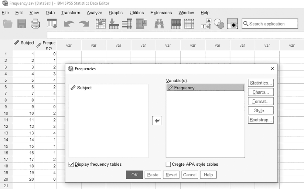
A screenshot displays a dialog box showing a selected variable with checkboxes and settings for defining how the frequency will be calculated and displayed.
Reprint Courtesy of International Business Machines Corporation, © International Business Machines Corporation. "IBM SPSS Statistics software ("SPSS")". IBM®, the IBM logo, ibm.com, and SPSS are trademarks or registered trademarks of International Business Machines Corporation.
Example output of frequency distribution table in SPSS.
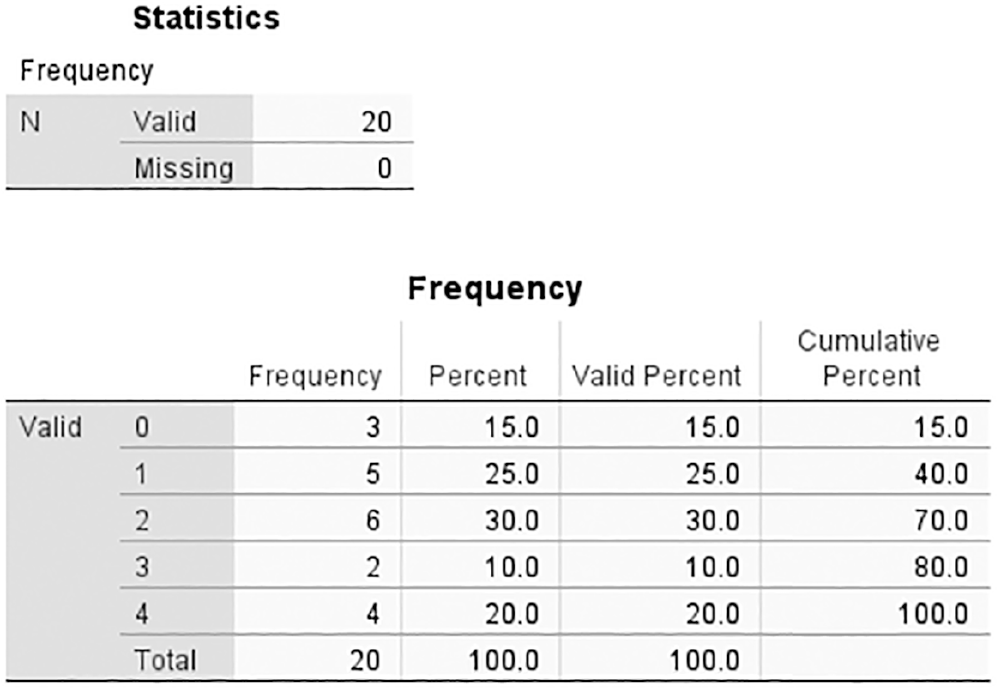
A screenshot displays two tables in the SPSS output window. The first table is labeled Statistics, and the second table is labeled Frequency.
Reprint Courtesy of International Business Machines Corporation, © International Business Machines Corporation. "IBM SPSS Statistics software ("SPSS")". IBM®, the IBM logo, ibm.com, and SPSS are trademarks or registered trademarks of International Business Machines Corporation.
Determining what type of frequency distribution table is best depends again on how the data are being measured and the range of values. If the range of data values is small, choosing an ungrouped frequency distribution table and retaining as much information as possible is probably best. If the data range is large or very complex, a grouped frequency distribution table will convey information in a more concise format, even though some details of the information will be lost.
Nurses using data and statistical results for evidence-based practice, quality/process improvement, and research may choose to convey information about data in graphs and charts that would be difficult or cumbersome to examine in text format. In fact, graphs and charts are the best method of describing data when the data set is large. Graphs and charts are visually impactful and, when designed well are easily understood.
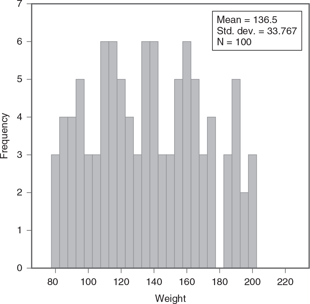
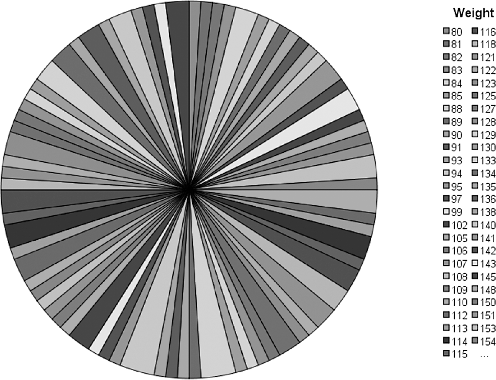
A useful chart or graph should display the data or statistics in a meaningful, clear, and efficient manner. Poor choices may lead to ambiguous or misleading interpretations of the data. Suppose that we needed to present the collected measurements of the weights of 100 patients. Because each patient will have different measurements in weight, choosing a pie chart as a description method will not display the data clearly, as presented in Figure 6-8. When there are many data values to display, seeing each data value as a separate category does not help us understand the data. In the case of patient weights, the use of a histogram is a much better way to understand the data (Figure 6-9).
Mistakenly used pie chart.
A pie chart shows 51 closely placed sectors, with the data not displayed vividly and the shades used for each sector not able to be differentiated clearly. The pie chart is drawn for 51 weight measurements, with data ranging between 80 and 154.
Histogram using the same data set as Figure 6-8.
A histogram displays the distribution of weights for a sample of 100 individuals.
The x-axis is labeled Weight, ranging from 80 to 220 in increments of 20. The y-axis is labeled Frequency, ranging from 0 to 7 in increments of 1. The histogram bars represent the following frequencies: 80 to 90: 3; 90 to 100: 4; 100 to 110: 5; 110 to 120: 3; 120 to 130: 6; 130 to 140: 5; 140 to 150: 4; 150 to 160: 6; 160 to 170: 3; 170 to 180: 5; 180 to 190: 4; 190 to 200: 3. In the top-right corner, a text box displays the summary statistics: Mean equals 136.5; Standard deviation equals 33.767; Sample size N equals 100.
There are many types of graphs and charts in Excel and SPSS, and we will explain how to create each with examples of variables. We also discuss the appropriate levels of measurement for each graph and chart. Each data set used here is also included for your practice in the online resources for this text, accessed using the code found in the front of this text.
Bar charts and pie charts are two useful ways to represent discrete data (i.e., categorical data, with a fixed number of categories measured at the nominal or ordinal level). They are commonly used charts as they are easy to create, use, and interpret.
The bar chart is the most appropriate choice for variables measured at the nominal and ordinal level of measurement and can be used to display one or more variables. If a bar chart is used with the ordinal level of measurement, ordering the ranks helps the reader interpret the chart (e.g., if discussing pressure ulcers, listing the measurements in orderstage I, stage II, stage III, stage VI). A typical bar chart has the response categories on the horizontal axis and the corresponding frequencies of each category on the vertical axis; this chart helps you discern much about the data, such as the most/least common category, the difference of one bar relative to the other, and changes in frequency over time.
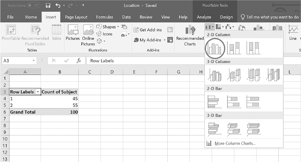
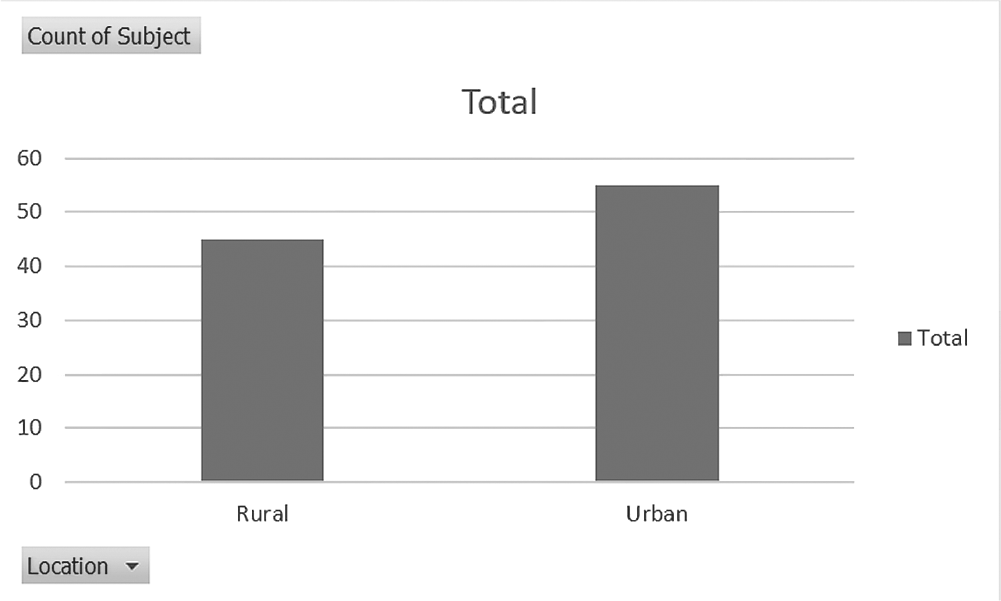
To create a simple bar chart for a variable in Excel, you will open Location.xlsx. Please note that the data should be organized in a frequency table to create a bar chart. Click on the arrow by the "Insert Column" or "Bar Chart" button under the Insert tab and then select either "2-D Column" (vertical) or "2-D Bar" (horizontal) from the list, as displayed in Figure 6-10. Clicking on the chart type, "2-D Column" in this case, will produce the output (Figure 6-11).
Selecting a bar chart in Excel.
An Excel screenshot displays the types of bar graphs to be selected. The data in the worksheet are as follows. The column headings are row labels with a drop-down list, and count of subjects. Row 1: 1, 45. Row 2: 2, 55. Row 3: Grand Total, 100.
Courtesy of Microsoft Excel © Microsoft 2020.
Example bar chart for Location in Excel.
A bar graph shows total subjects in rural and urban locations. The horizontal axis lists rural and urban, and vertical axis labeled, count of subject, ranges from 0 to 60, in increments of 10. The data from graph is as follows. Rural: 45; Urban: 55.
Courtesy of Microsoft Excel © Microsoft 2020.
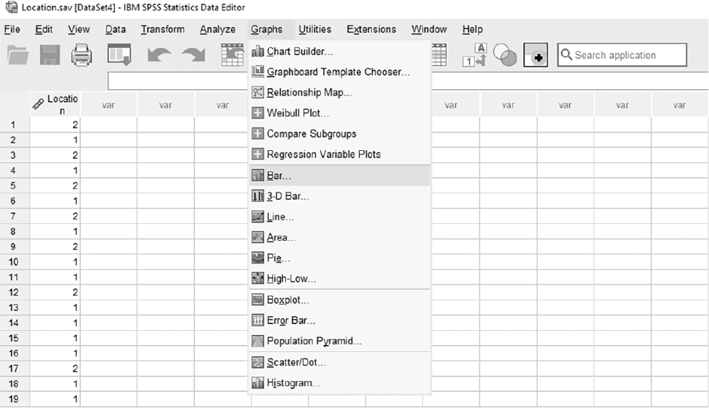
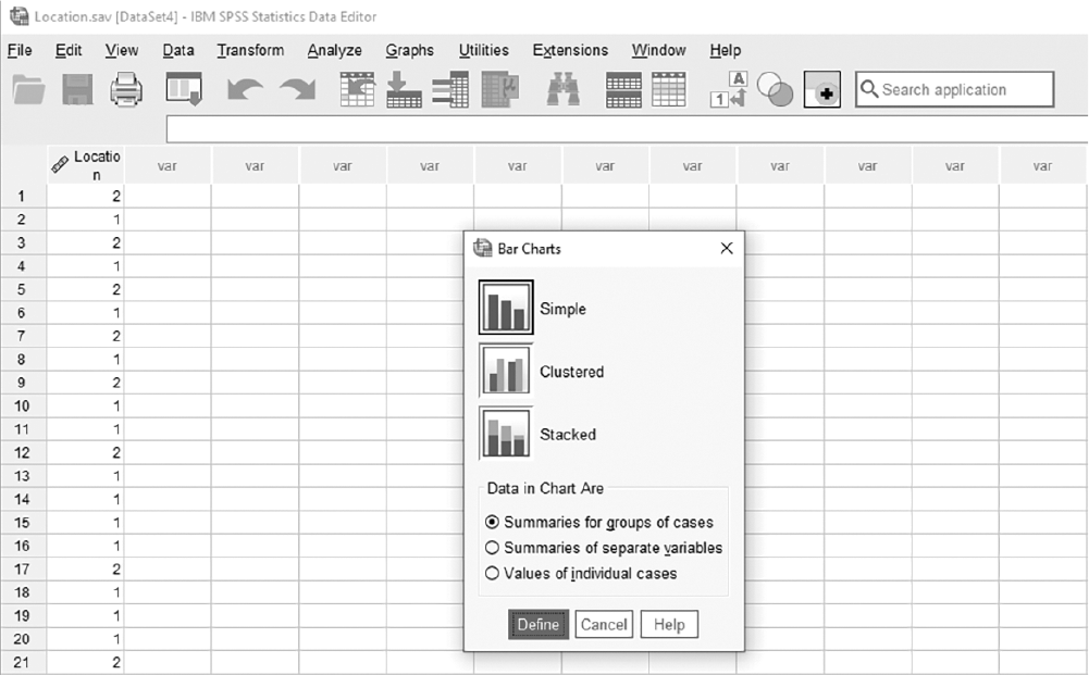
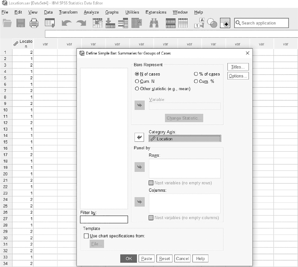
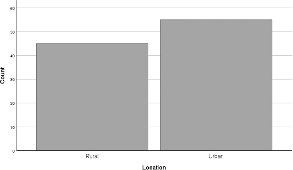
To create a simple bar chart for a variable in SPSS, you will open Location.sav, go to Graph > Legacy Dialogues, and select the type of graph/chart desiredin this case, Bar, as presented in Figure 6-12. In the Bar Charts box, you will leave "Simple" and "Summaries for groups of cases" selected as the default, and click "Define," as displayed in Figure 6-13. In the Define Simple Bar box, you will then move the variable of interestin this example, Locationinto "Category Axis," as presented in Figure 6-14. Click "OK" to produce the output (Figure 6-15).
Selecting a bar chart in SPSS.
A screenshot displays an SPSS chart type dialog box with a list of chart options, and the bar chart option is highlighted.
Reprint Courtesy of International Business Machines Corporation, © International Business Machines Corporation. "IBM SPSS Statistics software ("SPSS")". IBM®, the IBM logo, ibm.com, and SPSS are trademarks or registered trademarks of International Business Machines Corporation.
Selecting a simple bar chart in SPSS.
A screenshot displays a dialog box showing different bar chart styles, with the simple bar chart option selected.
Reprint Courtesy of International Business Machines Corporation, © International Business Machines Corporation. "IBM SPSS Statistics software ("SPSS")". IBM®, the IBM logo, ibm.com, and SPSS are trademarks or registered trademarks of International Business Machines Corporation.
Defining a variable in a bar chart in SPSS.
A screenshot displays a chart creation dialog box with a variable moved into the category axis field for plotting in the bar chart.
Reprint Courtesy of International Business Machines Corporation, © International Business Machines Corporation. "IBM SPSS Statistics software ("SPSS")". IBM®, the IBM logo, ibm.com, and SPSS are trademarks or registered trademarks of International Business Machines Corporation.
Example bar chart for nurses' job location in SPSS.
A screenshot displays a vertical bar chart with labeled categories along the horizontal axis and bars of varying heights representing counts, shown in the SPSS output window.
Reprint Courtesy of International Business Machines Corporation, © International Business Machines Corporation. "IBM SPSS Statistics software ("SPSS")". IBM®, the IBM logo, ibm.com, and SPSS are trademarks or registered trademarks of International Business Machines Corporation.
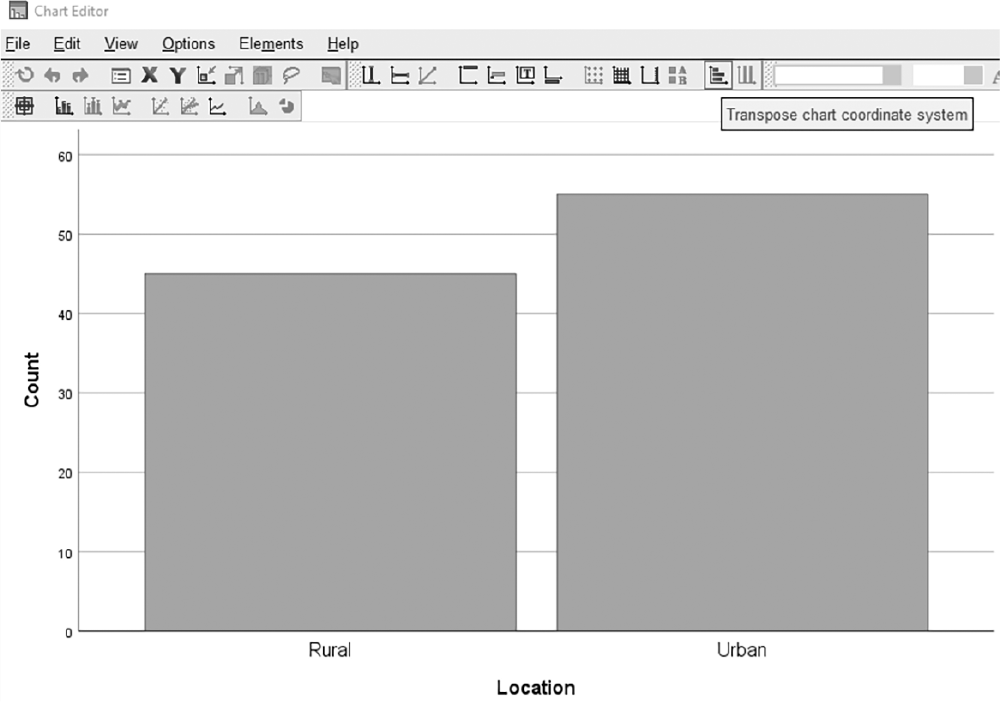
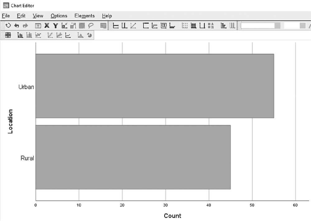
Note that a bar chart can also be created horizontally (i.e., the response categories on the vertical axis and the frequencies of each category on the horizontal axis), as in Excel. To create a horizontal bar chart, double-click on the chart and then click the "Transpose Chart Coordinate System" button in the Chart Editor box, as shown in Figure 6-16. An example output is shown in Figure 6-17. Additional examples where a bar chart can be handy to present the data include ethnicity, insurance category (Medicare/Medicaid), marital status, patient acuity, and gender.
Defining a horizontal bar chart in SPSS.
A screenshot displays a chart dialog box with the horizontal bar chart option selected and a variable assigned to the category axis.
Reprint Courtesy of International Business Machines Corporation, © International Business Machines Corporation. "IBM SPSS Statistics software ("SPSS")". IBM®, the IBM logo, ibm.com, and SPSS are trademarks or registered trademarks of International Business Machines Corporation.
Example horizontal bar chart in SPSS.
A screenshot displays a horizontal bar chart with labeled categories along the vertical axis and bars extending horizontally to represent counts in the SPSS output window.
Reprint Courtesy of International Business Machines Corporation, © International Business Machines Corporation. "IBM SPSS Statistics software ("SPSS")". IBM®, the IBM logo, ibm.com, and SPSS are trademarks or registered trademarks of International Business Machines Corporation.
A pie chart is a circular chart where pieces within the chart represent a corresponding proportion of each category, and it is an appropriate choice for nominal and ordinal levels of measurement. A pie chart is simple to create, use, and understand, much like a bar chart when it is created for a single variable. Pie charts are useful for visualizing the most commonly occurring class compared with the whole and the relative size of different classes. However, it may be difficult to compare data when the percentages are pretty similar across categories or when comparing different pie charts.
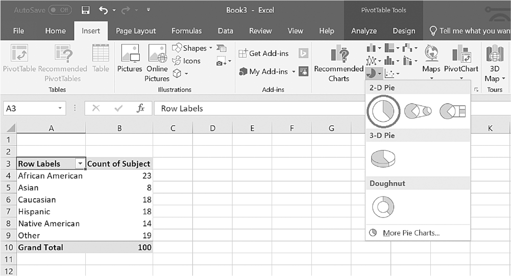
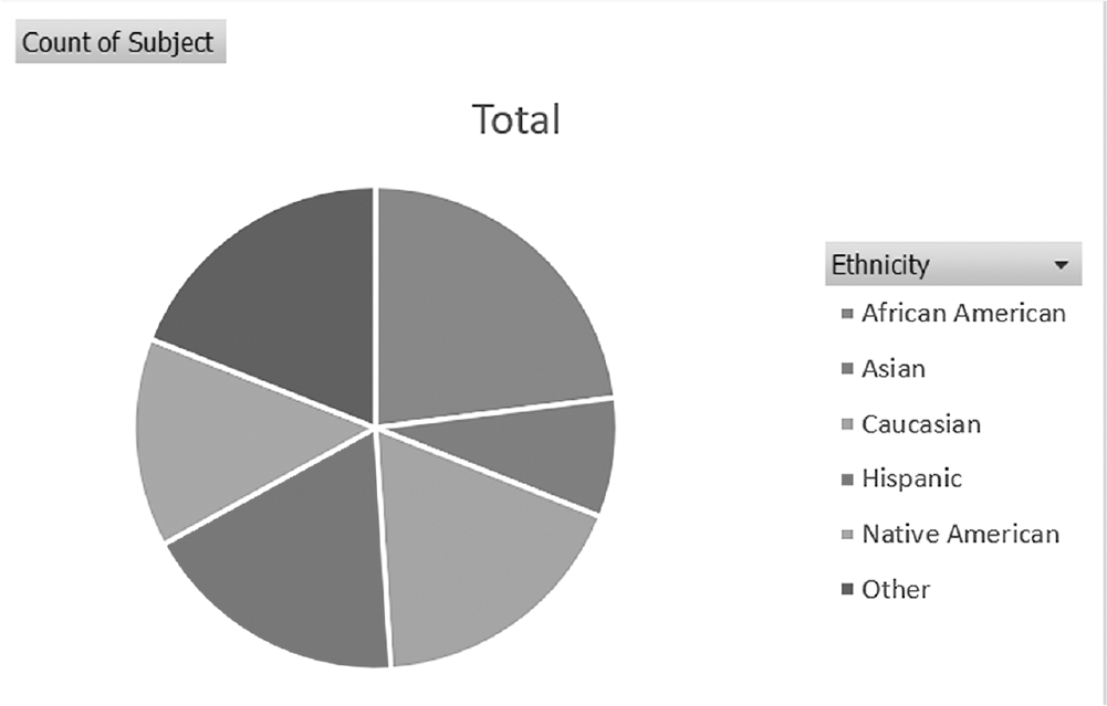
To create a simple pie chart for a variable in Excel, you will open Ethnicity.xlsx and note that the data should be in the frequency table to create a pie chart. Click on the arrow by the "Insert Pie" or "Doughnut Chart" button under the Insert tab. Then select a "2-D Pie" from the list, as shown in Figure 6-18. Clicking on the chart type will produce the output (Figure 6-19).
Selecting a pie chart in Excel.
An Excel screenshot shows the selection of the required pie chart.
The types of pie charts to be selected are displayed. The data in the worksheet are as follows. The column headings are row labels with a drop-down list, and count of subjects. Row 1: African American, 23. Row 2: Asian, 8. Row 3: Caucasian, 18; Row 4: Hispanic, 18; Row 5: Native American, 14; Row 6: Other, 19; Row 7: Grand Total, 100.
Courtesy of Microsoft Excel © Microsoft 2020.
Example pie chart for Ethnicity in Excel.
An Excel screenshot shows a pie chart display of the count of people in different ethnic categories. Approximate data from the chart in percent are as follows. African American: 24; Asian: 10; Caucasian: 17; Hispanic: 17; Native American: 15; Other: 17.
Courtesy of Microsoft Excel © Microsoft 2020.
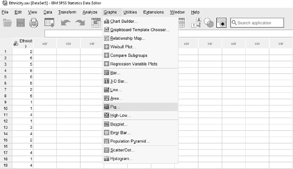
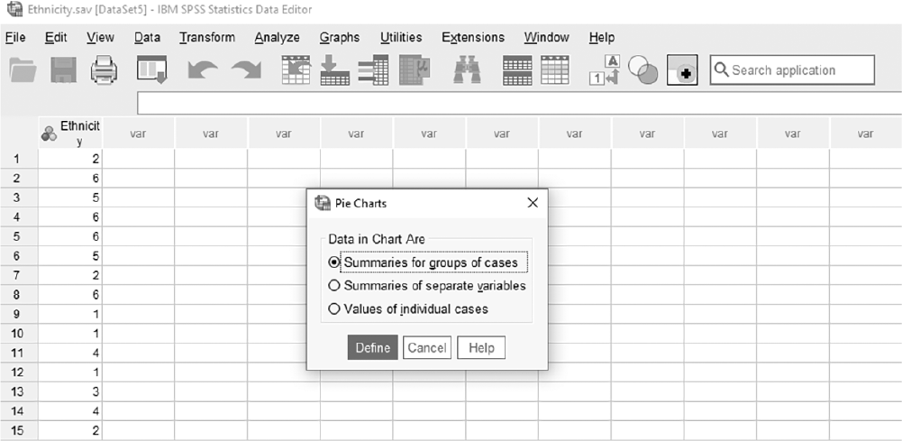
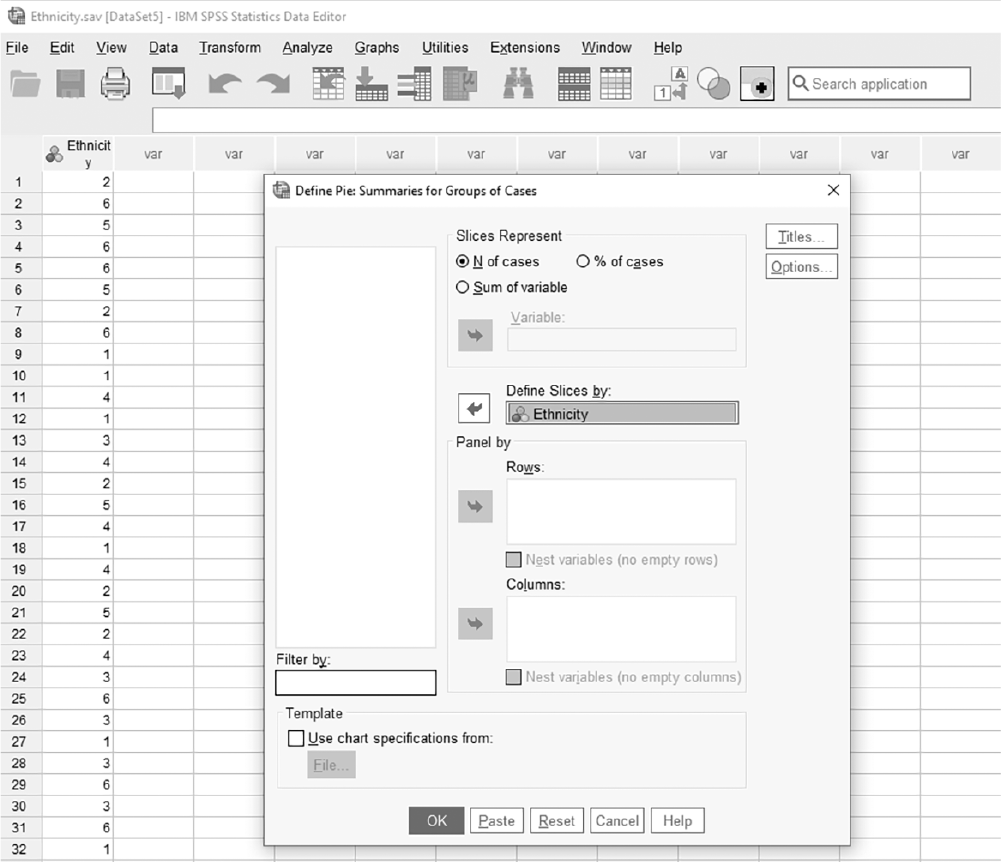
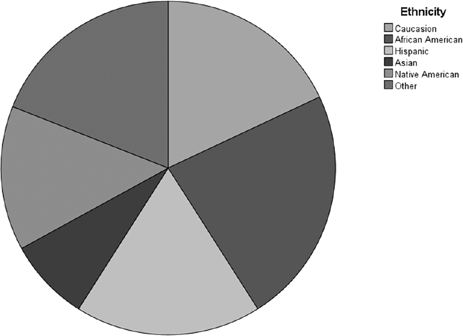
To create a simple pie chart for a variable in SPSS, you will open Ethnicity.sav and go to Graph > Legacy Dialogues > Pie, as presented in Figure 6-20. In the Pie Charts box, you will leave "Summaries for Groups of Cases" checked as default and click "Define," as presented in Figure 6-21. In the Define Pie box, you will then move a variable of interest, Ethnicity, into "Define Slices by," as presented in Figure 6-22. Clicking "OK" will then produce the output. An example output is displayed in Figure 6-23.
Selecting a pie chart in SPSS.
A screenshot displays the SPSS chart type dialog box. The left panel lists various chart types including bar, line, and pie charts. The pie chart option is highlighted.
Reprint Courtesy of International Business Machines Corporation, © International Business Machines Corporation. "IBM SPSS Statistics software ("SPSS")". IBM®, the IBM logo, ibm.com, and SPSS are trademarks or registered trademarks of International Business Machines Corporation.
Selecting a simple pie chart in SPSS.
A screenshot displays a dialog box showing multiple styles of pie charts, including 2D and 3D options. The simple 2D pie chart option is selected.
Reprint Courtesy of International Business Machines Corporation, © International Business Machines Corporation. "IBM SPSS Statistics software ("SPSS")". IBM®, the IBM logo, ibm.com, and SPSS are trademarks or registered trademarks of International Business Machines Corporation.
Defining a variable in a pie chart in SPSS.
A screenshot displays the chart creation dialog box. One variable is moved into the Define Slices By field, and checkboxes for display options, such as showing labels and percentages, appear on the right side.
Reprint Courtesy of International Business Machines Corporation, © International Business Machines Corporation. "IBM SPSS Statistics software ("SPSS")". IBM®, the IBM logo, ibm.com, and SPSS are trademarks or registered trademarks of International Business Machines Corporation.
Example pie chart for nurses' ethnicity in SPSS.
A screenshot displays a 2D pie chart in the SPSS output window.
The chart is a circle divided into several slices of varying sizes, each labeled with a category of nurses' ethnicity and corresponding percentages. A legend on the right side matches colors to each ethnic category.
Reprint Courtesy of International Business Machines Corporation, © International Business Machines Corporation. "IBM SPSS Statistics software ("SPSS")". IBM®, the IBM logo, ibm.com, and SPSS are trademarks or registered trademarks of International Business Machines Corporation.
When the variable is continuous (i.e., interval and ratio), both bar charts and pie charts become inefficient in displaying the collected data. It is important to demonstrate how the data are distributed with continuous data, because the data values can range differently, unlike with categorical data. Better choices for continuous variables are histograms, stem and leaf plots, and boxplots.
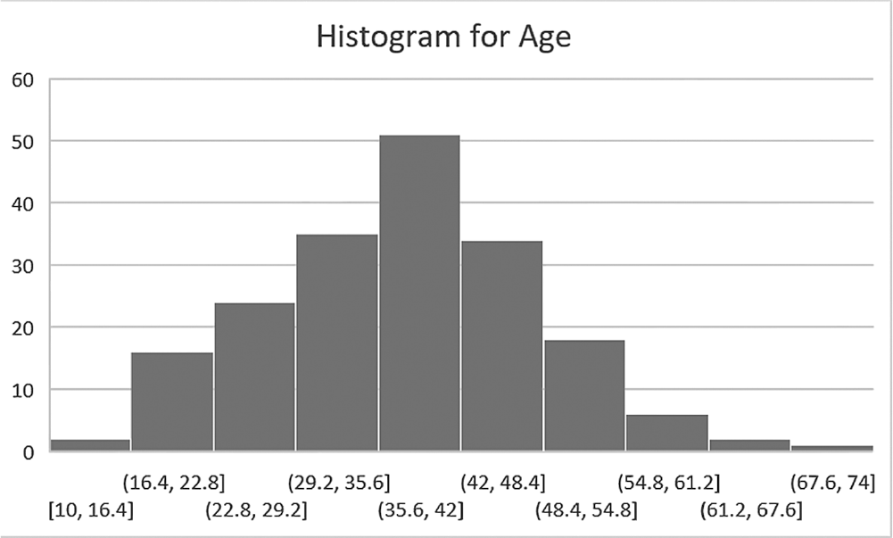
A histogram is similar to a bar chart in structure, which explains why histograms are often mistaken for bar charts. However, histograms are a graphical way of presenting information from a frequency distribution. It organizes a group of data points into several intervals, and the bar in a histogram represents the frequency in corresponding intervals, not in predefined limited numbers of categories as in a bar chart. With a histogram, you can understand the general shape of the data distribution (i.e., the data trends) and the most commonly occurring data values.
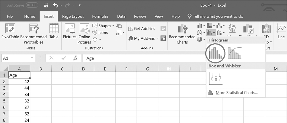
To create a histogram in Excel, you will open Age.xlsx. With any cell in column A selected, click on the arrow by the Insert Statistic Chart button under the Insert tab, and then select "Histogram" from the list, as shown in Figure 6-24. Clicking on the chart type will produce the output (Figure 6-25). Note that you can change "Chart Title" by double-clicking and typing in it.
Selecting a histogram in Excel.
An Excel screenshot displays the types of histographs to be selected. The data in the worksheet has Age as column heading with a list of numerical data.
Courtesy of Microsoft Excel © Microsoft 2020.
Example histogram for Age in Excel.
A histogram shows the frequency of age range.
The horizontal axis ranges from the range 10-16.4 to 67.6-74. The vertical axis ranges from 0 to 60, in increments of 10. The approximate data are as follows: (10-16.4, 2), (16.4-22.8, 17), (22.8-29.2, 22), (29.2-35.6, 33), (35.6-42, 50), (42-48.4, 33), (48.4-54.8, 19), (54.8-61.2, 5), (61.2-67.6, 2), and (67.6-74, 1).
Courtesy of Microsoft Excel © Microsoft 2020.
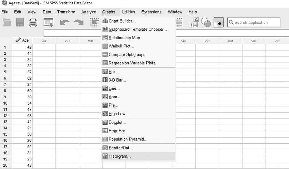
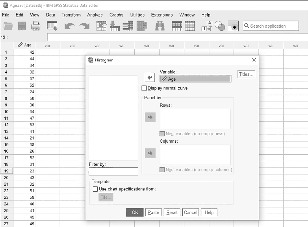
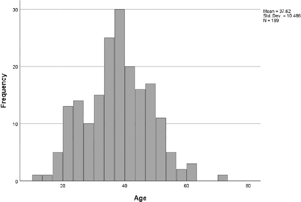
To create a histogram in SPSS, you will open Age.sav and go to Graph > Legacy Dialogues > Histogram, as shown in Figure 6-26. In the Histogram box, you will then move a variable of interest, Age, into "Variable," as shown in Figure 6-27. Clicking "OK" will then produce the output. An example output is shown in Figure 6-28. Note that a histogram can be obtained elsewhere, such as "Explore."
Selecting a histogram chart in SPSS.
A screenshot displays a dialog box with chart type options, and the histogram option is highlighted for selection.
Reprint Courtesy of International Business Machines Corporation, © International Business Machines Corporation. "IBM SPSS Statistics software ("SPSS")". IBM®, the IBM logo, ibm.com, and SPSS are trademarks or registered trademarks of International Business Machines Corporation.
Defining a variable in a histogram in SPSS.
A screenshot displays a dialog box where a variable is chosen from a list and assigned to the horizontal axis for the histogram.
Reprint Courtesy of International Business Machines Corporation, © International Business Machines Corporation. "IBM SPSS Statistics software ("SPSS")". IBM®, the IBM logo, ibm.com, and SPSS are trademarks or registered trademarks of International Business Machines Corporation.
Example histogram for nurses' age in SPSS.
A screenshot displays a bar chart with age intervals along the horizontal axis and frequency counts along the vertical axis, showing the distribution of ages.
Reprint Courtesy of International Business Machines Corporation, © International Business Machines Corporation. "IBM SPSS Statistics software ("SPSS")". IBM®, the IBM logo, ibm.com, and SPSS are trademarks or registered trademarks of International Business Machines Corporation.
Stem and leaf plots are also used for showing the distribution of continuous data. These are similar to histograms, but they have greater flexibility and display more information. In addition to the overall shape of the distribution, a stem and leaf plot shows information regarding individual data values. Stem and leaf plots are unavailable in Excel, so we go straight to SPSS.
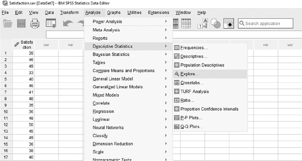
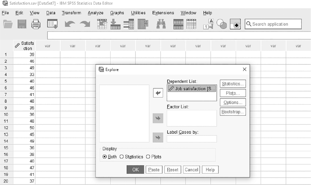
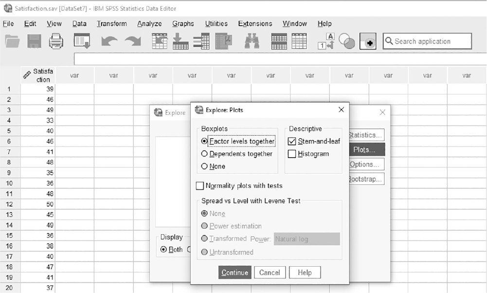
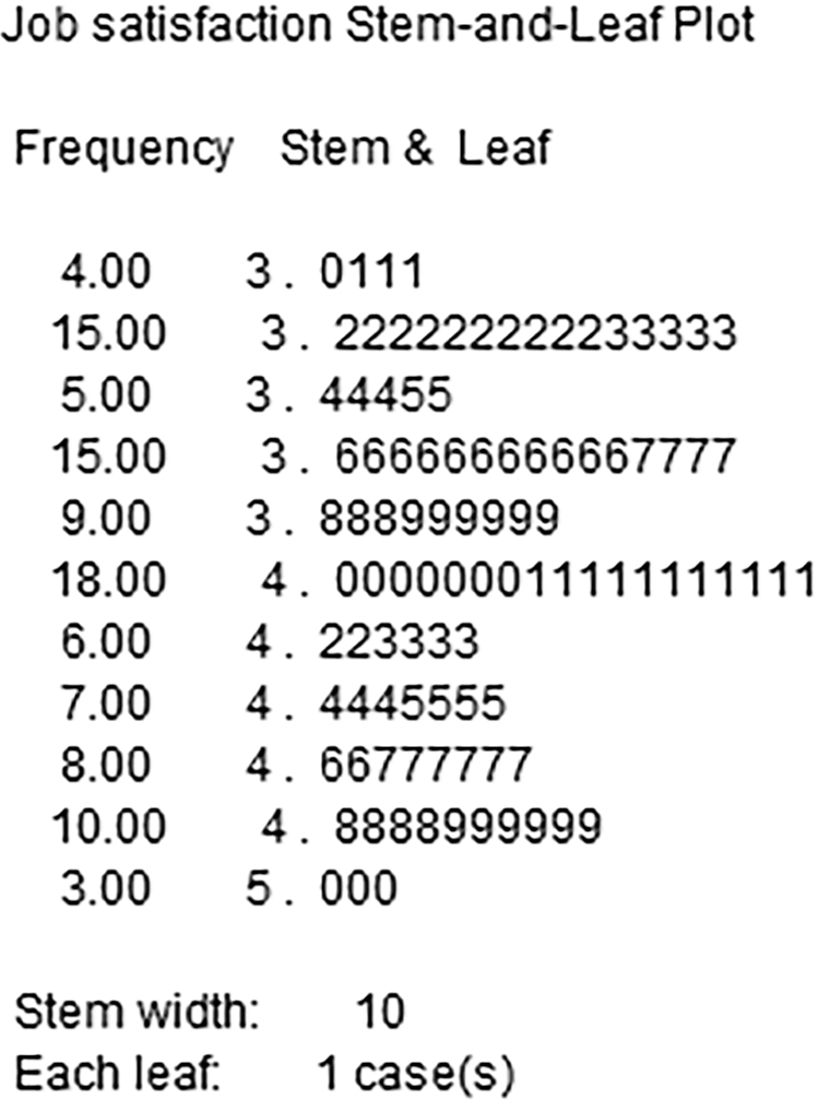
To create a stem and leaf plot in SPSS, you will open Satisfaction.sav and go to Analyze > Descriptive Statistics > Explore, as shown in Figure 6-29. In the Explore box, you will move a variable of interest, Job Satisfaction, into the "Dependent List," as shown in Figure 6-30. Note that you can move the categorical variable into "Factor List" if you want to create separate stem and leaf plots for a categorical variable; this will create separate plots for different variable categories. Stem and leaf plot is checked as the default in the "Plots" button, as shown in Figure 6-31, so clicking "OK" will then produce the output. Figure 6-32 is an example of a stem and leaf plot.
Selecting a stem and leaf plot in SPSS.
A screenshot displays a dialog box with various chart options, with the stem-and-leaf plot option highlighted.
Reprint Courtesy of International Business Machines Corporation, © International Business Machines Corporation. "IBM SPSS Statistics software ("SPSS")". IBM®, the IBM logo, ibm.com, and SPSS are trademarks or registered trademarks of International Business Machines Corporation.
Defining a variable in a stem and leaf plot in SPSS.
A screenshot displays a dialog box where a variable is selected from a list to create a stem-and-leaf display.
Reprint Courtesy of International Business Machines Corporation, © International Business Machines Corporation. "IBM SPSS Statistics software ("SPSS")". IBM®, the IBM logo, ibm.com, and SPSS are trademarks or registered trademarks of International Business Machines Corporation.
Defining a stem and leaf plot in SPSS.
A screenshot displays a dialog box showing additional options for organizing the stem-and-leaf plot, including sorting and display settings.
Reprint Courtesy of International Business Machines Corporation, © International Business Machines Corporation. "IBM SPSS Statistics software ("SPSS")". IBM®, the IBM logo, ibm.com, and SPSS are trademarks or registered trademarks of International Business Machines Corporation.
Example stem and leaf plot for nurses' job satisfaction in SPSS.
A screenshot displays a table where numerical job satisfaction scores are split into stems and leaves, showing the frequency of each score.
Reprint Courtesy of International Business Machines Corporation, © International Business Machines Corporation. "IBM SPSS Statistics software ("SPSS")". IBM®, the IBM logo, ibm.com, and SPSS are trademarks or registered trademarks of International Business Machines Corporation.
As you notice in Figure 6-32, the variable, Satisfaction, appears similar on both sides from the center, and the actual data values are shown. In this way, stem and leaf plots not only show the distribution, but also information about individual data values.
A boxplot can be used to display more information than any other chart discussed so far in this chapter. It is a good choice for variables measured on a continuous scale and allows for comparisons across groups. A boxplot does not show individual data values as a stem and leaf plot does, but it does display other information, such as the overall distribution, the center of the distribution, the quartile, and possible outliers.
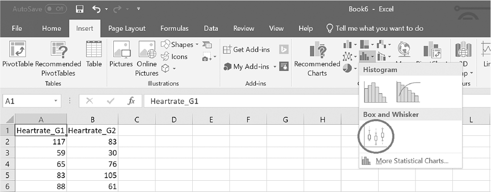
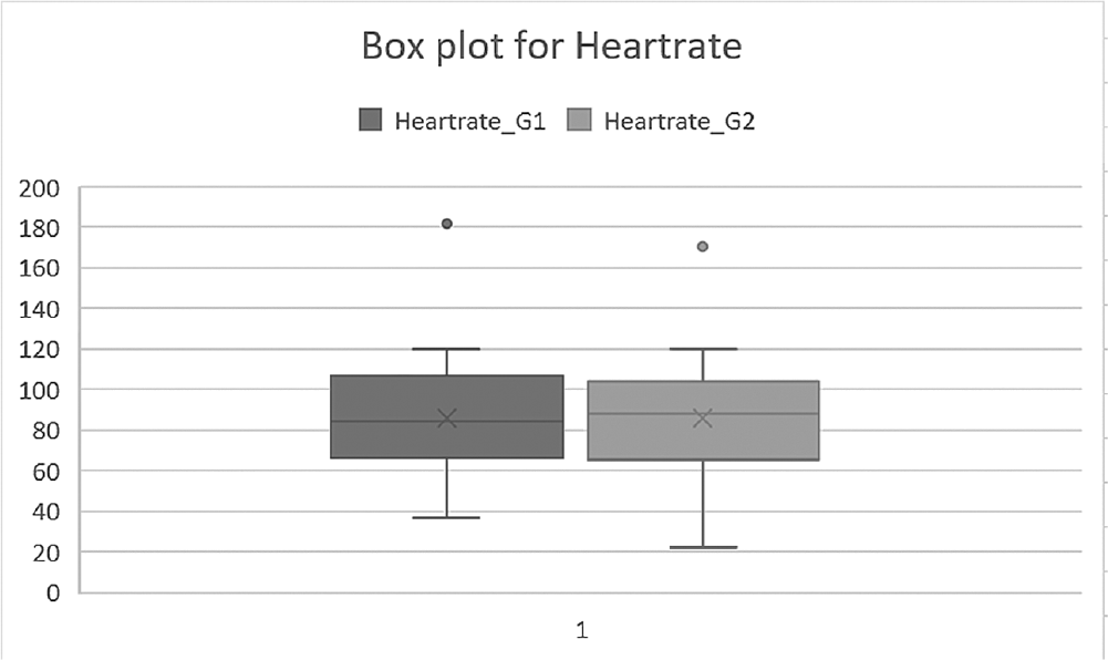
To create a boxplot in Excel, you will open Heartrate.xlsx. With any cell in column A or B selected, click on the arrow by "Insert Statistic Chart" button under the Insert tab and then select a "Box and Whisker" from the list, as shown in Figure 6-33. Clicking on the chart type will produce the output (Figure 6-34). Note that you can change "Chart Title" by double-clicking and typing on it.
Selecting a boxplot in Excel.
An Excel screenshot shows the selection of the Box and Whisker option in Excel, which is under the Charts group under the Insert menu.
The data in the worksheet shows two columns, Heartrate_G 1 and Heartrate_G 2. The row entries are as follows. Row 2: 117, 83. Row 3: 59, 30. Row 4: 65, 76. Row 5: 83, 105. Row 6: 88, 61.
Courtesy of Microsoft Excel © Microsoft 2020.
Example boxplot for Heartrate in Excel.
An Excel screenshot shows the box plot for heart rate.
The horizontal axis lists 1, and the vertical axis ranges from 0 to 200, in increments of 20. Heart rate_ G 1: All data are approximate. Two horizontal lines are drawn at values y = 63 and y = 105, at the center of the graph, and these lines are joined to form a rectangular box. Two shorter horizontal lines are drawn at values y = 39 and y =120. Vertical lines from the edges of the rectangular box are drawn. A point is plotted at y = 180, along the same line. Heart rate_ G 2: All data are approximate. Two horizontal lines are drawn at values y = 62 and y = 103, at the center of the graph, and these lines are joined to form a rectangular box. Two shorter horizontal lines are drawn at values y = 21 and y =120. Vertical lines from the edges of the rectangular box are drawn. A point is plotted at y = 170, along the same line.
Courtesy of Microsoft Excel © Microsoft 2020.
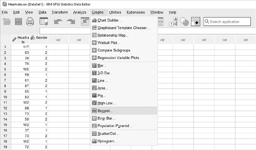
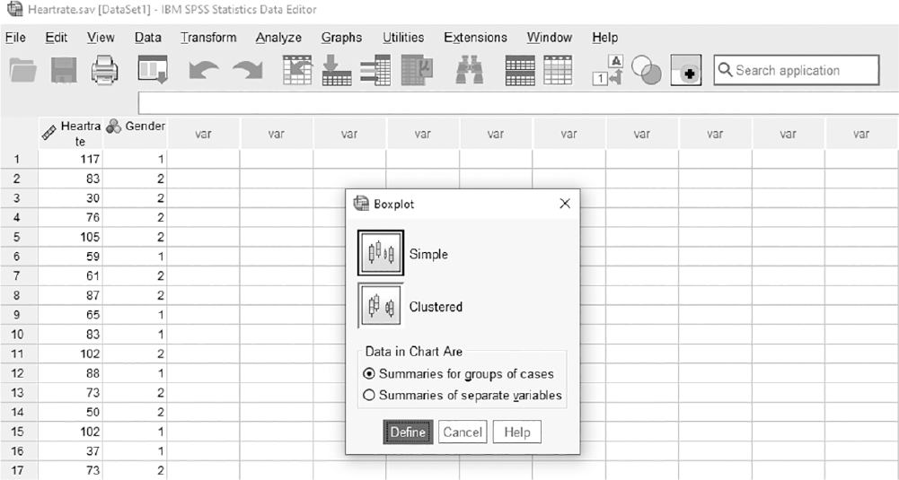
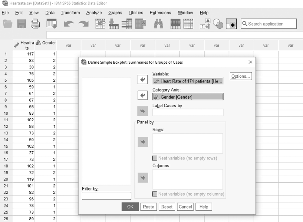
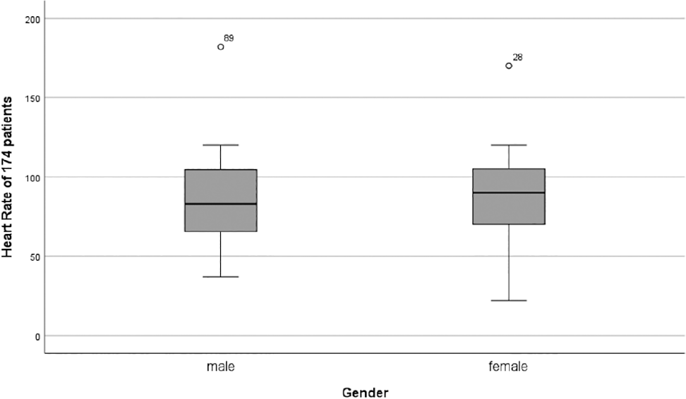
To create a boxplot in SPSS, you will open Heartrate.sav and go to Graph > Legacy Dialogues > Boxplot, as shown in Figure 6-35. In the Boxplot box, you will leave "Simple" and "Summaries for Groups of Cases" selected as the default, and click "Define," as shown in Figure 6-36. In the Define Simple Boxplot box, you will move a variable of interest, Heart Rate, into "Variable" and Gender into "Category Axis," as shown in Figure 6-37. Clicking "OK" will then produce the output. An example output is shown in Figure 6-38.
Selecting boxplot in SPSS.
A screenshot displays a dialog box with chart types, and the boxplot option is highlighted for selection.
Reprint Courtesy of International Business Machines Corporation, © International Business Machines Corporation. "IBM SPSS Statistics software ("SPSS")". IBM®, the IBM logo, ibm.com, and SPSS are trademarks or registered trademarks of International Business Machines Corporation.
Selecting a simple boxplot in SPSS.
A screenshot displays a dialog box showing different boxplot styles, with the simple boxplot option highlighted.
Reprint Courtesy of International Business Machines Corporation, © International Business Machines Corporation. "IBM SPSS Statistics software ("SPSS")". IBM®, the IBM logo, ibm.com, and SPSS are trademarks or registered trademarks of International Business Machines Corporation.
Defining variables in a boxplot in SPSS.
A screenshot displays a dialog box where a variable is selected for the vertical axis and an optional grouping variable is selected for the horizontal axis.
Reprint Courtesy of International Business Machines Corporation, © International Business Machines Corporation. "IBM SPSS Statistics software ("SPSS")". IBM®, the IBM logo, ibm.com, and SPSS are trademarks or registered trademarks of International Business Machines Corporation.
Example boxplot for 174 patients' heart rate in SPSS.
A screenshot displays a boxplot with heart rate values on the vertical axis and a single category on the horizontal axis, showing the median, quartiles, and outliers.
Reprint Courtesy of International Business Machines Corporation, © International Business Machines Corporation. "IBM SPSS Statistics software ("SPSS")". IBM®, the IBM logo, ibm.com, and SPSS are trademarks or registered trademarks of International Business Machines Corporation.
A boxplot can be drawn either vertically, as shown in Figure 6-38, or horizontally. It is one of the important charts used to describe the data in exploratory data analysis. Interpretation of a boxplot is as follows:
The box in the plot contains the middle 50% of the data set. The middle line in the box represents the 50th percentile, the exact middle number of the entire data set, whereas the upper edge represents the 75th percentile and the lower edge represents the 25th percentile.
If the middle line is not exactly in the middle of the box, it indicates that the data is not equally distributed on both sides from the center.
The vertical lines' ends, which are called "whiskers," represent the minimum and maximum data values. The lower whisker equals 1.5 times the interquartile range (IQR) below the first quartile (25th percentile), and the upper whisker equals 1.5 times the IQR above the third quartile (75th percentile).
Any data value outside of the whiskers is considered to be a possible outlier, which is defined as an unusual data value in the current data set.
We need to give you an explanation of percentile before we finish this discussion on boxplots. Percentile is a measure of location and tells us how many data values fall below a certain percentage of observations. For example, if you were in the 75th percentile on an exam, then you did better than 75% of the others taking that exam.
There are other graphs and charts that may be useful for displaying data. They include line charts and scatterplots. Line charts are used to examine trends of variables over time, and scatterplots are used to explore the relationship between variables.
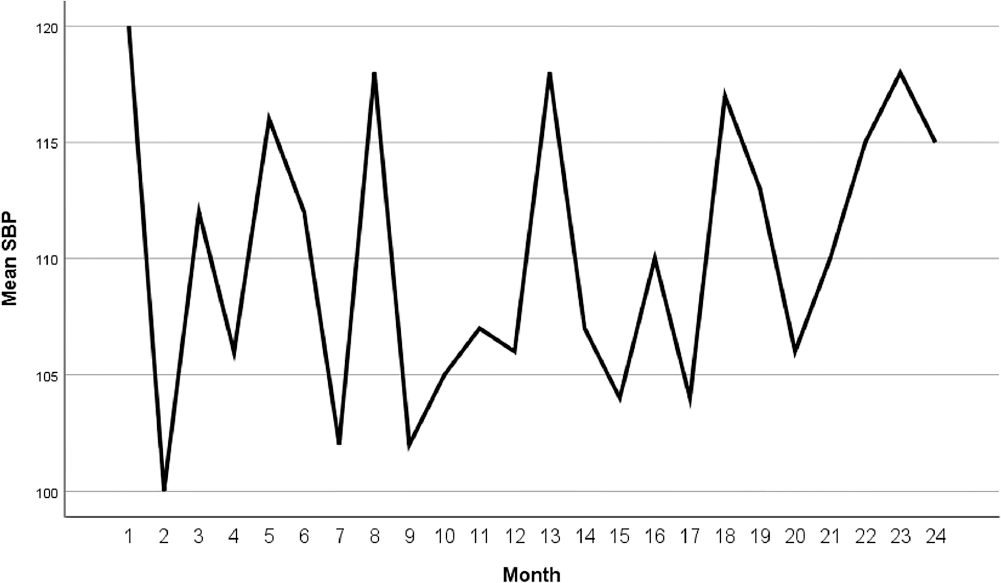
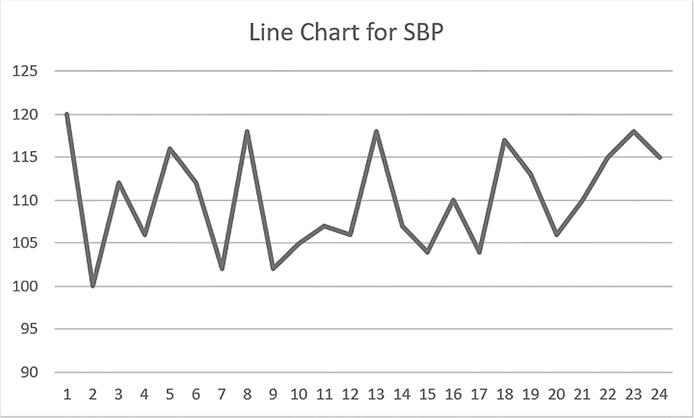
Similar to the bar chart and pie chart, the line chart is a good choice for displaying the frequency of categories. It is created by connecting dots representing the data values of each category, as shown in Figure 6-39. In this example, the horizontal axis represents "Month," a categorical variable, and the vertical axis represents "Systolic Blood Pressure," a continuous variable.
Example line chart for systolic blood pressure (SBP) in SPSS.
A line chart shows the systolic blood pressure in S P S S.
The horizontal axis is labeled Month and ranges from 0 to 24, in unit increments. The vertical axis is labeled, Mean S B P, and ranges from 100 to 120, in increments of 5. All data are approximate. The curve is plotted through the points (1, 120), (2, 100), (3, 112), (4, 106), (5, 116), (6, 112), (7, 103), (8, 113), (9, 103), (10, 105), (11, 106), (12, 106), (13, 117), (14, 106), (15, 104), (16, 110), (17, 104), (18, 117), (19, 113), (20, 106), (21, 113), (22, 115), (23, 118), and (24, 115).
Reprint Courtesy of International Business Machines Corporation, © International Business Machines Corporation. "IBM SPSS Statistics software ("SPSS")". IBM®, the IBM logo, ibm.com, and SPSS are trademarks or registered trademarks of International Business Machines Corporation.
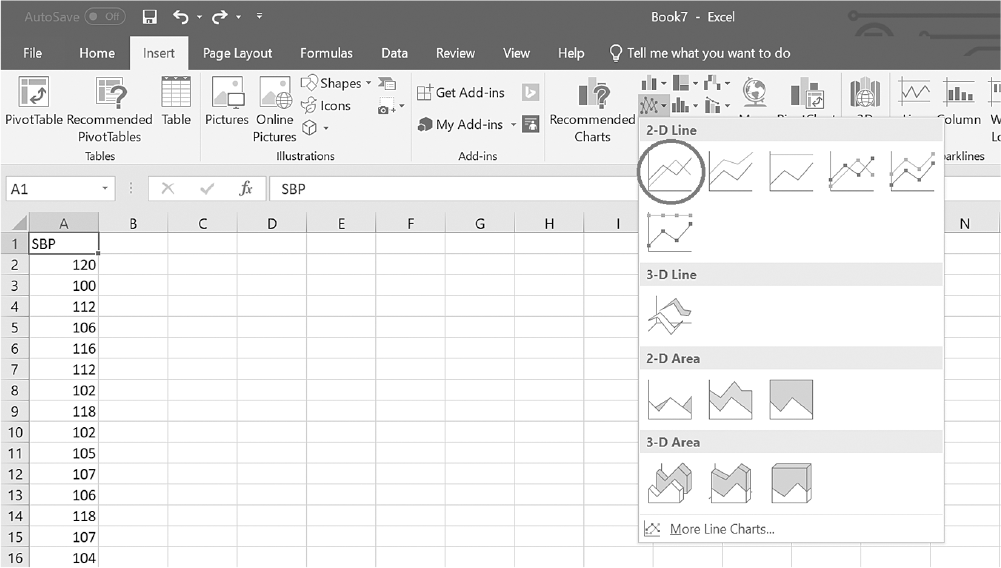
A line chart is useful when trying to find and compare changes over time or when trying to define meaningful patterns of variables. To create a line chart in Excel, you will open SBP.xlsx. With any cell in column A selected, click on the arrow by the "Insert Line" or "Area Chart" button under the Insert tab and then select "2-D Line" from the list, as shown in Figure 6-40. Clicking on the chart type will produce the output (Figure 6-41). Note that you can change "Chart Title" by double-clicking and typing on it.
Selecting a line chart in Excel.
An Excel screenshot displays the types of line graphs to be selected; 2 D line graph is selected. The data in the worksheet shows the column heading as S B P, with the numerical data between 100 and 108 at random.
Courtesy of Microsoft Excel © Microsoft 2020.
Example line chart for SBP in Excel.
A line chart shows the S B P values in Excel.
The horizontal axis ranges from 0 to 24, in unit increments. The vertical axis ranges from 90 to 125, in increments of 5. All data are approximate. The curve is plotted through the points (1, 120), (2, 100), (3, 112), (4, 106), (5, 116), (6, 112), (7, 103), (8, 113), (9, 103), (10, 105), (11, 106), (12, 106), (13, 117), (14, 106), (15, 104), (16, 110), (17, 104), (18, 117), (19, 113), (20, 106), (21, 113), (22, 115), (23, 118), and (24, 115).
Courtesy of Microsoft Excel © Microsoft 2020.
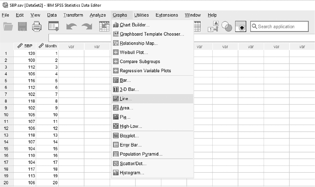
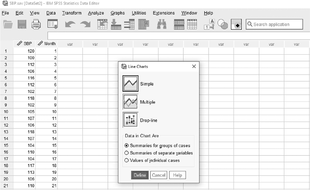
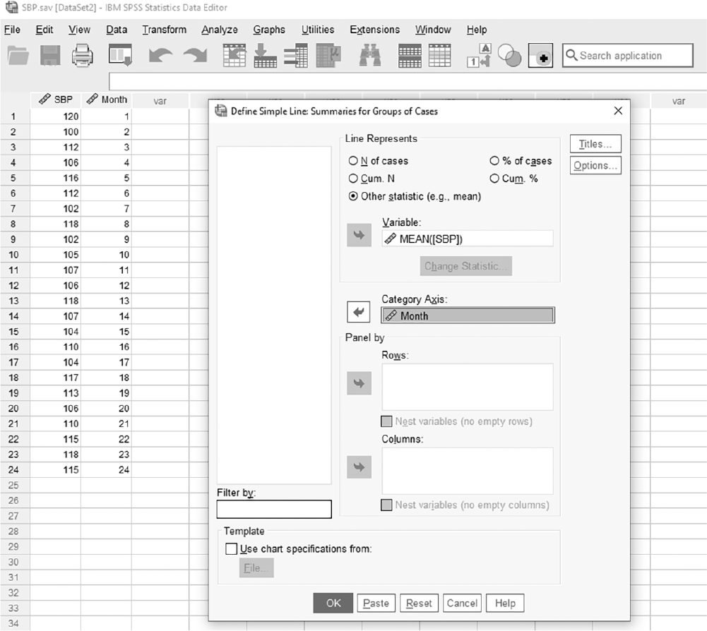
To create a line chart in SPSS, you will open SBP.sav and go to Graph > Legacy Dialogs > Line, as shown in Figure 6-42. In the Line Charts box, you will leave "Simple" and "Summaries for Groups of Cases" selected as the default, and click "Define," as shown in Figure 6-43. In the Define Simple Line box, you will then move a variable of interest, Systolic Blood Pressure, into "Variable" after clicking a radio button for "Other Statistics" (e.g., mean) and Month into "Category Axis," as shown in Figure 6-44. Clicking "OK" will then produce the output, as shown in Figure 6-39.
Selecting a line chart window in SPSS.
A screenshot displays a dialog box with various chart types, and the line chart option is highlighted for selection.
Reprint Courtesy of International Business Machines Corporation, © International Business Machines Corporation. "IBM SPSS Statistics software ("SPSS")". IBM®, the IBM logo, ibm.com, and SPSS are trademarks or registered trademarks of International Business Machines Corporation.
Selecting a simple line chart window in SPSS.
A screenshot displays a dialog box showing multiple line chart styles, with the simple line chart option highlighted.
Reprint Courtesy of International Business Machines Corporation, © International Business Machines Corporation. "IBM SPSS Statistics software ("SPSS")". IBM®, the IBM logo, ibm.com, and SPSS are trademarks or registered trademarks of International Business Machines Corporation.
Defining a variable in a line chart in SPSS.
A screenshot displays a dialog box where a variable is selected for the horizontal axis and another variable for the vertical axis.
Reprint Courtesy of International Business Machines Corporation, © International Business Machines Corporation. "IBM SPSS Statistics software ("SPSS")". IBM®, the IBM logo, ibm.com, and SPSS are trademarks or registered trademarks of International Business Machines Corporation.
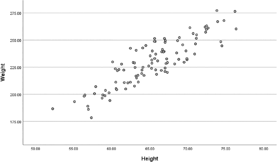
Scatterplots are used when an investigator wishes to examine the relationship between two continuous variables, for example, age and systolic blood pressure. Relationships can be in either positive or negative direction. A positive relationship means that both variables move in the same direction, such as increased smoking and the increased probability of getting lung cancer, whereas a negative relationship implies that the variables move in opposite directions, such as lower self-esteem and increased depression. Figure 6-45 shows an example of a scatterplot.
Example scatterplot for a relationship between height and weight in SPSS.
A screenshot displays a scatterplot with height values on the horizontal axis and weight values on the vertical axis, showing individual data points representing each observation.
Reprint Courtesy of International Business Machines Corporation, © International Business Machines Corporation. "IBM SPSS Statistics software ("SPSS")". IBM®, the IBM logo, ibm.com, and SPSS are trademarks or registered trademarks of International Business Machines Corporation.
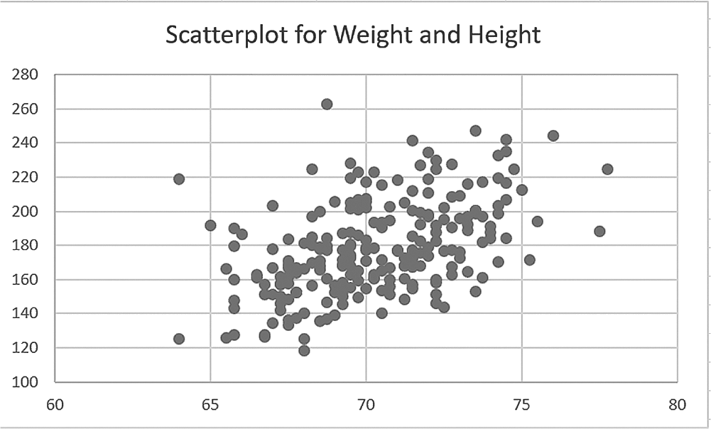
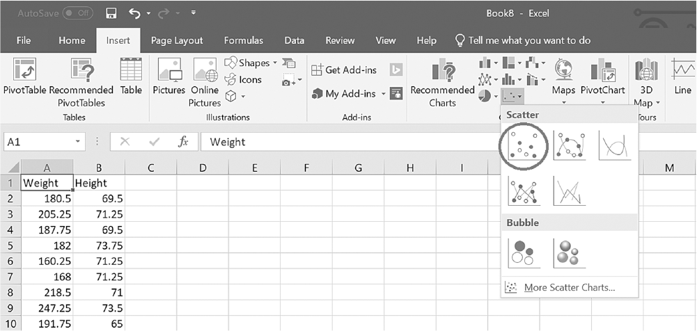
To create a scatterplot in Excel, you will open WeightHeight.xlsx. With any cell in column A selected, click on the arrow by "Insert Scatter (X, Y)" or "Bubble Chart" button under the Insert tab, and then select "Scatter" from the list, as shown in Figure 6-46. Clicking on the chart type will produce the output (Figure 6-47). Note that you can change "Chart Title" by double-clicking and typing on it, and also adjust scales on both the x-axis and y-axis by double-clicking and changing the range.
Selecting scatterplot in Excel.
An Excel screenshot displays the types of scatterplots to be selected. The data in the worksheet shows the column headings as Weight and Height, with ten rows of numerical data.
Courtesy of Microsoft Excel © Microsoft 2020.
Example scatterplot for weight and height in Excel.
A scatterplot in Excel shows the relationship between height and weight.
The horizontal axis ranges from 60 to 80, in increments of 5. The vertical axis ranges from 100 to 280, in increments of 20. The plots show an increasing trend. There are clusters between the points (65.5, 125), (65.5, 190), (74.5, 200), (74.5, 155). The plots are scattered at points x greater than 75, and at points x less than 65.
Courtesy of Microsoft Excel © Microsoft 2020.
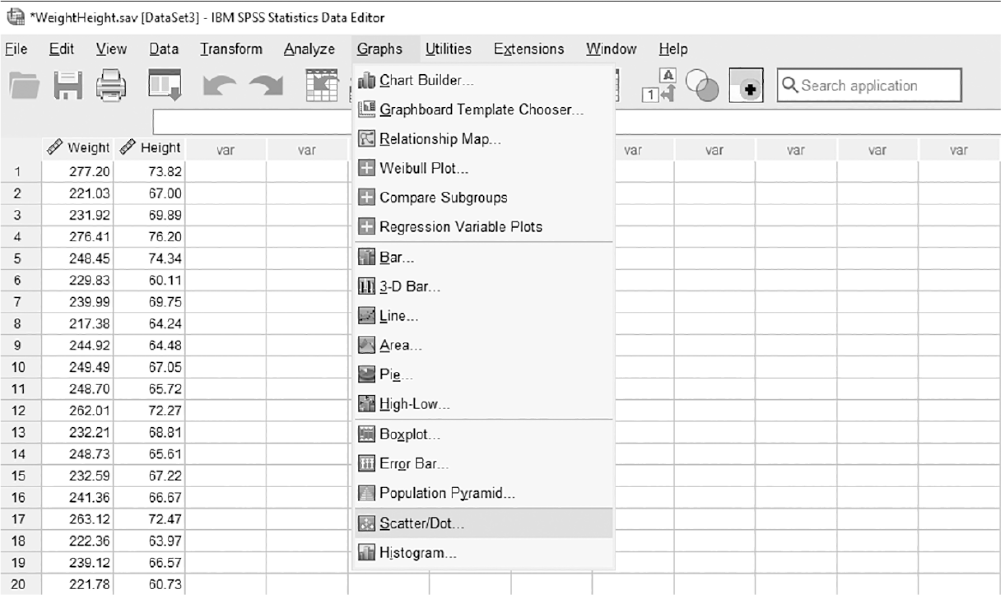
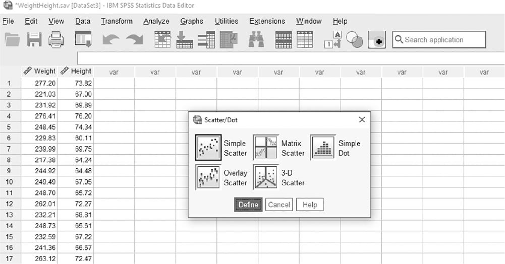
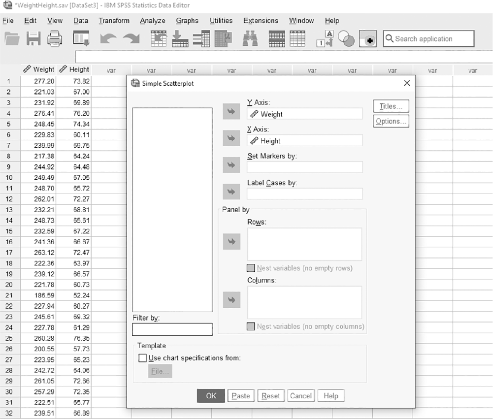
To create a scatterplot in SPSS, you will open WeightHeight.sav and go to Graph > Legacy Dialogs > Scatter/Dot, as shown in Figure 6-48. In the Scatter/Dot box, you will leave "Simple Scatter" selected as the default, and then click "Define," as shown in Figure 6-49. In the Simple Scatterplot box, you will move an independent variable, Height, into "X Axis" and a dependent variable, Weight, into "Y Axis," as shown in Figure 6-50. Clicking "OK" will then produce the output, as shown in Figure 6-45.
Selecting a scatterplot in SPSS.
A screenshot displays a dialog box with chart types, and the scatterplot option is highlighted for selection.
Reprint Courtesy of International Business Machines Corporation, © International Business Machines Corporation. "IBM SPSS Statistics software ("SPSS")". IBM®, the IBM logo, ibm.com, and SPSS are trademarks or registered trademarks of International Business Machines Corporation.
Selecting a simple scatterplot in SPSS.
A screenshot displays a dialog box showing multiple scatterplot styles, with the simple scatterplot option highlighted.
Reprint Courtesy of International Business Machines Corporation, © International Business Machines Corporation. "IBM SPSS Statistics software ("SPSS")". IBM®, the IBM logo, ibm.com, and SPSS are trademarks or registered trademarks of International Business Machines Corporation.
Defining variables in a scatterplot in SPSS.
A screenshot displays a dialog box where one variable is assigned to the horizontal axis and another variable to the vertical axis for plotting.
Reprint Courtesy of International Business Machines Corporation, © International Business Machines Corporation. "IBM SPSS Statistics software ("SPSS")". IBM®, the IBM logo, ibm.com, and SPSS are trademarks or registered trademarks of International Business Machines Corporation.
We have discussed many different methods of displaying data and statistical results, and most of these tables and charts are easy to create, use, and understand. However, if any of these charts are not carefully selected and designed, they can present false or misleading information. You should consider four elements when choosing the best type of graph or table for your data.
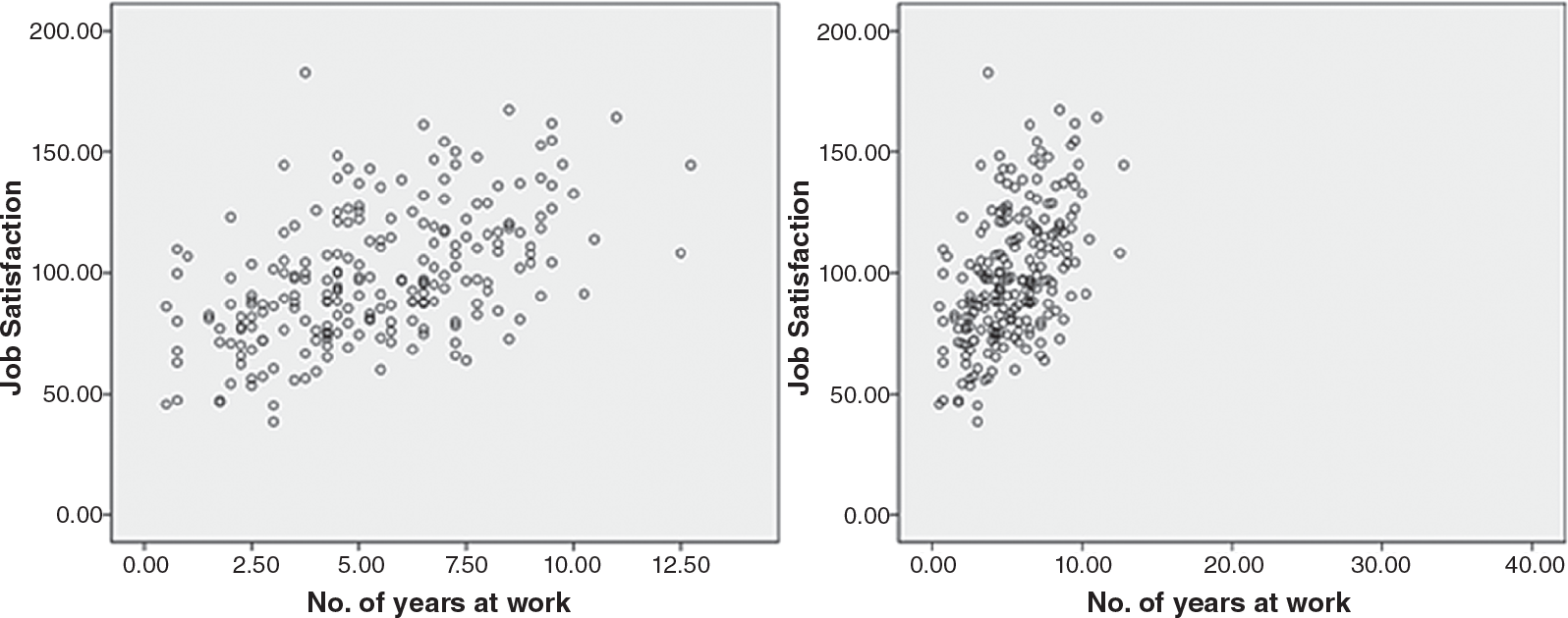
First, you need to ask yourself whether you have chosen the most appropriate type of graph for the data. This means considering the level of measurement and the data set's size and complexity. For example, you would not want to generate a histogram to display the data values on an ethnicity variable, or a bar chart for the sodium content level of 100 patients. Second, you should ensure that you have provided enough information on each component of the graph. The title for the graphic should be descriptive, and the variables should be clearly identified. Third, ensure that the independent variable is placed on the horizontal axis, while the dependent variable is placed on the vertical axis. If it is reversed, the graph may illustrate a different picture than what you want to show. Finally, you also have to ensure that the graph has been drawn on the proper scale, as it may show a different scenario than what is actually occurring if it is incorrectly drawn. Figure 6-51 is a perfect example of how an inappropriately scaled graph can be misleading. Although the data do not display a strong relationship between the number of years worked at the current job and job satisfaction (as presented in the graph on the left), the graph on the right shows a very strong positive relationship because of the inappropriately defined scale.
Example of data distortion.
Two scatterplots depict the relationship between years at work and job satisfaction, with the second scatterplot showing an inappropriate scaled graph.
Scatterplot on the left: The horizontal axis is labeled No. of years at work and ranges from 0 to 12.50, in increments of 2.50. The vertical axis is labeled job satisfaction and ranges from 0.00 to 200.00. The plots show an increasing trend. There are multiple plots between the points (0.50, 49.00), (0.50, 110.00), (10.00, 154.00), and (10.50, 80.00). Scatterplot on the right: The horizontal axis is labeled No. of years at work and ranges from 0 to 40.00, in increments of 10.00. The vertical axis is labeled job satisfaction and ranges from 0.00 to 200.00. There is a cluster of plots between the points (0.50, 49.00), (0.50, 110.00), (10.00, 154.00), and (10.50, 80.00), with the majority portion of the graph empty and the data not clear.
Reprint Courtesy of International Business Machines Corporation, © International Business Machines Corporation. "IBM SPSS Statistics software ("SPSS")". IBM®, the IBM logo, ibm.com, and SPSS are trademarks or registered trademarks of International Business Machines Corporation.
Graphs and charts are a useful and efficient way of displaying data, especially when the amount of data to present is large. When the table, graph, or plot is created thoughtfully, your data will be more clearly understood and more meaningful. The careful nurse investigator should keep in mind what each chart is good for and choose a chart accordingly.
Bar charts and pie charts are good for displaying the frequency or percentage of given categories. Line charts are also good when the variable for the horizontal axis is categorical.
Histograms, stem and leaf plots, and boxplots are good for displaying the distribution of continuously measured variables. A histogram is similar to a bar chart in structure, but it is used to show the distribution of data values. Stem and leaf plots show the same information as a histogram, but they show the actual data. A boxplot is probably the chart with the most information, as it shows information on potential outliers, the center values, and the 25th and 75th percentiles.
However, all of these charts can be easily manipulated to produce false information if they are not carefully designed. Therefore, we should think carefully about which type of graphs or charts will best fit the data, and be certain to include enough information on each component of the graph so that readers can accurately interpret the display.
What are the purposes of constructing a graph or table to display information about a variable?
Levels of measurement are an important factor in determining which chart to use. Explain why this is the case.
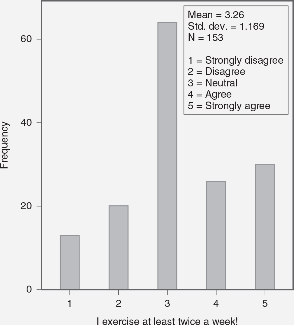
Refer to the graph that follows for questions 3 to 5.
Does this chart seem to be appropriate for this data? Why or why not? Explain your answer.
Is the title appropriately worded?
Is there any component of this chart that you think is not complete or is confusing? Explain.
How can the choice of graphical representation affect the interpretation of healthcare data? Provide an example of a misleading graph and explain its impact.
Compare and contrast bar charts and histograms. In what scenarios would each be most appropriately used in nursing research?
Describe how you would organize and display data from a survey on patient satisfaction to ensure clarity and accuracy.
How can descriptive statistics and data visualization help in identifying trends and patterns in patient outcomes over time? Provide a specific example.
Imagine you have a data set on medication errors in a hospital. How would you use various graphical displays to communicate the findings effectively?

A histogram shows the frequency of exercising twice a week.
The horizontal axis is labeled, I exercise at least twice a week, and lists 1 through 5. The vertical axis is labeled Frequency and ranges from 0 to 60, in increments of 20. The approximate data from the graph is as follows. 1: 17; 2: 20; 3: 62; 4: 25; 5: 27. The text on the right of the graph read: Mean equals 3.26; standard deviation equals 1.169; N equals 153. The list on the horizontal axis refers to the following terms: 1 equals strongly disagree; 2 equals disagree; 3 equals neutral; 4 equals agree; 5 equals strongly agree.
True or False: A histogram is useful when an investigator is trying to display information about a categorical variable.
True or False: Bar charts and pie charts can convey similar types of information.
True or False: There is no chart that allows an investigator to identify possible outliers.
Which of the following is a good example of data that can be appropriately displayed with a line chart?
Ethnicity
Systolic blood pressure
Income
Age
Which of these charts allows an investigator to examine a possible relationship between two continuous variables?
Histogram
Bar chart
Scatterplot
Line chart
True or False: A box-and-whisker plot can help identify outliers in the data.
True or False: A line graph is typically used to compare different categories of data at a single point in time.
What does the interquartile range (IQR) represent in a box-and-whisker plot?
The range of the entire data set
The average value of the data set
The middle 50% of the data
The most frequent value in the data set
True or False: The purpose of data visualization is to present data in a way that is easy to understand and interpret.
True or False: When displaying data, it is important to label axes and include a legend if necessary to ensure clarity.