This chapter prepares you for data analysis by guiding you through the evaluation of data quality and the assessment of assumptions underlying the proposed statistical tests. By the end of this chapter, you will be able to:
Define missing data and outliers and understand how these can affect an analysis.
Understand and apply remedies for missing data and outliers.
Understand the importance of checking assumptions of statistical tests prior to analysis.
Before conducting hypothesis testing, the investigator must ensure that data are free of any errors. Data cleaning is an important first step in every data analysis to prevent the introduction of errors in the results. Let us consider, for example, the variable "citizenship." If we have specified the variable range as "citizen" and "noncitizen," then we would expect to have only two possible responses in our data set. If we have collected data on another variable, "age," and we are studying adults between the ages of 18 and 24, then the responses on that variable should be between those limits. For both citizenship and age, we would be concerned if a response is missing or if the data set has a value outside the expected range. If the data are inaccurate, the inferred results will not be accurate either. The general steps of conducting hypothesis testing were covered in Chapter 7.
Errors in data are part of every study and may be introduced into data and results via missing data, outliers, violation of the assumptions for the proposed statistical tests, incorrect data entry, and data loss. A responsible investigator will have a plan to manage these issues to make accurate statements about statistical results. Similarly, as we read study reports, it is important to examine the statistical findings to determine how errors have been identified and treated in the analysis. A thorough understanding of how the investigator has managed missing data and outliers will help us determine the quality of the findings. Errors are a threat to both the internal and external validity of a study. For example, large amounts of missing data may limit either conclusions about the effect of an independent variable on the dependent variable or the generalizability of study findings to the target population.
Missing data occur when a study participant or subject deliberately or accidentally omits responses to a variable, when data are inadvertently left out, or when an investigator has not found a way of measuring a variable. The absence of data can significantly impact the validity and reliability of study results. Understanding the types of missing data, the reasons for their occurrence, and the appropriate methods for handling them is crucial for accurate data analysis and interpretation. There are several ways of dealing with missing data, and how serious a problem it poses depends on the amount and the pattern of missing data (i.e., whether the missing data are random or nonrandom). Sometimes the problem is simply one of transcription, with the person entering data having mistakenly omitted some value or set of values. Transcription errors are easily corrected by returning to the original data and making the necessary changes in the statistical software database.
The pattern of missing data has to do with whether the data are missing randomly or nonrandomly; this may be a more important issue than how much of the data set is missing. Understanding why and how the data are missing can help us find the correct solution.
Missing data are considered random when they are scattered in the database without any pattern. Consider a study about the relationship between income and health. If some participants across all different income levels did not provide information on their health, the missing data on health is not related to the level of income; this is considered random missing data.
In contrast, missing data are considered nonrandom when a pattern in the missing data is apparent. Nonrandom missing data are more problematic because the pattern will distort the results and jeopardize internal and external validity. Think about a study to investigate the relationship between gender and smoking. If the women participants consistently do not provide information on their smoking habits, but most of the men do, then the missing data on smoking may be related to gender identity and the data are nonrandom. In this example, the investigator should not report on the relationship between smoking and gender without dealing with the missing data first.
The pattern of missing data is important, but the volume of missing data can also be problematic. In general, the problem gets worse as the amount of missing data increases. There is no simple answer for how much missing data can be tolerated; the investigator must judge the effect of data loss on statistical power.
Missing data is a serious problem in data analysis as it can affect the generalizability of the results, and so it needs careful handling. Proper handling of missing data improves the robustness and credibility of research findings. There are several potential remedies for missing data. The decision of how to handle missing data is crucial and should be made in the context of the given problem.
The simplest approach to deal with missing data is to delete those cases with missing data and run the data analyses with only the complete cases. However, this approach only works if there are little missing data and if the missing data are random. If there are a large number of missing data in comparison with the total sample size, deleting those cases will result in a substantial loss of information. In addition, there could be a serious distortion of the data from the deletion of missing data if the pattern of missing data is not random. The general rule is to delete the missing data only if a small amount of the data (say 5% or fewer) is missing at random.
The next approach is to estimate the missing values and use these estimates in the data analysis. Estimation still introduces bias into the analysis, but it is useful when the sample size is small and the deletion of missing data will create further problems. There are several useful estimation procedures to replace missing data, such as using prior knowledge, substituting with mean values, estimating with regression models, expectation maximization, and using multiple imputations. We will discuss the most straightforward approaches: using prior knowledge and substituting with mean values.
Using prior knowledge may be the simplest estimation approach; we make a well-educated guess from prior knowledge to substitute for the missing data. This is an adequate estimation procedure if you have extensive experience with a research area and when the sample size is small. For example, a nurse carrying out a quality improvement project is collecting data on the ratio of nurses to patients in the general medical units. The nurse, having worked on these units for some years and having conducted similar projects, knows that the range is from 1:4 on the day shift to 1:6 on the night shift. When encountering missing data from a few shifts, the nurse substitutes these values based on experience.
Substituting missing data with mean values is another simple approach for estimating missing data. In this case, the investigator calculates an arithmetic average or mean from the available data, and that mean is used to replace the missing data. This approach is convenient because a calculated mean replaces each missing data point, and it often provides a more accurate estimation than prior knowledge. A quick example would be replacing missing data on the average daily number of medication errors with an average from the previous month. However, this estimation approach reduces the variability in the data set, as the mean value replacing the missing data will likely differ from the actual missing values. Note that the mean values should be computed for each group if the data are divided by a grouping variable.
Any data value that is an unexpected value or outside the expected range of values for that variable is considered an outlier. They can arise due to variability in the data, measurement errors, or data entry errors. In the study of adults, perhaps we find that all but one participant are 18 to 20 years old and that one participant is 46 years old. This participant's age, if accurately recorded, would be considered an outlier, as the participant is far older than other members of the study. Consider an example scatterplot created with SBP_Weight.sav, displayed in Figure 9-1.
Example scatterplot for weight and systolic blood pressure (SBP).
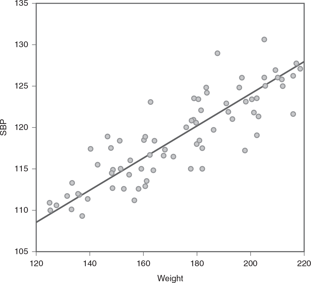
A scatterplot shows the relationship between weight and systolic blood pressure, S B P.
The horizontal axis is labeled, Weight, and ranges from 120 to 220, in increments of 20. The vertical axis is labeled, S B P, and ranges from 105 to 135, in increments of 5. The plots show an increasing trend. A diagonal line is drawn from y = 108 at the extreme left of the graph to y = 127 at the extreme right. The approximate data are as follows. There are plots between the points (122, 110), (138, 108), (135, 113), (140, 117), (158, 111), (162, 123), (180, 115), (180, 125), (185, 129), (199, 116), (192, 126), (205, 132), (215, 121), and ((217, 127).
You will notice that the scatterplot indicates that the data points are relatively close to each other from the center. However, the center line of this plot is shifted upward (as presented in Figure 9-2, created with SPB_Weight_Outlier.sav when a data value in the upper-right portion of the scatterplot is introduced. This is because the unusually large data value has increased the probable mean value. Identifying and handling outliers is crucial as they can have a substantial impact on statistical analyses, potentially leading to misleading conclusions.
Scatterplot for weight and SBP with an outlier.
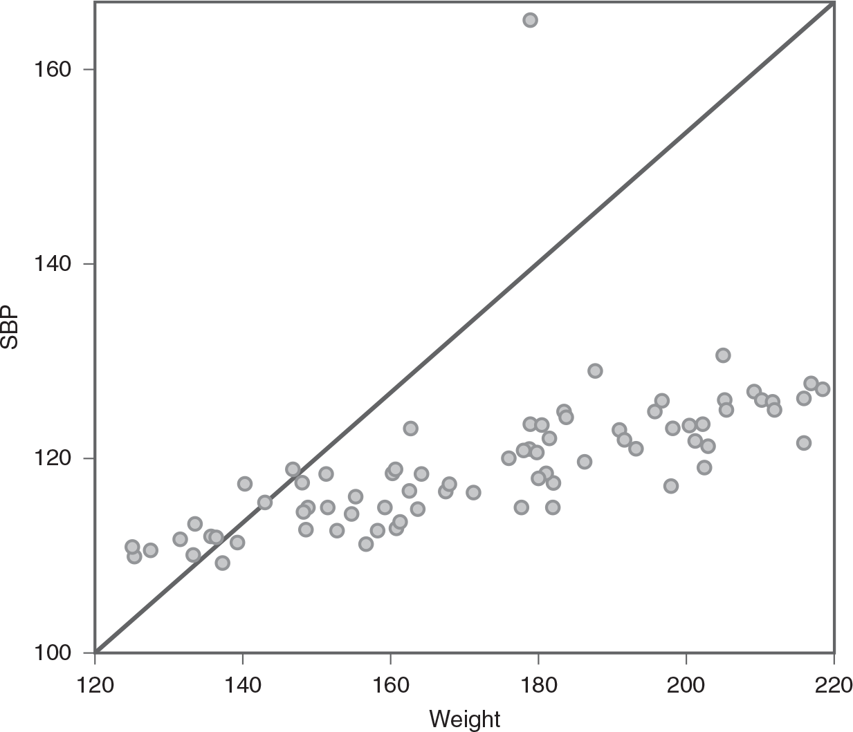
A scatterplot shows the relationship between weight and systolic blood pressure, S B P, with an outlier.
The horizontal axis is labeled, Weight, and ranges from 120 to 220, in increments of 20. The vertical axis is labeled, S B P, and ranges from 100 to 160, in increments of 20. The plots show an increasing trend. A diagonal line is drawn from (0, 0) to the highest point on the top right of the graph. The approximate data are as follows. There are plots between the points (122, 110), (138, 108), (135, 113), (140, 117), (158, 111), (162, 123), (180, 115), (180, 125), (185, 129), (199, 116), (192, 126), (205, 132), (215, 121), and ((217, 127). There is a lone plot at (175, 167).
Sometimes it may be difficult to determine whether an observation or measurement is an outlier, and the decision can be somewhat subjective. However, the following are commonly used approaches in identifying outliers in a data set.
A review of visual displays of data, such as graphs and plots, is the easiest way of identifying outliers. Observations or data points that are far away from the mass of data can be considered outliers. Several graphical displays useful for identifying the outliers include the scatterplot, histogram, and boxplot. You should be able to easily identify the outliers, as we saw in the scatterplots in Figure 9-1 and Figure 9-2. A histogram can also be useful for identifying outliers; any data points that lie far to the left or right side of all the other data are identified as outliers. In a boxplot, any data values that are either below the lower whisker or above the upper whisker are outliers. You will recall from Chapter 6 that the lower whisker equals 1.5 times the minimum data value and the upper whisker equals 1.5 times the maximum data value.
Another way of identifying the outliers is to examine the corresponding standardized score (i.e., z-scores) of the raw data. When you transform the raw data into z-scores, if the z-scores are unusually large or small, those data values should be treated as outliers. A general rule is that a data value is an outlier if its corresponding z-score is outside the −3 to +3 range, as we would expect 99.8% of all data values in the set to fall in this range as per characteristics of a normal distribution. The process for transforming raw data into z-scores was covered in Chapter 6.
Because outliers may be a serious problem in data analysis and can threaten internal and external validity, remedies should be considered before the data are analyzed. First, check if a transcription error is the cause of the outlier. If transcription is not the problem, other remedies may be implemented. Similar to missing data, the decision of how to handle the outliers is crucial and should be made in the context of a given problem.
The simplest way to deal with outliers is to delete those unusual cases and then run the data analysis with normal cases. However, this approach should be considered only if it is clear that the unusual data value is not a part of the intended population for the study and the number of outliers is small. For example, you know that a person who is 25 years old is not a part of your population if you define your intended population as people who are older than 50 years old.
When outliers are present in the data set, the distribution of the data will likely be skewed. This means the outlier is pulling the mean of the data in one direction or another, and this will lead to a violation of the commonly required assumption of normality (i.e., normal distribution of the variable). Transformation (arithmetic manipulation) of the data may seem to distort the data, but when all data values are transformed, the consistency and relationship between values remain the same. There are four commonly used transformation approaches: log transformation, square root transformation, reciprocal transformation, and reverse transformation. The first three transformation approaches attempt to correct problems with positive skewness, and the reverse transformation attempts to correct problems with negative skewness. Among approaches for correcting positive skewness, log transformation is for mild skewness, square root transformation is for moderate skewness, and reciprocal transformation is for severe skewness. If you are unsure how severe the skewness problem is, the best approach may be to experiment to examine which one transforms the distribution to normal, starting with log transformation. Please refer to Chapter 6 for a detailed discussion of skewness.
Each transformation approach can be performed in Microsoft Excel using formulas and functions. You will select an empty cell for the transformed values to start from and type in "=ln(B2)" for log transformation, as displayed in Figure 9-3. You will find the fill handle in the lower-right corner of the cell that resembles a little black square and drag this fill handle down to cell D76. This should copy the formula and automatically adjust it for all cells in column D, as presented in Figure 9-4. Note you will enter "=sqrt(B2)" for square root transformation and "=1/B2" for reciprocal transformation.
Selecting a cell and writing a function to transform a variable in Excel.
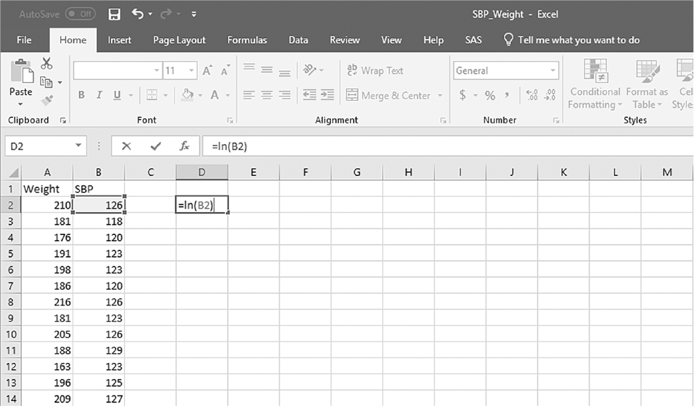
An Excel screenshot shows two columns of data and a transformation function displayed in a cell.
The top right corner of the window reads, S B P_Weight - Excel, and at the top left corner is the Quick access toolbar. The menu bar is below the quick access toolbar, with the menu, Home, selected. The groups Clipboard, Font, Alignment, Number, and Styles, each with its list of commands are displayed below the menu bar. Row 1 in Column A displays the heading weight, with three-digit numbers displayed from row 2 through row 14; Row 1 in Column B displays the heading S B P, with three-digit numbers displayed from row 2 through row 14. The cell D 2 displays the function, equal to l n of B 2, where the value of B 2, 126, is selected.
Courtesy of Microsoft Excel © Microsoft 2020.
Using fill handle to automatically compute translated values in Excel.
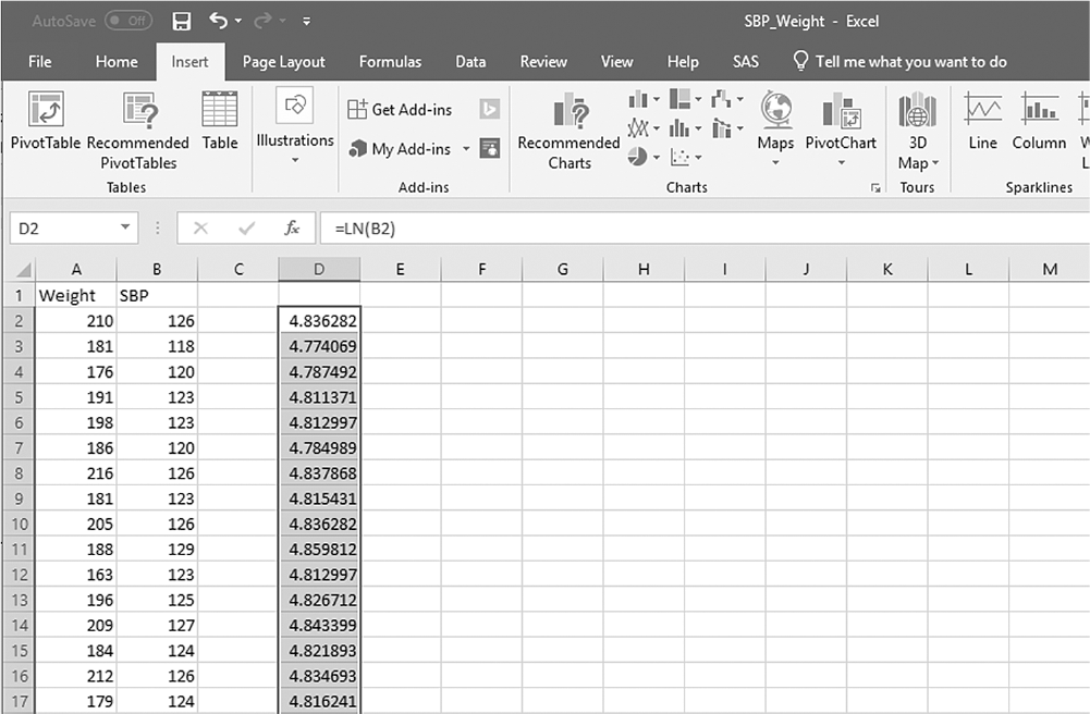
An Excel screenshot shows two columns of data and the output from a transformation function displayed in a third column.
Row 1 in Column A displays the heading weight, with three-digit numbers displayed from row 2 through row 17; Row 1 in Column B displays the heading S B P, with three-digit numbers displayed from row 2 through row 17. The cell D 2 displays the output of the function, l n of B 2. The output is displayed in the other cells in the column, with the formula copied to the cells, by dragging the fill handle down to the cell D17.
Courtesy of Microsoft Excel © Microsoft 2020.
Each transformation approach can also be performed in IBM SPSS Statistics software (SPSS) using "Compute Variable" under the Transform pull-down menu. In the Compute Variable dialogue box, as displayed in Figure 9-5, you give a target variable a name and write a transformation function you want to perform under the "Numeric Expression" subwindow. It is important to then check whether or not the transformation corrected the problem with the outliers; histograms can be used for this purpose, and an example of how to decide which transformation is the most appropriate is presented in Figure 9-6. In this example, the reciprocal transformation of the original variable, SBP, seems to correct the issue of skewness the best.
The "Compute Variable" dialogue box in SPSS.
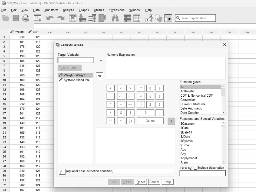
A screenshot displays the Compute Variable dialog box in SPSS with fields to enter a target variable, a numeric expression box, and a list of available variables on the right side.
Reprint Courtesy of International Business Machines Corporation, © International Business Machines Corporation. "IBM SPSS Statistics software ("SPSS")". IBM®, the IBM logo, ibm.com, and SPSS are trademarks or registered trademarks of International Business Machines Corporation.
Example histograms of the transformed variable, SBP.
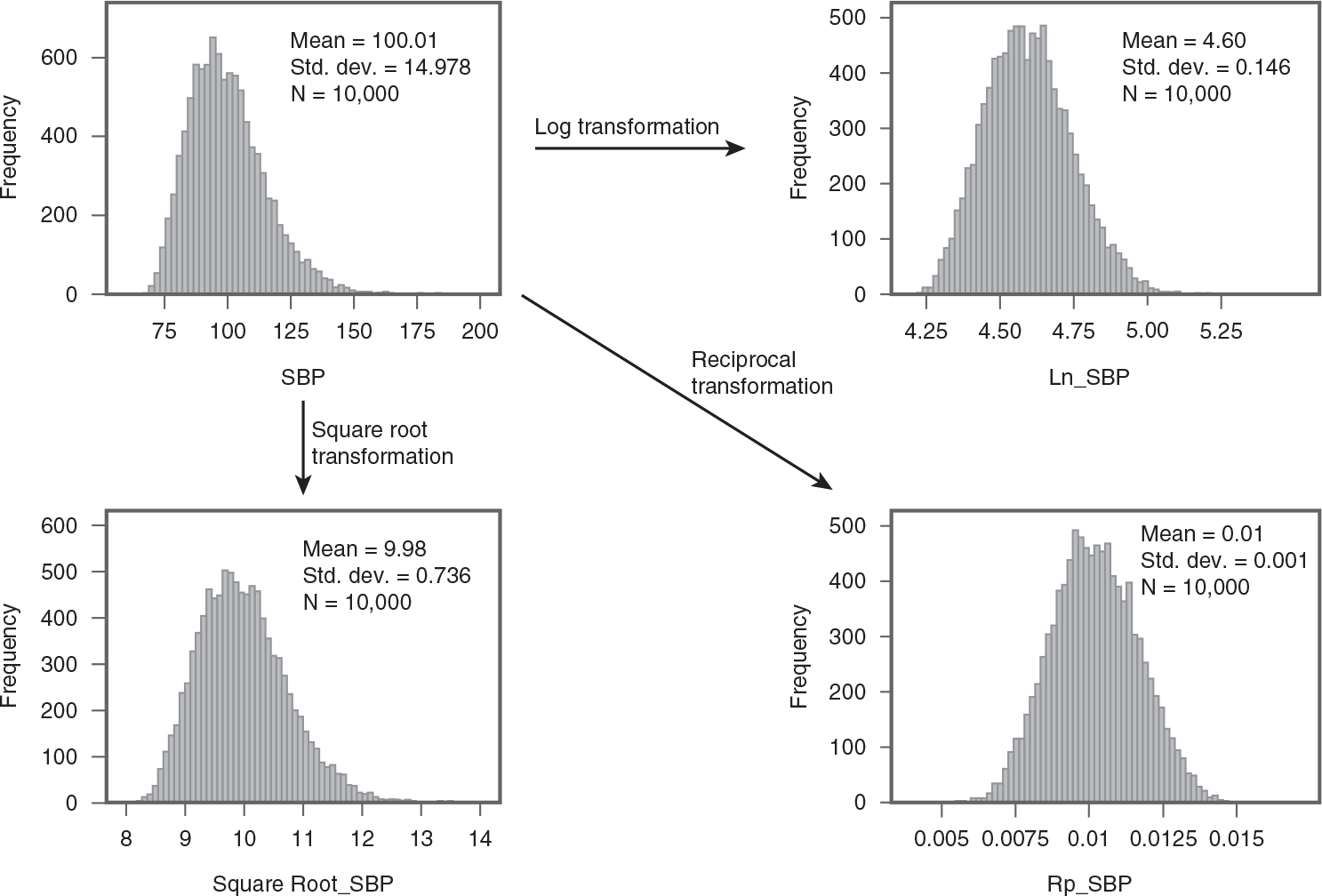
Four histograms show different transformation of the same data.
Top left: The horizontal axis is labeled S B P and ranges from 50 to 200, in increments of 25; the vertical axis is labeled frequency and ranges from 0 to 800, in increments of 200. Approximate data from the graph in the format, S B P: Frequency, are as follows. 75: 100; 88: 680; 100: 570; 125: 170; 150: 10. Mean equals 100.01; standard deviation equals 14.978; N equals 10,000. An arrow points to a histogram on the top right and the text reads, log transformation. Top right: The horizontal axis is labeled L n S B P and ranges from 4 to 5.25, in increments of 0.25; the vertical axis is labeled frequency and ranges from 0 to 500, in increments of 100. Approximate data from the graph in the format, L n S B P: Frequency, are as follows. 4.25: 10; 4.37: 300; 4.50: 475; 4.75: 330; 4.87: 90; 5.00: 15. Mean equals 4.60; standard deviation equals 0.146; N equals 10,000. An arrow points from the top left histogram to a histogram on the bottom left and the text reads, square root transformation. Bottom left: The horizontal axis is labeled square root S B P and ranges from 8 to 14, in unit increments; the vertical axis is labeled frequency and ranges from 0 to 600, in increments of 100. Approximate data from the graph in the format, square root S B P: Frequency, are as follows. 8.5: 70; 9: 260; 9.6: 500; 10: 450; 11: 160; 11.5: 90; 12: 15. Mean equals 9.98; standard deviation equals 0.736; N equals 10,000. An arrow points from the top left histogram to a histogram on the bottom right and the text reads, reciprocal transformation. Bottom right: The horizontal axis is labeled R p square root S B P and ranges from 0.005 to 0.015, in increments of 0.0025; the vertical axis is labeled frequency and ranges from 0 to 500, in increments of 100. Approximate data from the graph in the format, R p S B P: Frequency, are as follows. 0.006: 8; 0.0075: 125; 0.0087: 485; 0.01: 460; 0.0112: 400; 0.0125: 150; 0.0137: 10. Mean equals 0.01; standard deviation equals 0.001; N equals 10,000.
If transforming the data fails to correct the problems associated with outliers, you can consider changing the data value(s). Changing scores can be particularly useful when outliers are not errors but rather legitimate values that unduly influence the results. However, this approach should be used cautiously to avoid any appearance of unethical manipulation of data. The value should be changed in a way so that it is still treated as an outlier, but diminishes the biasing effect on the data analysis results. As with all approaches to managing outliers, you must state exactly your process in the methods section of the report, but it is especially important here to avoid any appearance of data falsification. One of the following methods can be used to change the score:
Change the data value to one unit above the largest data value and then exclude the outlier. For example, assuming an investigator is using a 200-point scale and has three outliers of 189, 192, and 199, if the next-largest score other than these three outliers is 142, the investigator may change these values to 143.
Convert any data with a z-score of 3.29 or larger back to the original data scale using x = z× s+ µ, where x is the converted data value, z is the z-score, s is the standard deviation, and µ is the mean. This value is chosen because a z-score of 3.29 or larger is often considered as an outlier. In this example, we have reduced the effect of the outliers 189, 192, and 199 by converting to a score of 149.48, and they remain in the data set at the extreme end.
Most of the statistical tests described in this text are types of parametric tests. These tests require that certain assumptions are met and violations of the assumptions influence the validity of statistical results. The careful investigator must check whether the required assumptions are met before conducting the proposed analysis.
The common assumptions for parametric tests are as follows:
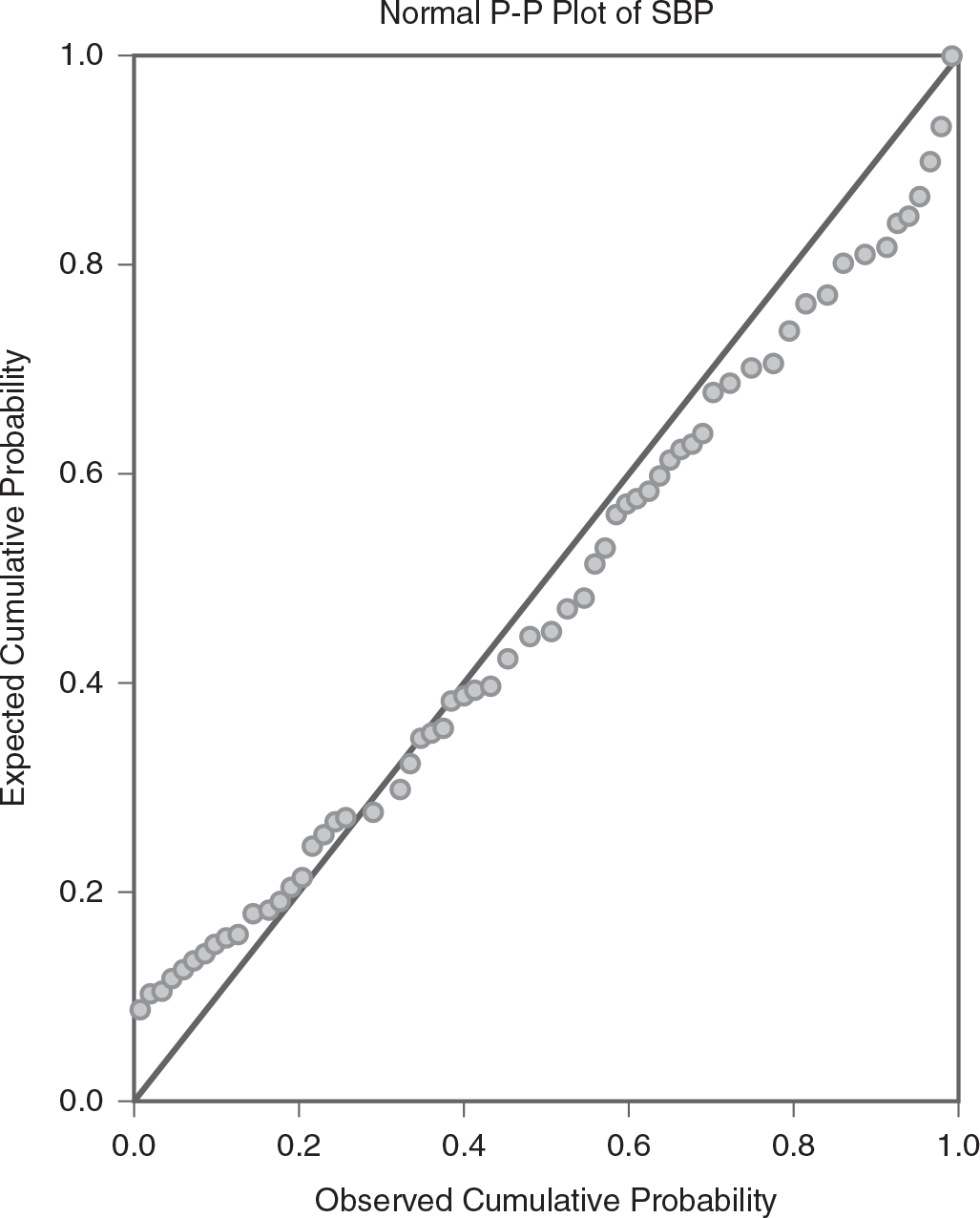
Data should be normally distributed. Each statistical test requires a specific factor to be normally distributed. This assumption states that the data should follow a normal distribution, which is a bell-shaped, symmetrical distribution centered around the mean. It may be the dependent variable for some tests, or it may be the error values that have to be normally distributed. Understanding and verifying this assumption is essential for the validity of test results. The normality assumption can be checked in several ways. First, it can be checked visually through histograms or P-P plots. In a histogram, you will want to observe a symmetrical, bell-curved distribution if the data are normally distributed. A P-P plot is the cumulative probability distribution of a variable against the cumulative probability normal distribution. You would want to observe the majority of data values fall on or close to the upward slope of the right diagonal line. If the data values deviate much from this diagonal line, the data distribution is said to be nonnormal. An example P-P plot is displayed in Figure 9-7. Second, you can use the measures of skewness and kurtosis. These measures should fall in the −1 to +1 range if the data are normal. Finally, you can perform statistical tests: the Kolmogorov-Smirnov test and/or the Shapiro-Wilk test. To perform these tests, go to Analyze > Descriptive Statistics > Explore in SPSS. Click the "Statistics" button, and then check "Normality Plots With Tests."
The hypotheses for these tests are as follows:
H0: The distribution is normal.
H1: The distribution is not normal.
The test indicates the violation of the normality assumption when the p-value associated with both tests is small. Note that these normality tests are only needed when the sample size is small, because such tests are robust against the violation of normality assumption with a robust sample size. An example output is presented in Table 9-1.
Variables should be measured at interval or ratio level.
Independence of the data. As with determining if data are normally distributed, you should be careful with this assumption because different statistical tests require different data to be independent. This assumption has to do with errors that result from unexpected correlations in the data. Such errors are particularly a problem if the proposed statistical tests are regression analyses. The Durbin-Watson statistic is an example of testing this assumption and will be discussed in Chapter 11. However, when the proposed statistical tests are to compare groups, this assumption means that the individuals in different groups have to be independent from each other for group comparison tests (i.e., no individual should be in more than one group). This case is relatively straightforward to examine and will be discussed in Chapter 12.
Equality of variance. This assumption states that the variance should be equal. Similar to assumptions of normality and independence, the comparison of variance is related to the nature of the analysis. If the proposed test is to compare groups, this assumption means that the variance across groups should be equal. If the proposed test is to examine a relationship, this assumption means that the variance of one variable should be equal at all levels of the other variables. Levene's test is one of several tests used for testing this assumption. The hypotheses for Levene's test are as follows:
H0: Variances across groups are equal.
H1: Not all variances across groups are equal.
Levene's test is determined to indicate a violation of the equal variance assumption when the p-value associated with Levene's test is small. An example output is presented in Table 9-2. Levene's test will be discussed in more detail in Chapter 12.

A scatterplot shows a normal P-P plot of systolic blood pressure, S B P.
The horizontal axis is labeled observed cumulative probability and ranges from 0.0 to 1.0, in increments of 0.2. The vertical axis is labeled expected cumulative probability and ranges from 0.0 to 1.0, in increments of 0.2. A diagonal line is drawn from (0.0, 0.0) to (0.9, 1.0). The plots are shows on the left of the line from (0.0, 0.08), reaching the line at (0.3, 0.3), and are at the right of the line from ((0.32, 0.32) to (0.9, 0.92), and finally reaching the line at (0.9, 1.0).
Data cleaning to correct errors is an important first step for every data analysis. Errors in the data set should be corrected before the analysis to reduce the introduction of errors into the results. Errors can be introduced into data and results in various ways, including from missing data, outliers, and violations of the underlying assumptions to be met for the proposed statistical tests.
Missing data occur when a participant does not respond to a variable and when data are skipped in data entry. We need to pay careful attention to the pattern of missing data, as nonrandom missing data present a more serious problem than random missing data. The volume of missing data is another important consideration, and the problem generally worsens as the amount of missing data increases. Missing data can be handled through either deletion or estimation. Deletion should be done only if the amount of missing data is small and it is missing in a random pattern. Otherwise, missing data should be estimated.
Outliers are another important source of errors in data and are defined as any unusual variable value in the data set. Outliers can be spotted through visual displays, such as histograms and scatterplots, or by examining corresponding z-scores of the raw data. Outliers can be handled through deletion, transformation, or changing the score. Deletion should be done only if you have a sound reason to do so; otherwise, transformation should be performed. If transformation does not solve the problem, you may consider changing the score.
All parametric tests require some assumptions. Common assumptions include normality of the data, independence of the data, interval data, and equality of variance. These assumptions should be checked before the data analysis is performed, as violations of the assumptions can distort the results.
Why should the investigator examine the data before conducting data analysis?
Where would information about the treatment of missing data be found in a report of research?
Suppose that one of the collected variables was "Birth Year," and we found out that one of the respondents wrote down the current year instead of their actual year of birth. What seems to be an appropriate action for this data?
Use the data file called Satisfaction.sav (found in the Navigate course accessed via the code included with this text) and determine which transformation method seems the most reasonable approach with an outlier(s).
Why is it important to understand the mechanism behind missing data before deciding on a method to handle it?
Explain the concept of data imputation. What are the potential risks and benefits of using this technique in clinical research?
How can outliers affect the mean and standard deviation of a data set? Provide examples from healthcare studies.
Discuss the implications of violating the assumption of normality in parametric tests. How can researchers test and address this assumption?
How can graphical methods like histograms be used to check the normality assumption? What are their limitations?
Discuss the implications of violating the assumption of normality in parametric tests. How can researchers test and address this assumption?
True or False: Normality is assumed with all parametric statistical tests; therefore, it is important to check whether the collected data are normally distributed.
True or False: Suppose that respondents who decided not to answer the question about annual income in a study of quality of life were not from any specific age group. This type of missing data is considered as random missing.
Which method replaces missing values with the mean of the observed data?
Listwise deletion
Median imputation
Mean imputation
Pairwise deletion
What is the main disadvantage of listwise deletion?
It retains all data points.
It can lead to significant data loss.
It is complex to implement.
It introduces bias.
Which test is used to check for homogeneity of variances?
Shapiro-Wilk test
Levene's test
Durbin-Watson test
Bartlett's test
True or False: Multiple imputation involves creating multiple complete data sets and combining the results.
True or False: Boxplots can be used to identify potential outliers in a data set.
True or False: Transformations can help stabilize variance and reduce skewness in data.
True or False: Outliers always need to be removed from the data set to ensure accurate results.
True or False: Listwise deletion removes any case with missing values from the analysis.