Throughout this text, we have stressed how important a visual check of statistical findings can be. A visual check is a useful first step in understanding the existence and nature of the relationship, and a scatterplot is a good choice for creating a visual display of the correlation. It is simply a twodimensional plot between two variables of interest, indicating how the data are spread between the variables. We refer to the relationship between two variables as a bivariate relationship (bi meaning two). Figure 10-1 is an example scatterplot displaying the relationship between age and depression.
Example scatterplot between age and depression, demonstrating a positive relationship.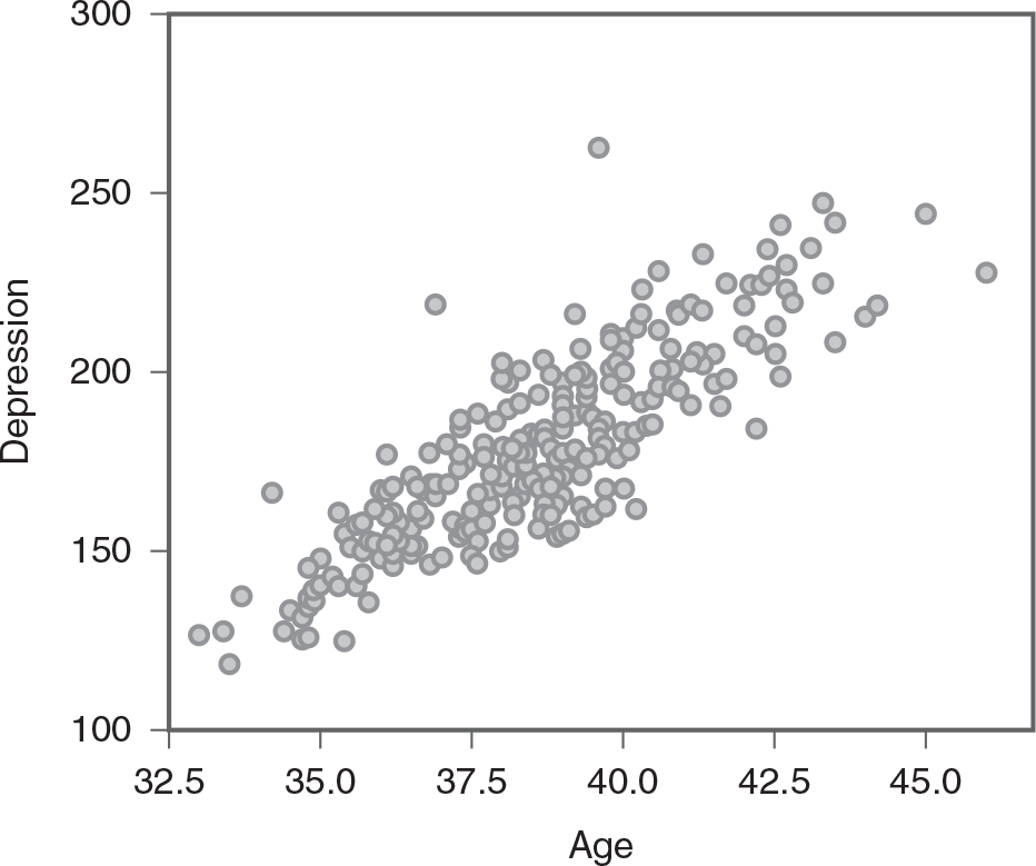
A scatterplot shows the relationship between age and depression.
The horizontal axis is labeled Age and ranges from 32.5 to 45, in increments of 2.5. The vertical axis is labeled Depression and ranges from 100 to 300, in increments of 50. The plots show an increasing trend. All data are approximate. There are some scattered plots surrounding the points (33, 122) and (33.5, 132), a plot each at (34, 168), (36.5, 220), (39, 265), (42, 180), (43.5, 214), (44, 240), and (46.5, 225), and clusters diagonally between (34, 122) and (43, 225).
When a scatterplot displays a pattern where the data points are moving in the same direction (i.e., one variable increases as the other increases), as in Figure 10-1, we say the variables are positively related. However, the variables are said to be negatively related if the data points move in the opposite direction (i.e., one variable increases as the other decreases), as in Figure 10-2. If the variables are not related, the data points are scattered randomly (Figure 10-3).
Example scatterplot displaying a negative relationship.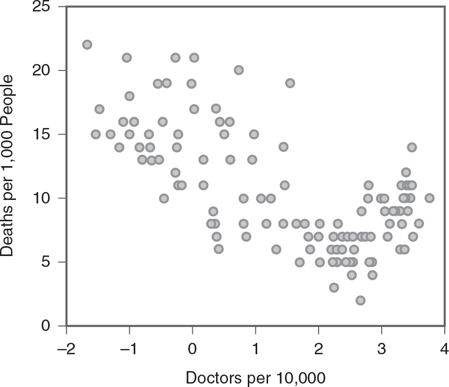
A scatterplot shows the relationship between doctors per 10,000 and deaths per 1,000 people.
The horizontal axis is labeled doctors per 10,000 and ranges from minus 2 to 4, in unit increments. The vertical axis is labeled deaths per 1,000 people and ranges from 0 to 25, in increments of 5. The plots show a decreasing trend. There are plots between the points (minus 1.6, 22), (minus 1, 21) (minus 1.5, 15), (0, 21), (minus 0.5, 10), (0.8, 20), (0.5, 6), (1.5, 8), (2, 5), and (2, 8). There are dense plots between the points (2.1, 6), (2.5, 5), (2.6, 5), (2.7, 11), (3, 10), (3.2, 12), and (3.5, 7).
Example scatterplot displaying no relationship.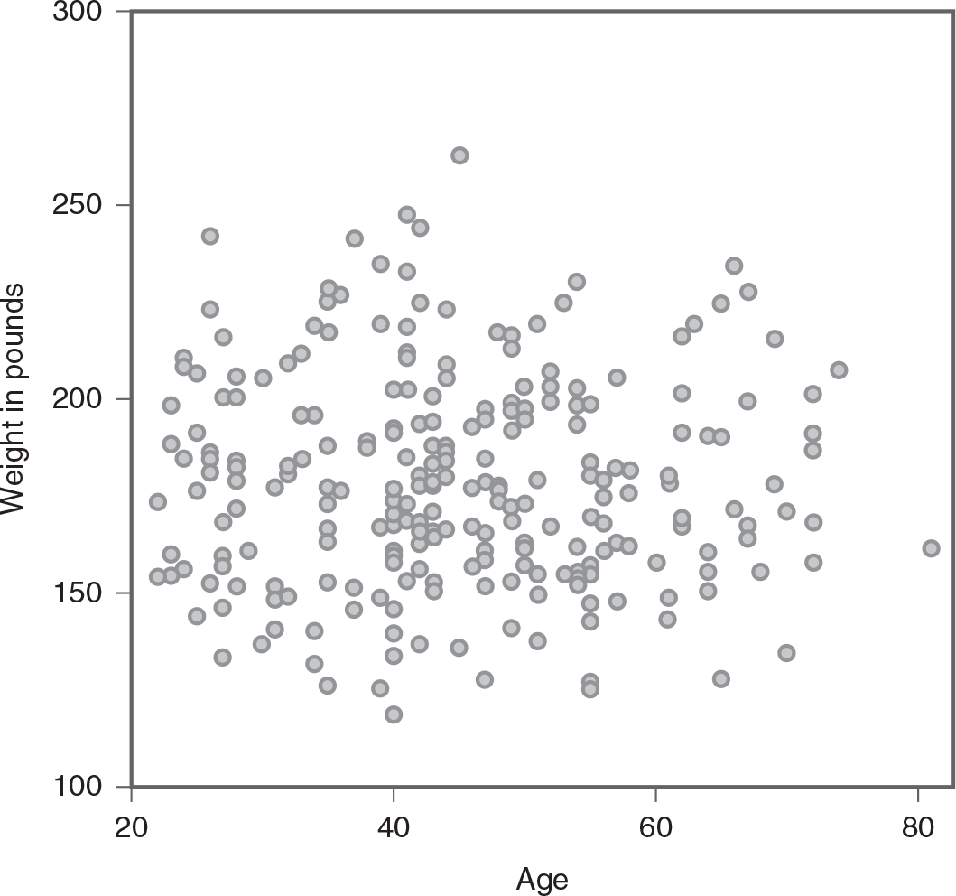
A scatterplot shows the data points scattered randomly.
The horizontal axis is labeled Age and ranges from 20 to 80, in increments of 20. The vertical axis is labeled weight in pounds and ranges from 100 to 300, in increments of 50. The plots are scattered throughout the graph between the lowest weight at the point (40, 120) and the heaviest weight at (45, 260).
Scatterplots are a valuable tool for visualizing the nature of the relationship between variables—whether it is positive, negative, or nonexistent—and for identifying patterns, trends, or outliers in the data. However, a visual inspection can also be somewhat subjective, especially when the relationship is not strongly positive, not strongly negative, or not related. In addition, it is difficult to describe the relationship and its strength precisely by visual inspection only. We need a numeric measurement to define both the direction and strength of the relationship precisely.
The simplest way to numerically define the relationship between variables is to determine whether the two variables covary. The measurement is called covariance and can be found using the following formula:

Formula reads: Covariance equals summation of open bracket open parenthesis x minus x-bar close parenthesis times open parenthesis y minus y-bar close parenthesis close bracket over N minus 1.
where


To explain how covariance is computed, consider the following data set:
Number of years in employment (x): 5 2 4 3 1
Level of job satisfaction (y): 6 9 4 7 2
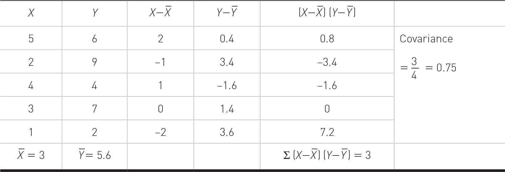
A table with six columns depicts X, Y, deviations, products, and covariance calculation, resulting in 0.75
Under correlations, the table shows four columns: Blank, Blank, Number of years in the current job, and satisfaction level. Row entries are as follows. Row 1. Number of years in the current job, Pearson correlation: 1; .694, double asterisk. Row 2. Number of years in the current job, Sig. (two-tailed): No data; .000. Row 3. Number of years in the current job, N: 89; 89. Row 4. Satisfaction level, Pearson correlation: .694, double asterisk; 1. Row 5. Satisfaction level, Sig. (two-tailed): .000; no data. Row 6. Satisfaction level, N: 89; 89. Text for double asterisk reads, correlation is significant at the 0.01 level (two-tailed).
First, you need to calculate the means of both variables, x and y, for each subject. You will then subtract the corresponding mean from each and every data value to calculate deviations between a data value and the mean for both variables. Finally, dividing the sum of products between deviations in x and deviations in y with n - 1 (degrees of freedom) equals covariance.
Covariance for the previous data set was 0.75, but what does this mean? Covariance can range from negative infinity to positive infinity and tells us how the two variables of interest are related to each other. Whether a covariance is positive or negative tells us whether the relationship is positive or negative. When a covariance is zero, it means that the two variables are not related. Therefore, our example covariance of 0.75 indicates that our variables, the number of years in employment and level of job satisfaction, are positively related. However, the relationship is weak as the covariance measure is very close to zero.
The interpretation of covariance seems relatively easy, but there is a major drawback of using covariance as a measure of relationship in that covariance is not a standardized measure. In other words, the coefficient depends on the measurement scale and may not allow for comparisons between one covariance and another. Therefore, we need a standardized measure of relationships to allow us to make such a comparison, and correlation is such a measure.
The correlation coefficient is a statistical measure that quantifies the strength and direction of the linear relationship between two variables. The most commonly used correlation coefficient is Pearson's correlation coefficient, often denoted as r. Pearson's r is a standardized measure of the relationship between two or more variables and can be found using the following formula:
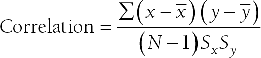
Formula reads: Correlation equals summation of open bracket open parenthesis x minus x-bar close parenthesis times open parenthesis y minus y-bar close parenthesis close bracket over open bracket open parenthesis N minus 1 close parenthesis times open parenthesis S subscript x times S subscript y close parenthesis.
Formula reads: Correlation equals summation of open bracket open parenthesis x minus x-bar close parenthesis times open parenthesis y minus y-bar close parenthesis close bracket over open bracket open parenthesis N minus 1 close parenthesis times open parenthesis S subscript x times S subscript y close parenthesis.
where
As the correlation is a standardized measure of the relationship, we can make a scale-free comparison between coefficients that range between −1 and +1. A coefficient of −1 indicates a perfect negative relationship, meaning that a variable goes down with exactly the same unit change as the other variable goes up, and a coefficient of +1 indicates a perfect positive relationship, meaning that a variable goes up as well with exactly the same unit change as the other variable goes up. A coefficient of 0 indicates no relationship between the two variables.
When interpreting a correlation coefficient, a general rule, as presented in Box 10-1, can be applied. However, the correlation coefficient should always be interpreted along with the corresponding p-value because the interpretation can be sample-specific. Both Excel and IBM SPSS Statistics software (SPSS) will perform a t-test on a correlation coefficient to determine if we have strong evidence for the null hypothesis, or whether the correlation coefficient of zero is true or not.
Box 10-1. Interpreting a correlation coefficientCorrelation:
0 and .1: no relationship
1 and .3: low relationship
3 and .5: medium relationship
5 and .8: high relationship
> .8: very high relationship
To compute the Pearson correlation coefficient in Excel, you will use correlation.xlsx and can use the CORREL function or the Analysis ToolPak add-in we discussed in Chapter 7. In order to use the CORREL function, you can manually type "=CORREL(A2:A90,B2:B90)" in an empty cell, as presented in Figure 10-4, and press Enter to get a correlation coefficient of .69. Note that you can also find the CORREL function in Formula > Insert Function, as displayed in Figure 10-5, and define the range of Year and Satisfaction, as presented in Figure 10-6, in order to get the same correlation coefficient of 0.69. Note, you will have to use further functions in order to get the corresponding p-value for the computed correlation coefficient. First, you will derive the t statistic from the correlation coefficient using "=(r*sqrt(n-2))/sqrt(1-r^2)," where n is the sample size, so it will be "=(0.69*sqrt(89-2))/sqrt(1-0.69^2)" for our example, which will give 8.89, as presented in Figure 10-7. Now, you will use the TDIST function with "=t.dist.2t(t, n-2)" in order to compute the p-value associated with this value so it will be "=t.dist.2t(8.89, 89-2)" for our example, which will give an exceptionally small value of 7.54468E-14 (i.e., .000), as presented in Figure 10-8.
Typing in the CORREL function in Excel.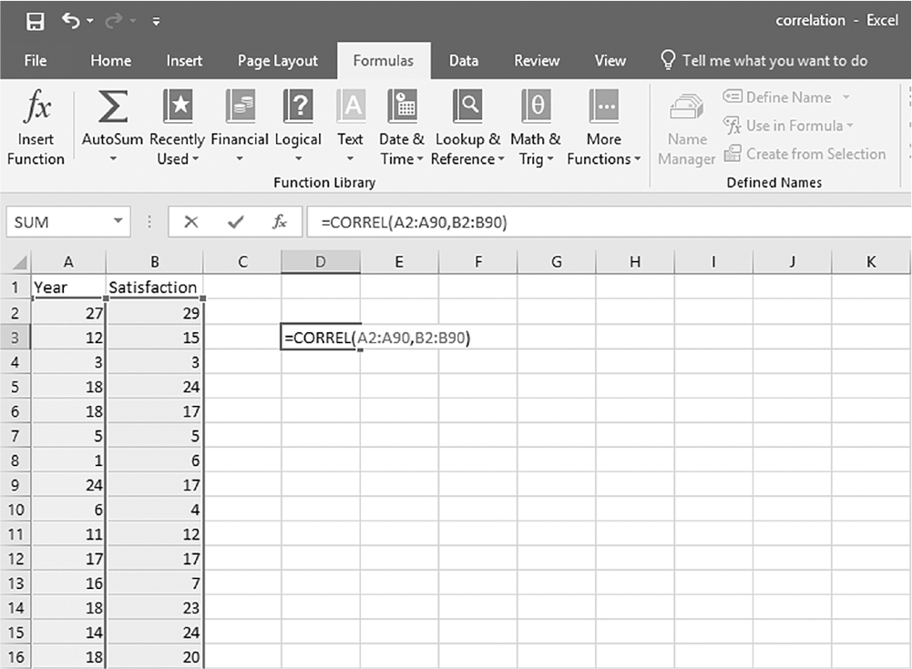
An Excel screenshot shows the Correl function typed, starting with an equal sign, in the cell D 3.
Row 1 in Column A displays the heading, Year, and that in Column B displays the heading, Satisfaction, with numerical data displayed from row 2 through row 16. The cell D 3 displays the function, equal to Correl of A 2 to A 90, B 2 to B 90, where the values of the cells specified in the function are selected.
Courtesy of Microsoft Excel © Microsoft 2020.
Selecting the CORREL function from the function list in Excel.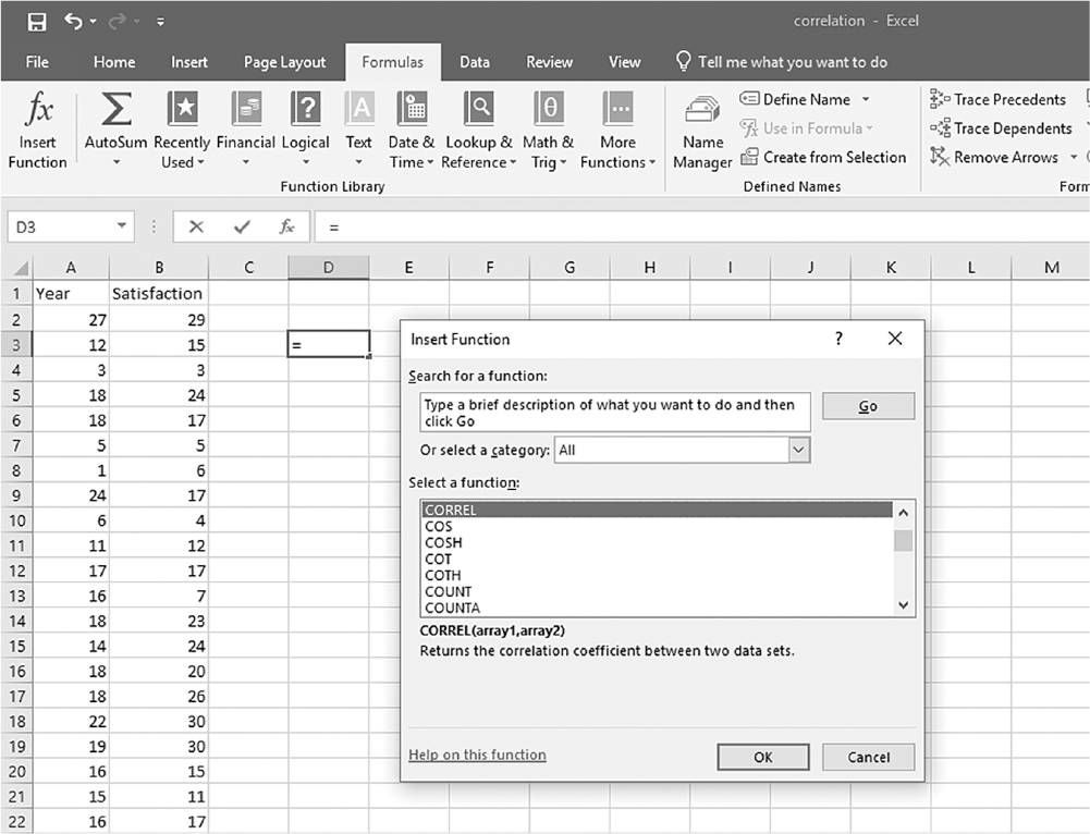
A screenshot of an Excel worksheet shows the Correl function entered in a dialog box, with heading Insert function.
In the dialog box, Insert function, the text reads, Search for a function: type a brief description of what you want to do and then click Go, with a Go button to its right. Below is an entry field, Or select a category, with a drop-down list, and All selected. A drop-down list of functions, namely, Correl, Cos, Cos H, Cot, Cot H, Count, Count A, is displayed. Below the list is a description of the function, Correl which is selected. The text reads, Correl of array 1, array 2: returns the correlation coefficient between two data sets. At the bottom of the window are the O k and Cancel buttons.
Courtesy of Microsoft Excel © Microsoft 2020.
Defining the data range for the CORREL function in Excel.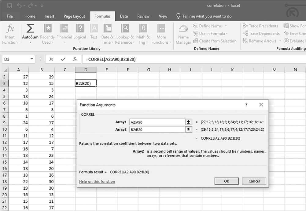
An Excel screenshot shows the dialog box in which the numerical data range for the Correl function is defined.
The worksheet displays numerical data in the first two columns, with the formula bar showing the formula, equal to, Correl of A 2 to A 90, B 2 to B 20. The dialog box, with heading Function Arguments, shows the textbox Correl, with two drop-down lists, Array 1 and Array 2, which shows A 2 to A 90 and B 2 to B 20, respectively. The text below reads, equal to, Correl of A 2 to A 90, B 2 to B 20. The description below reads as follows: Returns the correlation coefficient between two data sets; Array 2 is a second cell range of values—the values should be numbers, names, arrays, or references that contain numbers; Formula result equals Correl of A 2 to A 90, B 2 to B 20. At the bottom of the window are the O k and Cancel buttons.
Courtesy of Microsoft Excel © Microsoft 2020.
Computing the t statistic from the computed correlation coefficient in Excel.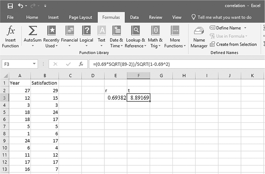
An Excel screenshot shows the derivation of the t statistic from the correlation coefficient.
Row 1 in Column A displays the heading, Year, and that in Column B displays the heading, Satisfaction, with numerical data displayed from row 2 through row 13. The cells E 2 and F 2 display r and t, respectively, and their values in E 3 and F 3 show the values, 0.69382 and 8.89169, respectively. The formula bar shows the formula, equal to 0.69, times, square root of, 89 minus 2, all over, square root of, 1 minus, 0.69 to the power of 2.
Courtesy of Microsoft Excel © Microsoft 2020.
Computing the p-value using the TDIST function in Excel.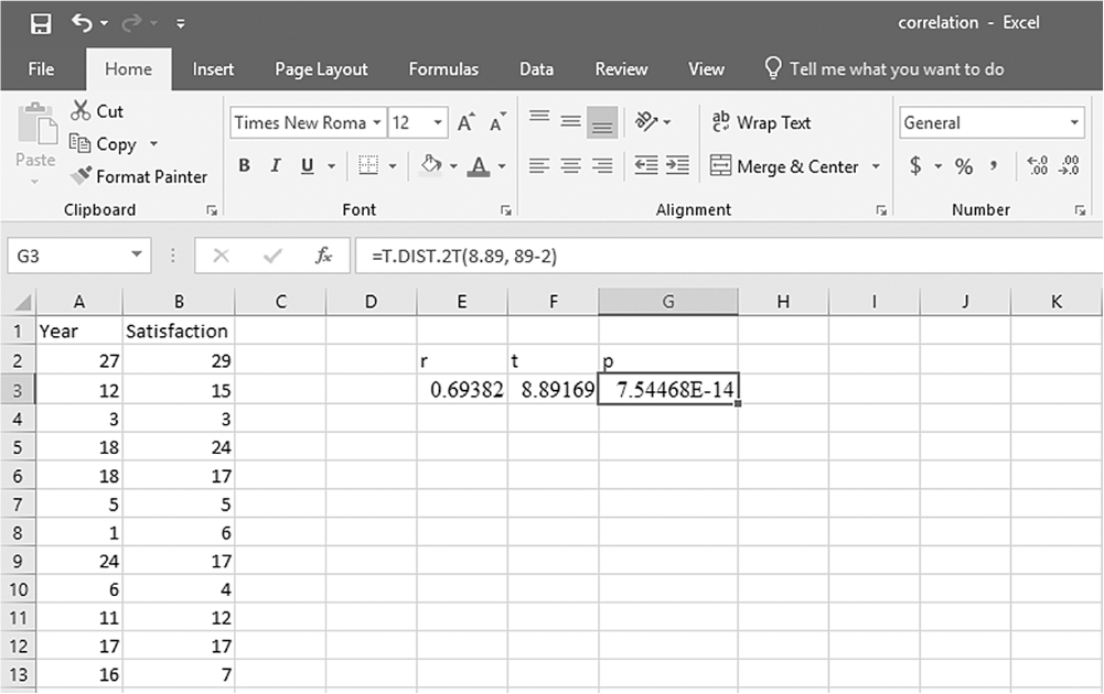
An Excel screenshot shows the derivation of the p-value using the T DIST function.
Row 1 in Column A displays the heading, Year, and that in Column B displays the heading, Satisfaction, with numerical data displayed from row 2 through row 13. The cells E 2, F 2, and G 2 display r, t, and p, respectively, and their values in E 3, F 3, and G 3 show the values, 0.69382, 8.89169, and 7.54468 E minus 14, respectively. The formula bar shows the formula, equal to T dot Dist dot 2 times T, times, 8.89, 89 minus 2.
Courtesy of Microsoft Excel © Microsoft 2020.
To use the Analysis ToolPak add-in, you will go to Data > Data Analysis, as displayed in Figure 10-9. In the Data Analysis window, choose "Correlation" and then click "OK" (Figure 10-10). In the next window, provide the data range A2:B90 as the Input Range and E3 as the Output Range, and then click "OK" (Figure 10-11). This should produce the same correlation coefficient of .69, as presented in Figure 10-12. Note you can obtain the corresponding p-value as previously displayed.
Finding Data Analysis in Excel.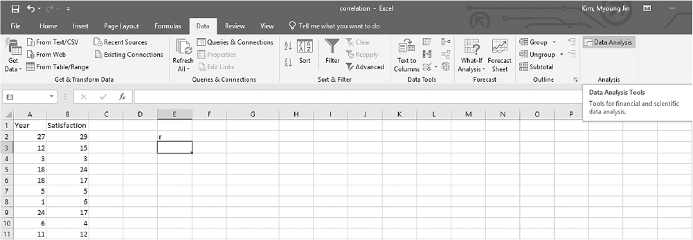
An Excel screenshot shows the Data Analysis ToolPak add-in, in the Analysis group under Data menu. Row 1 in Column A displays the heading, Year, and that in Column B the heading, Satisfaction, with numerical data displayed from row 2 through row 13.
Courtesy of Microsoft Excel © Microsoft 2020.
Selecting "Correlation" in the Data Analysis dialogue box in Excel.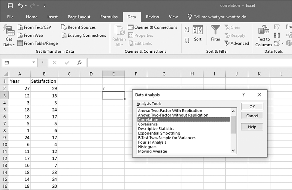
An Excel screenshot shows selection of the analysis tool, Correlation, from a list of tools in the data analysis dialog box. Row 1 in Column A displays the heading Year, and that in Column B, Satisfaction, with numerical data from rows 2 through 13.
Courtesy of Microsoft Excel © Microsoft 2020.
Defining the data range in the Correlation dialogue box in Excel.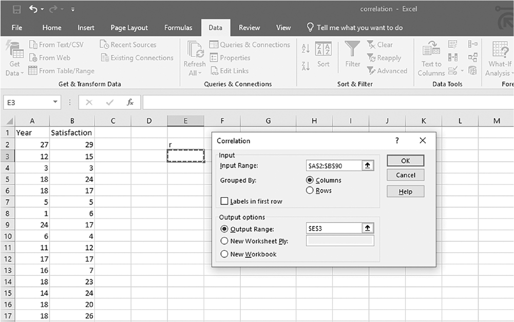
An Excel screenshot shows the Correlation dialog box with fields to define data. The data in the worksheet has the column headings, Year and Satisfaction, with a list of numerical data.
The dialog box has two textboxes. The first textbox with heading, Input, consists of a drop-down list, input range; Grouped by with two options, Columns and Rows, preceded by option buttons, of which Columns is selected; and the text, Labels in first row, preceded by a check box which is unchecked. The second textbox with heading, Output options, consists of a drop-down list, output range which is checked and the cell E 3 entered; new worksheet ply; and new worksheet. The buttons, O k, Cancel, and Help, are on the right of the dialog box.
Courtesy of Microsoft Excel © Microsoft 2020.
Output for correlation coefficient in Excel.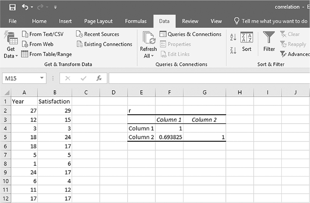
An Excel screenshot shows the output for correlation coefficient. The data in the worksheet has the column headings, Year and Satisfaction, with a list of numerical data, in Columns A and B.
The output data is displayed as follows. Cell E 2: r; Cells E 3, F 3, and G 3 display no data, Column 1, and Column 2, respectively; Cells E 4, F 4, and G 4 display Column 1, the number 1, and no data, respectively. Cells E 5, F 5, and G 5 display no data, Column 2, 0.693825, and no data, respectively.
Courtesy of Microsoft Excel © Microsoft 2020.
To compute the Pearson correlation coefficient in SPSS, you will use correlation.sav and go to Analyze > Correlates > Bivariates, as displayed in Figure 10-13. In the Bivariate Correlations dialogue box, you will select the variables that you are interested in investigating a relationship between and move them over to the right window by clicking the arrow button in the middle, as presented in Figure 10-14. Pearson's coefficient is checked by default in this dialogue box, so you should leave it unless parametric assumptions are violated. Clicking "OK" will then produce the output of the requested correlation coefficients. An example output is presented in Table 10-1.
Selecting "Correlation" in SPSS.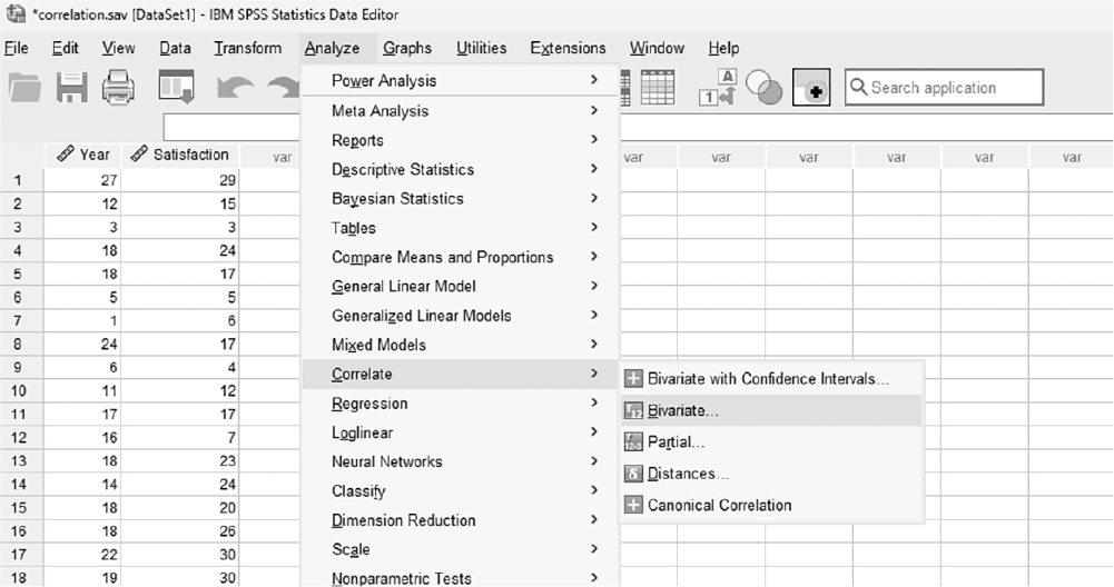
A screenshot displays a dialog box with statistical analysis options, and the correlation option is highlighted for selection.
Reprint Courtesy of International Business Machines Corporation, © International Business Machines Corporation. "IBM SPSS Statistics software ("SPSS")". IBM®, the IBM logo, ibm.com, and SPSS are trademarks or registered trademarks of International Business Machines Corporation.
Defining the variables to compute correlation coefficients in SPSS.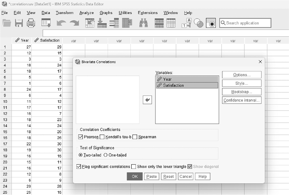
A screenshot displays a dialog box where multiple variables are selected from a list and placed into the variables panel for correlation analysis.
Reprint Courtesy of International Business Machines Corporation, © International Business Machines Corporation. "IBM SPSS Statistics software ("SPSS")". IBM®, the IBM logo, ibm.com, and SPSS are trademarks or registered trademarks of International Business Machines Corporation.
Correlations | |||
|---|---|---|---|
Number of Years in the Current Job | Satisfaction Level | ||
Number of years in the current job | Pearson correlation | 1 | .694** |
Sig. (two-tailed) | .000 | ||
N | 89 | 89 | |
Satisfaction level | Pearson correlation | .694** | 1 |
Sig. (two-tailed) | .000 | ||
N | 89 | 89 | |
**Correlation is significant at the .01 level (two-tailed). | |||
The Pearson correlation coefficient between the number of years in the current job and the level of satisfaction is .694; this indicates that there is a positive relationship between the two variables: the level of satisfaction goes up as the number of years in the current job increases. Note that the corresponding p-value of .000 in the table is small enough to rule out an association by chance between the number of years in the current job and the level of satisfaction.
Recall that we cautioned earlier that correlation does not imply causation, and the direction of the influence is not always clear. Is it that job satisfaction is influenced by years on the job, or do people lengthen their time of employment because they are satisfied? Relationships may be bidirectional or move in both directions, and correlation does not tell us what that direction is. Another important thing to note about the correlation coefficient is that the ratio of differences between and/or among correlation coefficients cannot be expressed. For example, a correlation coefficient of .50 does not mean the relationship is twice as strong as a correlation coefficient of .25.
A correlation coefficient can be squared to provide additional information. A squared correlation coefficient is called a coefficient of determination and tells us how much variation in one variable is explained or shared by the other variable. For example, we may be interested in the relationship between the number of nursing staff at a nursing home and the quality of nursing care. Let us suppose that we found a correlation coefficient between the two variables of .39. Taking a square of this correlation coefficient, we get (.39)2 = .1521; this means that 15.21% of the variability in the quality of nursing care is explained or shared by the number of staff at a nursing home. More importantly, this also means that the remaining 84.79% of variability in quality of care is attributed to something other than the number of staff. The coefficient of determination can be useful in determining how important the relationship between the variables is; the larger the coefficient, the more the variables explain each other. Note that a coefficient of determination ranges between 0 and 1 as it is obtained by squaring a correlation coefficient.
Pearson's correlation coefficient is a parametric correlation coefficient, which requires parametric assumptions such as the normality assumption. When parametric assumptions are not met (such as nonnormally distributed variables or ordinal level of measurement for variables), Pearson's correlation coefficient cannot be used to examine the relationship between the variables. In this situation, two alternatives to Pearson's correlation coefficient are Spearman's rho and Kendall's tau. Both coefficients are calculated by first ranking the data and then applying the same equation we used for Pearson's correlation coefficient. We will not discuss the detailed computation of these two statistics, but the coefficients are interpreted in the same manner as before. As it is not easy to obtain Kendall's tau in Excel, we will only discuss how to obtain Spearman's rho.
To compute Spearman's rho in Excel, you will use correlation.xlsx and first determine the rank for each value in both year and satisfaction. With cell names of "Rank Year" and "Rank Satisfaction" given in cell C1 and D1, respectively, you will type "=RANK.AVG(A2,A$2:A$90,1)" in cell C2, as displayed in Figure 10-15. With C2 selected, press and hold the Ctrl key and place the cursor on the little square on the bottom right of the cell until it changes to "+". Clicking on the little square and dragging it down to cell C90 will rank the values of Year (Figure 10-16). You will do the same for Satisfaction in column D in order to get the ranked values for satisfaction. Type "=RANK.AVG(B2,B$2:B$90,1)" in cell D2. While pressing and holding the Ctrl key, click the cursor on the little square on the right bottom of the cell until it changes to "+", and drag it down to cell C90 in order to get the rank values of Year. Now, type "=CORREL(C2:C90,D2:D90)" in cell F2, and you should get a correlation coefficient of .83 (Figure 10-17).
Typing in a function to convert raw data into rank values in Excel.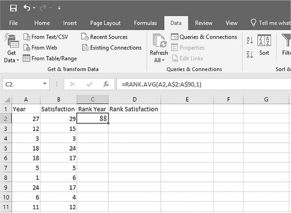
An Excel screenshot shows the entering of a function in one cell to convert raw data into rank values.
Cell A 1 displays the heading, Year, and B 1, the heading, Satisfaction, with numerical data displayed from row 2 through row 13. Cell C 1 displays the heading, Rank Year, with the value 88 in C 2. Cell D 1 displays the heading Rank Satisfaction. With C 2 selected, the formula bar shows the formula, equal to Rank dot Average of A 2, A dollar 2 to A dollar 90, 1.
Courtesy of Microsoft Excel © Microsoft 2020.
Converting raw data into rank values in Excel.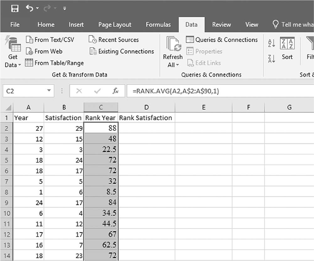
An Excel screenshot shows the entering of a function in one cell to convert raw data into rank values, and output dragged to the other cells in Column C.
Cell A 1 displays the heading, Year, and B 1, the heading, Satisfaction, with numerical data displayed from row 2 through row 13. Cell C 1 displays the heading, Rank Year, with the value 88 in C 2, and the cell dragged down. Cell D 1 displays the heading Rank Satisfaction. With C 2 through C 14 selected, the formula bar shows the formula, equal to Rank dot Avg of A 2, A dollar 2 to A dollar 90, 1.
Courtesy of Microsoft Excel © Microsoft 2020.
Obtaining a Spearman's rho coefficient in Excel.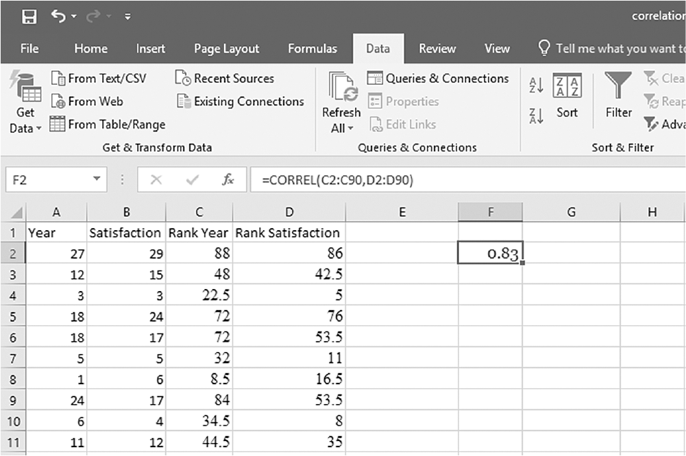
An Excel screenshot shows the Correlation coefficient
Cells A 1 through D 1 display the headings, Year, Satisfaction, Rank Year, and Rank Satisfaction, with numerical data displayed from rows 2 through 12. Cell F 2 shows the value 0.83, with the formula entered in the formula bar as, equal to Correl of C 2 to C 90, D 2 to D 90.
Courtesy of Microsoft Excel © Microsoft 2020.
To compute either Spearman's rho or Kendall's tau in SPSS, you will use NPcorrelation.sav and go to Analyze > Correlates > Bivariates, as displayed in Figure 10-18. In the Bivariate Correlations dialog box, you will select the variables you are interested in investigating the relationship between and move them over to the right window by clicking the arrow button in the middle, as presented in Figure 10-19. Pearson is checked by default in this box, but you should uncheck it and select Spearman and Kendall's tau-b instead. Clicking "OK" will then produce the output of the requested correlation coefficients. An example output is presented in Table 10-2.
Selecting Spearman's and Kendall's correlation coefficients in SPSS.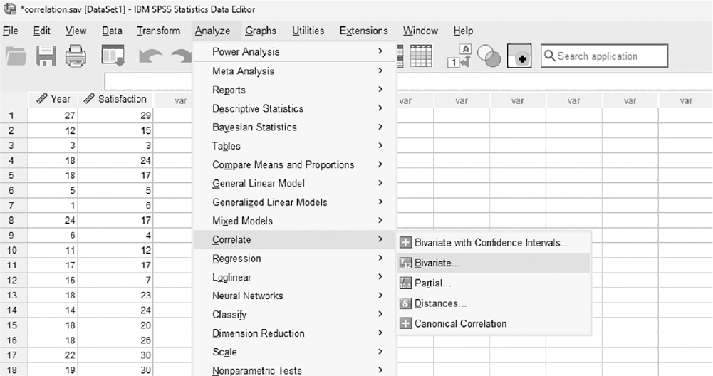
A screenshot displays a dialog box with checkboxes for different correlation methods, and the options for Spearman and Kendall are selected.
Reprint Courtesy of International Business Machines Corporation, © International Business Machines Corporation. "IBM SPSS Statistics software ("SPSS")". IBM®, the IBM logo, ibm.com, and SPSS are trademarks or registered trademarks of International Business Machines Corporation.
Defining variables for Spearman's and Kendall's correlation coefficients in SPSS.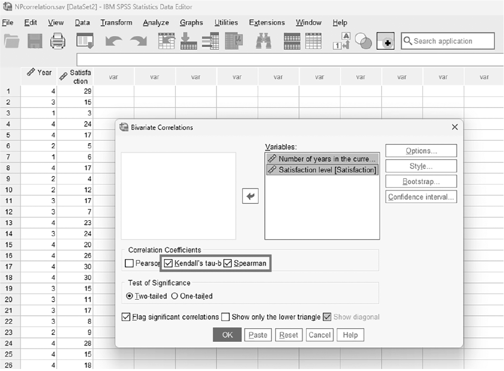
A screenshot displays a dialog box where variables are highlighted and moved into the analysis panel for nonparametric correlation computation.
Reprint Courtesy of International Business Machines Corporation, © International Business Machines Corporation. "IBM SPSS Statistics software ("SPSS")". IBM®, the IBM logo, ibm.com, and SPSS are trademarks or registered trademarks of International Business Machines Corporation.
Correlations | Year | |||
|---|---|---|---|---|
Satisfaction Level | ||||
Spearman’s rho | Satisfaction level | Correlation coefficient | 1.000 | .549** |
Sig. (two-tailed) | .000 | |||
N | 89 | 89 | ||
Year | Correlation coefficient | .549** | 1.000 | |
Sig. (two-tailed) | .000 | |||
N | 89 | 89 | ||
Kendall’s tau_b | Satisfaction level | Correlation coefficient | 1.000 | .671** |
Sig. (two-tailed) | .000 | |||
N | 89 | 89 | ||
Year | Correlation coefficient | .671** | 1.000 | |
Sig. (two-tailed) | .000 | |||
N | 89 | 89 | ||
**Correlation is significant at the .01 level (two-tailed). | ||||
Often other variables can influence the main relationship you are currently investigating. If this is the case, you cannot examine the true relationship between the two variables of interest unless you control the effect of the unwanted or other variable(s) in the relationship. A partial correlation coefficient is such a measure, and it allows us to examine the true relationship between two variables after controlling for the influence of a third/unwanted variable (i.e., the effect of that variable is held constant). Let us assume that a nurse practitioner (NP) is interested in studying the relationship between a treatment and a patient outcome, but the NP believes that the level of patient anxiety also influences the relationship between treatment and outcome. If the NP does not control for the effect of patient anxiety, the result can be very misleading because it will not account for the true relationship between the two variables. The NP should control the effect of patient anxiety and then examine the relationship between a treatment and the patient outcome.
To explain partial correlation a bit more, let us consider Figure 10-20. The first diagram indicates the relationship between patient outcome and treatment, and the second diagram presents the relationship between patient outcome and patient anxiety. When we combine those two diagrams, you will notice that the double-shaded area in the middle is the portion of variability in patient outcome that is shared by both patient anxiety and a treatment. Therefore, this is not a unique relationship between a treatment and patient outcome, and it should be removed from the rectangle of the first diagram. What is left will be the true relationship between a treatment and patient outcome.
Example diagram of partial correlation.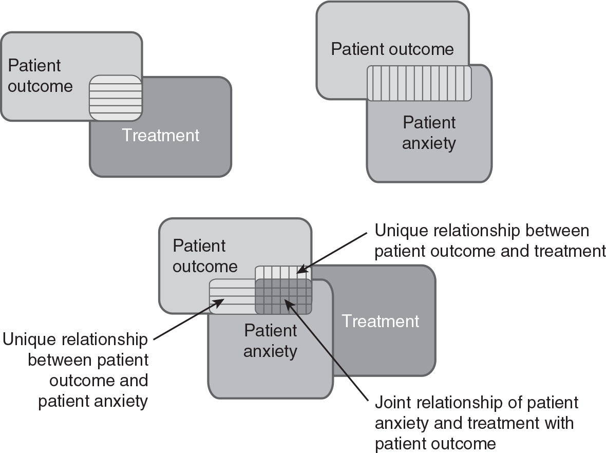
Three diagrams depict partial correlation.
The first diagram shows the relationship between patient outcome and treatment, and the second diagram shows the relationship between patient outcome and patient anxiety. The third diagram shows the two diagrams combined; the portion common to patient outcome and patient anxiety is labeled, unique relationship between patient outcome and patient anxiety; the portion common to patient outcome and treatment is labeled, unique relationship between patient outcome and treatment; the double-shaded area is the portion of variability in patient outcome that is shared by both patient anxiety and a treatment, which is labeled, joint relationship of patient anxiety and treatment with patient outcome.
To obtain a partial correlation coefficient in SPSS, you will use Partialcorrelation.sav and go to Analyze > Correlate > Partial, as displayed in Figure 10-21. In the Partial Correlations dialogue box, you will select the variables you are interested in investigating a relationship between (i.e., patient outcome and treatment) and move them over to the upper window by clicking the arrow button in the middle. You will also move a variable to control (i.e., patient anxiety) to the lower window, as presented in Figure 10-22. Clicking "OK" will then produce the output of the requested correlation coefficients. An example output is presented in Table 10-3.
Selecting partial correlation in SPSS.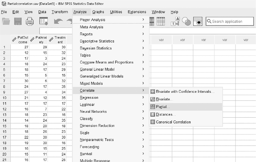
A screenshot displays a dialog box listing analysis procedures, with the partial correlation option highlighted for selection.
Reprint Courtesy of International Business Machines Corporation, © International Business Machines Corporation. "IBM SPSS Statistics software ("SPSS")". IBM®, the IBM logo, ibm.com, and SPSS are trademarks or registered trademarks of International Business Machines Corporation.
Defining the variables to compute the partial correlation coefficient in SPSS.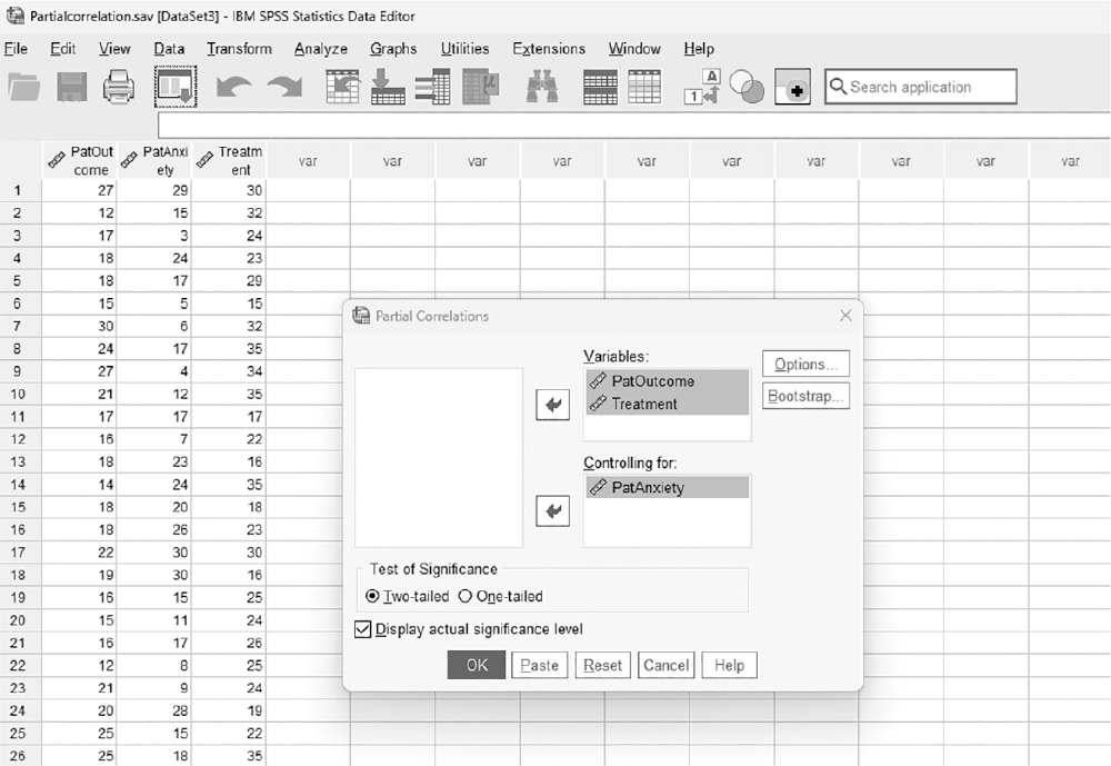
A screenshot displays a dialog box where variables are selected and placed into separate panels labeled for variables and control variables to compute the partial correlation coefficient.
Reprint Courtesy of International Business Machines Corporation, © International Business Machines Corporation. "IBM SPSS Statistics software ("SPSS")". IBM®, the IBM logo, ibm.com, and SPSS are trademarks or registered trademarks of International Business Machines Corporation.
You may recall our discussion of effect size earlier in Chapter 8 as the measure of the strength of the effect of the independent variable on the dependent variable. Correlation coefficients are commonly used measures of effect size. When using a correlation coefficient as an effect size, a value of ±.1 represents a small effect, ±.3 represents a medium effect, and ±.5 represents a large effect.
Many journals and other venues for reporting findings require a particular format intended to standardize the reporting of statistics. In nursing, we mostly use the American Psychological Association (APA) format. When reporting correlation coefficients in APA format, include the size of the relationship between variables and its associated significance. Some important things to remember when reporting correlation coefficients are: (a) you should not include a zero in front of the decimal, (b) all correlation coefficients should be reported in two decimals, and (c) the exact p-value should be reported regardless of how small or large it is. An example of reporting correlation coefficients is as follows: There was no substantial relationship between treatment dosage and surgery outcome, r = .19, p = .066, 95% CI [-.01, .40].